“look” - this is not a render characteristic.
Render resolution - this is how many pixels will be rendered (simply put)
Look at these settings as being so important that they got their own tab.
2 Likes
Come on, don’t go semantic.
Settings as light bounces, sampling, integrator, clamping, caustics, etc are all render engine related and fit well together. Then, how big you want your picture out, is not bound by these settings.
Think of traditional photography: you used to choose the film, the lens, exposure, color filter… then you went to print your photos, and decide the paper, the format and size.
It makes quite sense to me.
1 Like
Could be nice to have the header visible only when the mouse is on it.
That will clean the UI a bit IMO.
9 Likes
Hey, one little UI thing wich slow down my workflow all the time,
is the missing of the good old one click: “remove doubles”,
cause it was very quick.
can i get it back  in the toolbar of the Modeling workspace?
As alternative is the whole Cleanup Section okay too, with the hover effect.
Thanks in advance!
4 Likes
Untill release beta, I really hopel all tool button are actually correspond with each selected workspace.
we still need to use many command from top menu>drop down menu> then select.
which not offered as one click tool icons .
even though there is no good image which represent each command,
at least I hope , we can easy add custom tool menu, by r-click on each command.
it is OK, when there is no assgiend image, it simply show “command labell” as button.
your suggested “remove dobules” is definetly I often use and I may serch in tool buttons.
as same as many UV command, and shading smooth flat etc.
4 Likes
workspaces label editable order list
at the moment it is not possible to sort the list of workspaces and it is frustrating, it would be useful if it were made possible by click and drag on the workspace label in order to move it to the list in a more pleasant position
4 Likes
Right-click on the tab, Reorder to Front/Back. It’s not the ideal solution we know, but it seems to be a lot of work to make it properly and there are much higher priorites at the moment.
2 Likes
In a recent video @pablovazquez asked for feedback on how to align the transform info in the 3d view.
When in the middle of a transform, the info bar’s left side goes blank. Any reason we couldn’t put the transform info there?
It’s a bit weird that moving something makes the header disappear. Is there any value in that? If not I’d suggest moving the info to the info bar as that seems to be what it’s designed for. You can only transform one thing at a time, so there will be no problem even if using a layout that has many different editors and you’re transforming things in all of them (UV’s, objects, VSE strips, etc.).
The one conflict is that when using a tool in edit mode the info bar’s hotkey suggestions are still available, but it’s actually incorrect during the operation anyway and conflicts with the header’s hotkey suggestions.
Case in point, what will left click in this situation do? Different things according to the header and the info bar.
1 Like
Workspace Tabs are doing some funky things. If you open default blender so the currently active tab is the left most one labeled “Layout” then click the /+\ at the right end of the tabs and under General select “Layout” (by the way, why are all these names greyed out?) then what happens is the original active Layout tab suddenly becomes the rightmost (and still active) tab, and a new “Layout.001” tab is now on the left.
Also when new workspaces are created from the /+\ they often differ in subtle ways from the original ones you get at startup. For example in the General->Layout created from the /+\ menu, the left side (tool?) pane of the timeline is expanded showing “Dope Sheet Summary” which was not visible in the original.
Does anyone know of a good write-up or video demonstrating the intended workflow of view layers and collections? I’m trying to understand why the collections default outliner view is more useful than say showing the object parenting hierarchy.
Also Collections still seems somewhat half-baked in certain areas. [Edit: I bugged this crash and it has been fixed!] Like if you duplicate a collection and click an object name like “Cube” in the original collection then it gets selected. If you shift-click the same object name in the duplicate collection, you have both selected with a blue highlight bar in the outliner, but it unselected the cube when the second one was shift-clicked (add a third duplicate collection and it will become selected again if you shift-click that one). Now right click any of the “selected” cubes in the outline and right click and “Delete” and blender crashes presumably because it tried to delete the same object multiple times.
1 Like
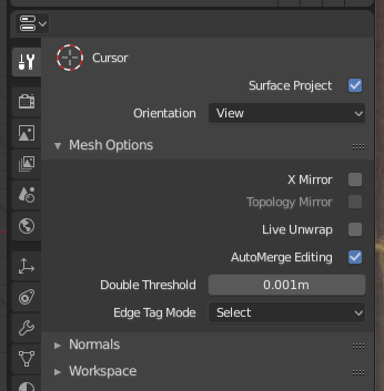
I happend to find this problem. (Auto merge option is removed for snap vertex)
I often use “Auto merge” option, with snap vertex ( on to itself option) .
if It can not auto - merge, it easy cause problem even though I try to remove dobules, after snap many vertices. (may lost some non double vertices, or remain it, without intention, with Double Threshold values.
Then “Auto merge” work with snapping process is important for me.
This subject is already confirmed by developers as “must” ?
1 Like
Hi Takeshi. Luckily, this was added back into the interface. You can find it in the “Mesh Options” dropdown on the right side of the top bar. It is also under the tool settings tab in the properties editor.
1 Like
Thanks, I seems not serching enough. 
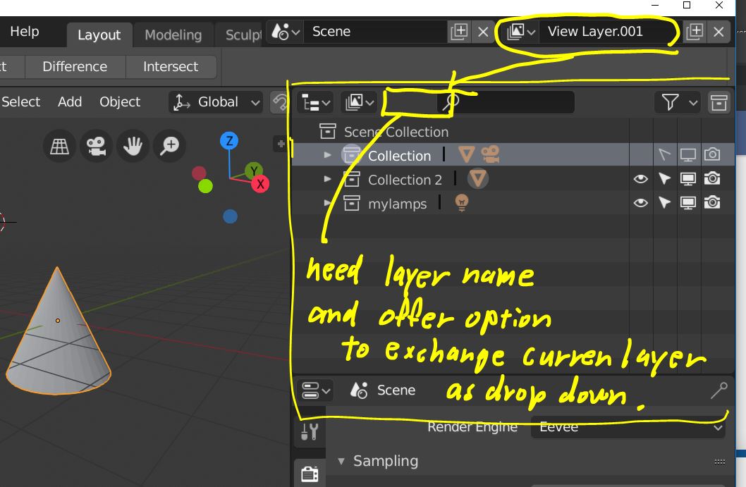
Hi, I could understand concepts, view layer and collections. I think it should be offer better management of each scene view and render. (Of course I hope “local view” will return with 2.8 beta)
At same time, as basic hobby user, I could find some lack infomation about current Outliner and 3d view.
So, 3dview only show current acitve view layer. right? and it is only one layer. we can not set multi view layer as visible in 3d view. right? If it work so, I hope there should be more clear infomation. about current active view layer name, on 3d view.
I can not get clear infomation without cehck right top header . but 3d view is depend view layer.
So if user set many view layer, I hope to know, current view layer more clear.
And we need to use the top right corner header to change current viewlayer.
What I hope is, offer more good visuaization about current "viewlayer name " for 3d view, and outliner.
and offer way to exchange “viewlayer” without using top header menu.

Because outliner is mainly used for such purpose (select obj, or select group, edit name etc)
it expected about “viewlayer” too. But at current we can not change viewlayer name, we can not change active viewlayer, without double open outliner (with scene mode). Or user need to exchange outliner mode from scene to layer , layer to scene often.
It not means, I hope to remove “view layer menu” from top menu. it still need .
but it seems reasonable,that there are same dorp down menu and labell., in outliner (view layer mode). which clear see current layer name,and exchange layer as drop down.
6 Likes
When in Camera View Mode, how about a Walk Navigation button(good for laptop people and newbees)?
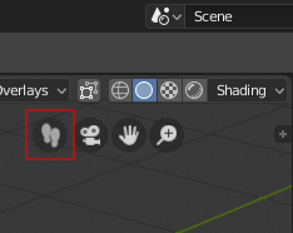
8 Likes
No, it’s good for anyone willing to navigate in the viewport. The more options you have, the more flexibility you have.
We could add a lot of other buttons here. Like lock view, walk & fly navigations, roll, dolly zoom, … Though, the UI should remain simple. 
1 Like
The weird thing is, if you use a 3D Connexion SpaceNavigator mouse with Blender, this is the default (and pretty much only) behavior… which is contrary to how ALL other apps work with that product (Max, Solidworks, Alias, etc. etc. etc.).
In short, I guess if you want that behavior, buy a SpaceNavigator. 
(The bug report I made on it was closed and said that this wouldn’t be changed. So since we got left click finally after all these years, maybe the will fix this in another 10 years… sorry, had to vent a bit on that one.)
Hello everyone
I’m a new user on this forum and wanted to quickly say hi
As many of you I hope that Blender will get the recognition in the professional industry it deserves and I think that 2.8 could be a big step in that direction. Since I am studying and workin in the field of UI & UX I will soon post a feedback comment regarding the current state of the UI design and point out a few things that really annoy me aswell as something the current visual design does really well imo.
Hopefully now I won’t be considered a new user anymore and will be able to post more than one picture in my posts …
1 Like
Actually the one that really bugs me is that “User view” is not actually a thing in that it’s not a view mode you can switch back to with a command. So if you’re a noob and you see that colorful navigation gizmo, and you click one of those inviting little axis dots, you get put in some orthogonal top/right/front view with no obvious way to “get back to where you were”. “Just rotate out of it” is hardly something we can expect people to try (AFAIK there’s no other program that would work in other than Blender).
Camera view is magically a toggle that saves the view state and restores it if you click it twice, but no other view seems to behave like that.
I would propose that any view navigation command that is going to leave User view for something else should save the User view state, and there should be a command to restore that last-saved view. So if I switch to front view from user perspective view, I could then just hit a key (I like Backspace myself) to return to the previous view when I’m done.
Unless there’s some way of accomplishing this today that I’m just not aware of.
4 Likes