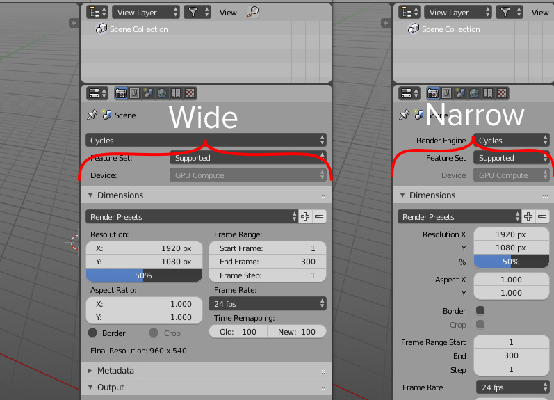
I saw a new single column layout in properties, and it’s cool for narrow properties area, but what about wide? Take a look at web-sites: if browser has wide screen site blocks will set in multi-column layout, but if you shrink browser’s width or look on website from mobile device the site blocks will appear at one column. It’s called responsive design.
What if we apply this principle in properties area? if you shrink properties to a special width, it automatically change layout from two column to one and vice versa?
Hello Blender Development Team, and thank you for your effort trying to build Blender into unique way as professional tool which corresponding to all important and necessary standards to the CGI industry.
You did a lot, and we can’t wait to see finally the latest result with 2.80, which will be the Top of the top i think!
However, because I’m professionally involved into UI/UX and 3D building cockpit electronics for automotive industry, I would like to give you my feedback for the latest version build of 2.8
To be more straight I will upload some images to compare both 2.79 and 2.8 and what I think is positive and negative into the current way of development.
Please, look my comments bellow.
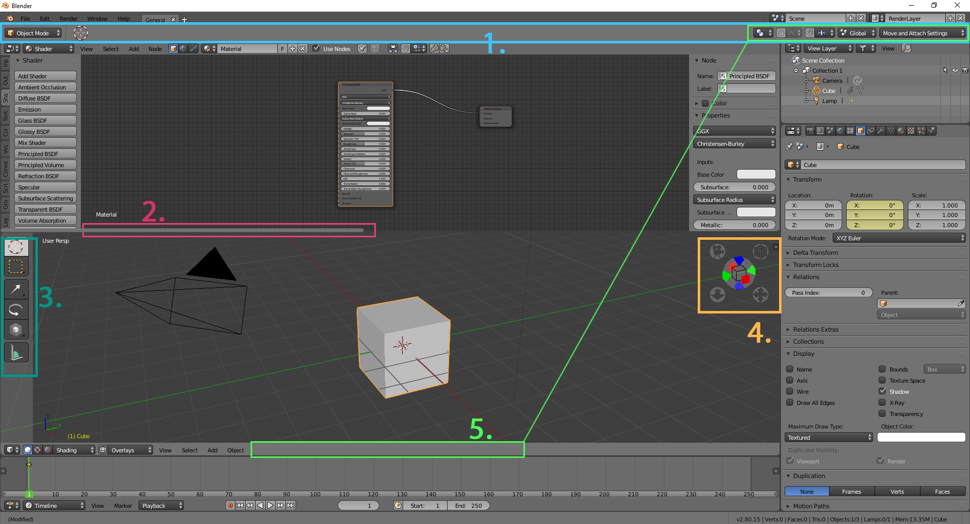
Here in this image I’ve marked what I miss into the new version of Blender and what is negative for the UX from my perspective. The numbers are corresponding to the comments and feedback.
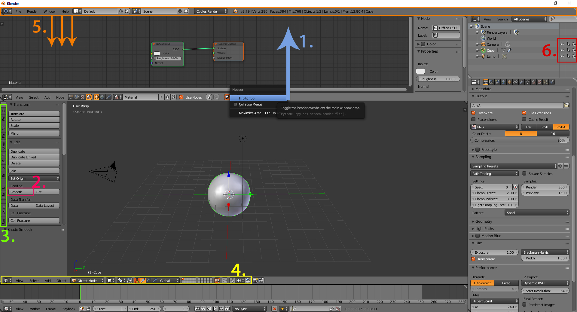
1, Currently, the new build is able to switch the main menu line to top and bottom, by right click option. However by default the menu line is straight top, and into the next picture will show you why this is negative in using it as default in that way, but not like before.
Now for the current workflow we have the nice left panel including the icons for move, rotate, scale etc. I clearly understand that in this preview for 2.79 and before there were placed add-on settings, anyway for the initial workflow of the user, he/she can easily find the plugin and operation to use by looking on the specific menu. Now there is no such think, also I can’t believe users will use and press those icons instead of the unique short keys - for G-grab, R-rotate, S-scale. My question is, where i can find all those add-on properties now? Simple example also, is smooth geometry button. Currently, they not exist or they are difficult to be founded…
Please, confirm the post so I can continue upload the next images.
I really believe the add-on vertical menu bar is super original and useful from the user professional point of view. I think this should be saved for 2.8, for any practical use to the workflow.
One of the best thing in Blender is the super flexible customization and the switchable behavior for the UI.
The header bar -4- now 2.8 is separated top left and right, and I really don’t like the idea of clicking first up-left to change the shading mode, then up-right to change any pivot point property for the orientation; smoothing selections or any other option for that menu. I’ve tried but it makes me super slow…
I really don’t like the current situation with that menu there. Suggestion is to keep it back in raw on the header menu like before, it’s 100t better for the UX .
About -5- the system - printing the processes behind this menu after dragging it down.We can see any operation blender is doing in a form of code event list.
This was really nice and cute - UI-secret-space for running the backlog and watching the dynamics in the code side. Currently, the new version is not containing such thing, or at least I can’t see it, and it looks more user straight and flat from this -developer perspective - If it’s up to me as a designer - I would keep it for 2.8 if there is an option for it.
The missing options for hiding, locking and rendering in 2.80, were quite useful in 2.79 for the way they worked. Now, 2.80 I have go trough the Outliner and filtering menu to click and make it happen, now I’m using 2ts more clicking to make the same operation like before. By the way - everything should be separated in collections, from UX perspective it will make the user to think and relate everything to ID-group from the really beginning, which is good but, compare to the previous concept with the grouping, it not a huge benefit now, or may be I’m not familiar enough to it.
Ok here I’ve been capturing the main topics of my concerns related to UI and User Experience at the end.
This separated Menu which is quite usable, and as an artist I’m using it so much into my main workflow, down in one line like before is much better then up there.
The main idea is good, but again - who will use that!?
I like the idea because we have it included /I know that this is not the final design of it/ however, I don’t think most of the users are using it, probably a really small group, and I don’t think should appear by default, because it taking a lot of attention and space.
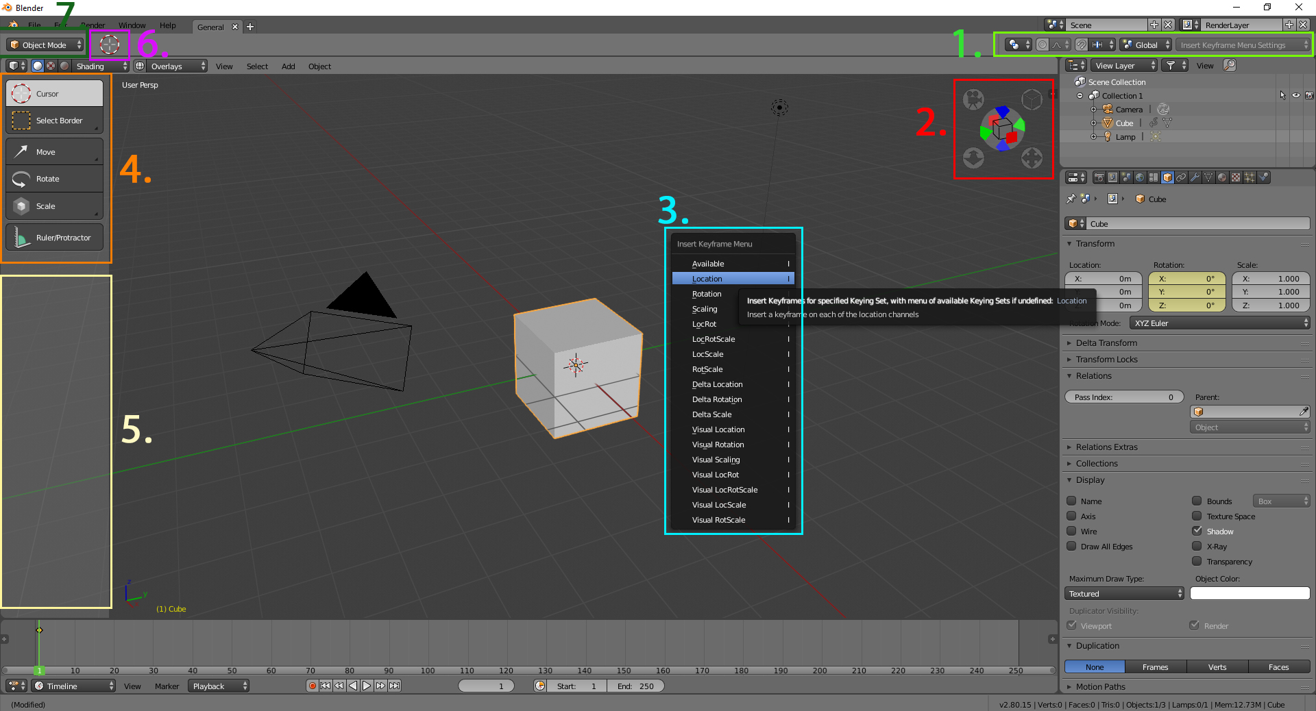
The example I’m showing is that if I don’t use the short-key for adding key-frame, downstairs to the action dope sh. line there is no such options which is kind of petty, and confusing I think. However I manage to find the additional property window for adding and replacing key-frames in the Timeline bar by pressing N/or on the little + icon. But I think for the timeline bar this should be available and shown/active by default.
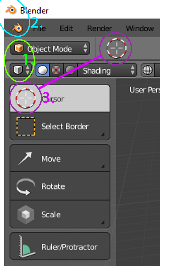
Again I think the left menu bar should contain more - like before - properties panels etc. Now those 5 icons will be mostly decorating it there for the Object Mode. The edit mode is nice, but I think for the final polishing it could reduce a lot.
The empty spaces are quite confusing me. in some spots like 1,2, and also the Outliner, we see big densities of icons and information, but some spaces are quite ZEN, and not used at all
As a cockpit electronic designer with sharp view on UI placement and positioning I think the idea of showing what was selected in that way is quite confusing, there should be a no need of illustrating the process in that way. For indicating such think, you can use really small version of it, to make it clear and minimal as sign. But this place of indication should be for all. not only for few elements.
As you can see what I’m talking about the repetition.
This will make the user confusing, watching repetitive elements which are showing in the same time during his/her workflow. I really like all your ideas for 2.8, but for sure they have to be optimized.
I was watching Pablo with his daily youtube sessions about the build progress, when I’ve decided to share my feedback on that topic.
For the header on top think should be completely removed from there, or at least with options for placing it in bottom and mid section of the UI view-port, in this way the top raw will always be only 1, not 2 like in the example.
The dividers between the UI view-port are appearing on hover only, which again makes the UI a bit not clarified visually as windows and frames. In the example you can see the appearance from both high and low density grid in the view port, making them look a bit strange I think and also the side windows are not finishing natural in that way.
If it’s up to me I would like to keep this one as default one, but also I will include the vertical menu line from the 2.79 as concept.
If you keep it there, the indicator should appear as much smaller object I think. Should indicate current selection not only for the standard modeling tools but also for all /objects, text, data-text/, instead of the current appearing at place -5-.
The navigation panel should appear as info button for all beginners I think.
Will be really good if you can create a state during the installation with asking the level of knowledge in blender. Beginner, Advanced, Pro etc. base on that you can configure the startup file into a specific order.
Some beginner users were asking for hints - well this will be then good approach for them. Putting some + hints here and there - what is for what, something closer to the rest of the 3d programs - simple UI introduction. Of course this should be really simple and also only for beginners I think.
The Pivot point properties, soft selection and all in green, should goes back to the header as one element I think. Much more comfortable as position from the UX perspective I think.
cool to read that im not the only one, to think like this.
I think the topbar area shouldnt even contain the mode, because each editor has its modes, and if i have two editors open which one will be showing in the top bar?, makes no sense, i think that area of the top bar should be for either COMMON options like the F6 options which are common for every editor in which you execute a function, also should be the status bar with the indormation that at the moment is shown below.
and should show you useful information about the active tool, that´s it. the rest should stai in its own editor.
I think that topbar tool part must be a separate area that user could put vertical or horizontal, and could put where he preffer, or call it with a shortcut.
I played with a new One column layout for a while and can admit that the idea is good and it does the job. But I have to aware developers about the dangerous chase for eliminating “empty spaces”. This is a WRONG approach.
If you take a great book or a magazine in your hands which are made by true professionals with an idea that a reader should be able just to glance at the page and immediately (subconsciously) find all the text blocks, and headers he is looking for, and see the structure so that he could easily readout the whole page in a few seconds - you’ll see that there are so many empty spaces. On the opposite side, if you take a page of the text which is filled from up to down and no paragraphs or empty spaces are there, it will make it so difficult to read and you won’t remember what is where.
If there is an empty space, it doesn’t mean that the space is wasted, there is a reason for this! And an empty space is actually a functional unit of the interface design, it’s purpose to visually separate different UI blocks and to make them distinct and easy to find for the eye. Searching for a setting by reading its label is super slow no matter which names you use… in comparison with muscle memory saying that “the setting I need is somewhere in the right upper block, not in the big one but in a small one”. These definitions perform instantaneously in our mind. It’s like you may remember the pin code for your bank card not by numbers but by the directions where you put your fingers.
So empty spaces which should visually separate one settings groups from others, and placing them properly on the UI pane is super important, they should NOT be simply eliminated. A few millimiters here and there may make the interface great and poor depending on your decisions.
With that said, I also have to admit that the old panel layout was a bit better to read and navigate, but it doesn’t mean that the new approach is wrong - it should be carefully developed with basic Graphic design principles in mind. Good luck!
PS Just a small feedback on the new hotkeys for Modes selection:
it’s super nice!! Very fast and intuitive, please keep it, it’s great!
As it may have gone unnoticed, in this quick and dirt mockup, moving the name of the property above the value sliders, and only keeping x, y, etc… solves the problem of the left hand empty space, allowing for very narrow properties column, or double column.
As someone stated though, a too narrow property panel doesn’t match well with the outliner which usually has to wide on a certain degree.
Someone mentioned on facebook that they have a problem with Blenders sliders. It happens
too often, as he states, that clicking to drag puts him into value insertion mode instead of slider mode.
Now I know that if you keep LMB pressed and drag it, it should work fine. However, maybe using LMB to insert values and MMB for the slider would be closer to industry standards (like it’s done in Maya) and a little easier to manage.
I’ve got an old 1280*1024 display, and, actually, in some modes the top bas is overcrowded, some menus are cropped. To see all the menus, i have to set the UI display size to 0.66, and it’s unreadable.
To access all the tools, i have to scroll, again, and again
As an option, is it possible to have a two rows top bar ?
Not useful for me. In short It’s basic and fat. I totally understand how big improvement that is for newcomers. I do believe there are people that could benefit from that feature. Personally I took advice and learned keyboard shortcuts first. I like cage transform + vertex snap though. (could be useful if there is option to add, remove, customize stuff)
Looks more organized and somehow more pleasing to eye. New Transform and “Lock fix” makes sense and is great.
In my opinion there was nothing wrong with corner triangle. I liked that feature so much when it came out. Sad to see it go but its fine. I had some issues at earlier builds but works fine now. It may not be obvious now that windows can be manipulated.
I haven’t noticed info strings have moved at first. Kinda bummed to realize it cant be turned off or manipulated as all windows.
I love tabs. Since we all use browsers now days we are familiar with that so well. If I am working on small project(create and texture object) Im working in 2D view and split it if i need UV editor or something. Tab system can make work flow so much faster since its faster than drop down menu.
I believe integration of Dope sheet and other stuff in timeline makes sense and is step to making things simpler.
Other things to note that I noticed:
Adding new object does not present me option to customize newly added object. I have no idea where it went. Its super frustrating to the point where advanced user can become noob not knowing how to readjust. I wouldnt mind if it moves to Properties window and gets its own tab. Could make sense since I will probably use T key less if at all.
Object origin is now behind drop down menus which is slowdown for me. Its not a big deal and ill probably find workaround by setting dedicated shortcut. I use it a lot unlike a newcomers.
Even when " top " stripe shown in edit mode something that wasn’t emptiness it’s just a double of hotkey commands… The only usage - for disabilities that can’t use hotkeys. Rly ???
More usability in other modes like vertex paint. But is this emptiness most the time is the cost for this? Are your sure? If talk about vertex paint - 2.79 left panel that can show " expanded " settings all the time gives more information and control. If user want to collapse all this settings stuff - pres T and hide. What a point for this " non Informative ", " always collapsed " pack of settings and big emptiness under gigantic buttons on left panel?
Find how to hide " top " stripe. But where is my tools & settings now? Bottom still shown " nothing ". And again uninformative pictures of brushes ( i like current 2.79 pictures more ) + ton of emptiness on left panel. Are your sure guys that it’s the true way of jedi, are your sure?
Maybe something in this direction? But this unused emptiness under buttons ( they really gigantic… looks like by default for people with visual impairment ) …
PS. " New user can paste only one image in post. Are you kidding ? No words… "
First my opinion of Blender UI 2.8 after I used it for a few days: It is a huge improvement, a lot easier to learn and more intuitive than before. Keep on improving it and don’t get distracted by the Naysayers.
Second Blender should start using more of the platform specific UI dialogs, messageboxes. For example when selecting File->Revert it will be much more clear what Blender will do if on Windows a standard warning MessageBox pops up in the middle of the screen with Warning icon and Yes, No buttons. It will significantly reduce the chance that somebody screws up his work.
Also I don’t know if it is a bug but when you click on the X icon on the top right corner of the main Window or on the console window - Blender should by default always ask you with a platform specific message box if you really want to quit and not just quit as it does now. Specifically if you click on the X on the console window Blender will quit even if you have unsaved work. That should never happen.
I would advise you to look at other software how it is designed specifically CAD software and there are many types of CAD software - not just drawing ones and not at books or magazines. Books and magazines are a completely different type of a medium.
One problem with advanced users is that after they have perfected the use of some junk tool they’ll resist with all their soul any change, even if you offer them something significantly better than what they are used to.
One of the most funny thing I had ever seen is how an older accountant used his computer - just a single, simple accountant application. It was extremely frustrating and comical at the same time. I am pretty sure he would gladly return to doing his accounting with pen and paper if he could.
Maybe for who dont used blender that much will find easy to adapt the changes but long time users will have a painfull time Re-learning the new UI.
Also, I agree, the interface is TOO Round and TOO Fat.
I dont like at all the Switch tools, It will make new users slow and lazy, blender will loose its only differential over other software (The workflow speed).
@Zingam told a truth. I will resilt with all my soul and strenght or leave blender forever.
And here is some real feedback. One of the worst thing in Blender is how the manipulator works when scaling in all directions. How does this tool even work - it is so jerky and illogical and inconvenient to use. Or maybe it is just buggy? Specifically if you want to scale down a large face at some point it just flips over. At least for me it seems that it is impossible to scale something in just one move - you need to scale down, stop re-select and repeat as many times as necessary.
To me this feels like a poor design/implementation and not as a feature.