Just as a general note, we are behind on our UI topics and todos. There are many many tasks that need completing. So, while proposals are of course always welcome, it will probably be quite a while before we can start tackling new things.
First we have to complete all the things that were started for 2.8.
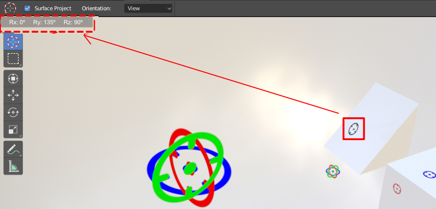
This is a cool concept. I do want to point out that you CAN have the cursor align to the surface while snapping to it. This can be enabled in the tool settings. I do like your idea of projecting a 2d version of the cursor onto the surface like you show.
I have to say there is a certain nostalgia to the current cursor design, that I don’t want to go away. It’s also very useful that the existing cursor has the cross hairs and the point in the center.
I agree with you about the current cursor design. But, In 2.8 we have the pan, rotate and zoom with visual icons (Top Right Corner) on the 3D View. So, I’m proposing this cursor with some visual design. And this would be easy for the beginners to understand the usage of the 3D cursor and for advanced users, This will save time with a fast and precise workflow. Whether the users use a Graphic tablet or mouse or touch display, this would be really helpful for accuracy and fast workflow.
Yeah, while I know collections are better in almost every way, I really miss the pure simplicity if the viewport layers. Where I really miss them is in configuring render layers. Right now, without the dynamic overrides, it’s very difficult. important settings are hidden in menus which obscures checking the status of a layer. Also, I* really feel renaming them “View layers” was very un-intuitive.
A while ago I saw a design for a panel that would handle render layers and dynamic overrides but I haven’t seen any actual development on this yet. That worries me because we are fast approaching the deadline.
I know I sound negative. I’m sorry for that. I really do love the concept of collections and feature-wise, it looks really good on paper. But I think implementation is not really there yet. obviously, we are still in the early stages. I expect they will come up with better ways to work with collections eventually.
And yeah, I would expect you could easily bring back the buttons with an addon.
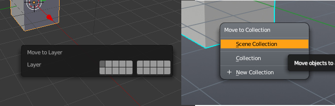
I actually don’t mind this to much to be honest. I do like the old way but I kind of like the new way it works now too. It works much better than adding and managing collections from the Outliner because it’s so simplified. We need more of this.
One thing though, when you pick “New Collection” a tiny dialog pops up and prompts you for a name. You type it in and hit enter. Nothing happens. It just sits there until you realize you need to click the Ok button. See? This is clearly not done yet.
But yeah, it’s pretty simple to use once you get used to it. Once you get all your collections created, it’s really easy to just select some object in the view, hit M and select one of those collections. Not really that much different.
it is obvious that the changes were made keeping in mind an evolution …
I just say that on a visual level the layer interface was more immediate, that’s all
the most practical way I used the layers, was to select objects that would break my balls and throw them on another random layer …
this thing I will miss a lot
You know, that’s not a bad feature suggestion: Have blender create a “Junk” layer that’s hidden by default. Then, you can just hit M and drop all those pieces in the Junk layer.
The new shear tool is great. I think I may actually start using shear now instead of avoiding it at all costs. This is great for making miters on frames. If you use a value of 1, you get a 45° miter and with the cursor sitting at the point that you want to keep fixed, you can make sure your two sides match up. I never could get the old taper operator to behave. Keep it up with these new gizmos.
As a side note, I’d like to see gizmos like this in modifiers as well. Any modifier that has an object selector could greatly benefit from having a built in gizmo as well (Mirror, UV Project, and Array come to mind). This way the user wouldn’t have to deal with extra objects in the outliner and wouldn’t have to worry about parenting the empty to the modified object. I always mess up and skip this second step. I’ll move my base object and my projected map disappears because my source object is left behind.
From time to time, I find myself wanting to change my default “Orbit Style” in the viewport from Turntable rotation to Trackball, but avoid doing so because that means I have to Open up Preferences -> Go to “Input” -> Click “Trackball”, and go through a few clicks to reverse the process.
Maybe we can have a viewport gizmo icon to toggle Trackball/Turntable? I mean, we even have a button there for Orthographic/Perspective, which already requires just one hotkey anyways. A button for Trackball/Turntable would be much more useful.
And/or we also need a hotkey toggle to quickly switch the orbit styles.
hi, is it possible to only add the new feature to blender2.79 except from the new interface. i sincerely don’t like blender2.8 interface. i downloaded it yesterday and deleted it back. i suggest you have two blender downloads one for the new interface and the other for the old interface… and keep updating the both. Please!!! seeing blender2.8 interface made me realise how much i love the way it was. thank you
I think if you worked with it for more than one day, you’d probably change your mind. I seriously doubt you’ll be able to convince a Blender Foundation dev to put in the amount of time required to maintain two interfaces. That’s a tremendous amount of work that would be better utilized moving blender forward instead of back.