Ideally you could be able to see all at once: https://blender.community/c/rightclickselect/nPbbbc/

3 Likes
this new wireframe from recent blender 2.8 build! thank to developer
in my opinion set default xray:0 is much better , i like blender2.79 wireframe
2 Likes
About Pie menus and fast moving selection feature.
I know that many users love Pie Menus. But for those of us who do not feel comfortable using them, could in user preferences be added an option to disable these “fast move” selection feature?
With that feature I make mistakes all the time. I know that with current configurations of Pie menus there are workarounds to achieve it, but they are only workarounds and not the real solution that should be an option to completely disable that feature.
The ideal solution for me would be to be able to completely disable Pie Menu and obtain in its replacement common floating window with options where Pie Menu is being implemented. But if we are going to be forced to use Pie Menu, at least implement what I am requesting.
Thanks.
1 Like
@YAFU I don’t currently like them either for the reason I describe here: https://blender.community/c/rightclickselect/bdcbbc/suggestion-or-request-about-the-pie-menus but if they change that behavior it would be less annoying to use them. Greetings
Yeah that is weird looking isn’t it something about that menu is just really really hammering on eye and makes you feel confused.


 I have 5 minutes before i dive into work today
Why are we not updating the ability to Click and drag stacking order?
Is this a design thing that is way more superior than then click and drag and i am not seeing it? I’m a big fan of UI ergonomics.
Here a link to some code in C++ for click and dragging.
Seriously this is a mystery to me? I mean keep the current system if you want it but please please please just add a little thumb grabber icon next to all those little arrows so we can click and drag because you know its right there.
You could start with the
- Grease pencil layers
- Modifiers
Let curiosity prevail and push us forward
ad 
2 Likes
Main reason is, Blender’s UI toolkit and code doesn’t make this kind of thing easy. But absolutely, I agree we should have this. Most definitely.
2 Likes
last build blender 2.8 wireframe is better.
have problem when box have many segment.not all wires show
i think its will be better if overlay wireframe set to 1
7 Likes
Definitely! Hiding “some” wires by default is really confusing! I guess its still default because of 2.79 had it too.
99% of all times i want to see my wires, i want to see ALL my wires. Thats the point, no?
7 Likes
Same for me, I don’t understand why they do that 
Other apps have three types shading:
- wireframes
- wireframe + solid
- solid
Can we hope for the appearance of this?
Wireframe + solid it is so useful for modeling (when you can fast on/off it).
sorry for my english
3 Likes
How can I disable all the pie menus with a few clicks?
3 Likes
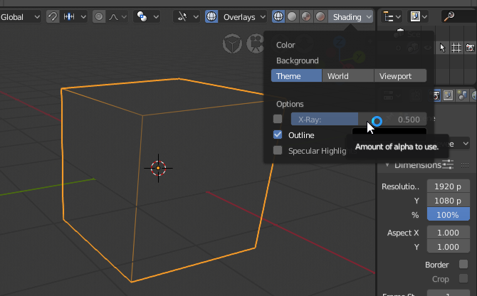
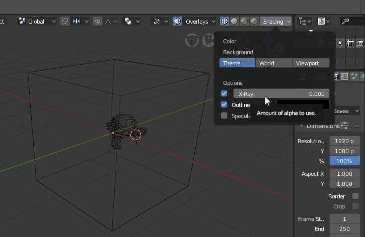
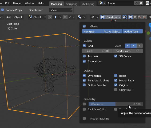
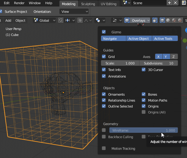
Question: Has the “Wireframe” slider for the Overlay been changed to controlling the opacity of the wireframes? Or if it hasn’t, has an ability to easily change the wireframe opacity been added?
Previous demonstrations showed it doing some other behavior not expected by changing the slider. At the very least, I think this is a basic feature that should be added if not planned.
Just FYI, Blender 2.79 also did this. If you subdivide a cube in 2.7x and go to Object Mode, you don’t see all the subdivisions unless you enable All Edges. This is to make more readable shapes. 2.8 just does it in a more flexible and consistent way.
Yes but no, modelers want to see all the wire.
You can look at the reactions, everybody dislike this.
You added something that will not be really used as default instead something that will be used every time every day.
For example, a beginer will activate the wire, he will see this ugly thing, he will not understand why the wire is like that.
He will post on every forum and people will have to tell him, same for other beginners, again and again and again.
So, even if for you this is nice, for a majority of users, this is bad.
A better solution would have to use the opacity of the wire and keep draw all edge as an option.
2 Likes
I didn’t say if it’s nice or not. The point is, this was also there in 2.7x, only that it is more consistent now.
We could change the default value or this slider so something else, but that’s a slightly different matter.
Nope sorry, this is really important.
If you want to make the view more consistent and readable, use it for unselected objects, not for the selected object.
On those ones, viewing the entire wire is important.
Having something cool is bad if we can’t see our wire and check for errors.
Default settings are really important, having to edit them when starting to learn a software is bad.
Honestly, I still have too many options to edit after testing each new release.
For example, the rotate around selection, avoid beginners to turn the view and don’t see the selection.
Why did you choose to not use it as default?
Same for the move to mouse position, that helps beginners too.
2 Likes
You misunderstand what I’m saying. I didn’t say it wasn’t important.
What I said was, this was how 2.7x worked too. The only change that happened in 2.8 is that the feature is less glitchy than before, and offers a slider to make all wires visible. That was not possible before - it would always do this unless you enabled ‘Display All Edges’ for each object.
So technically, 2.8 already shows more wires than in 2.7x.
However, as I said, defaults can be tweaked. But also be aware that there are disadvantages to showing all wires at 100% all the time. A subdivided cube, for example, can be more readable without seeing all the subdivisions in Object Mode, so this is a nice feature to have.
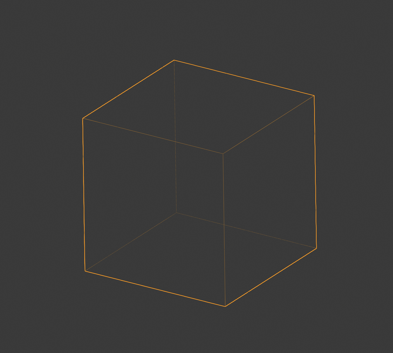
0.5 works mostly like 2.7x, and is the current default:
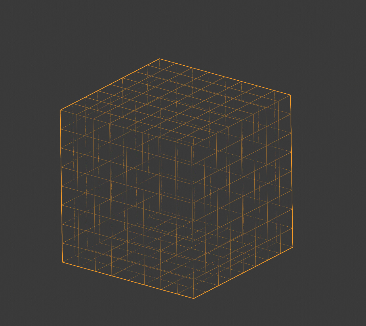
1.0 shows all wires the same
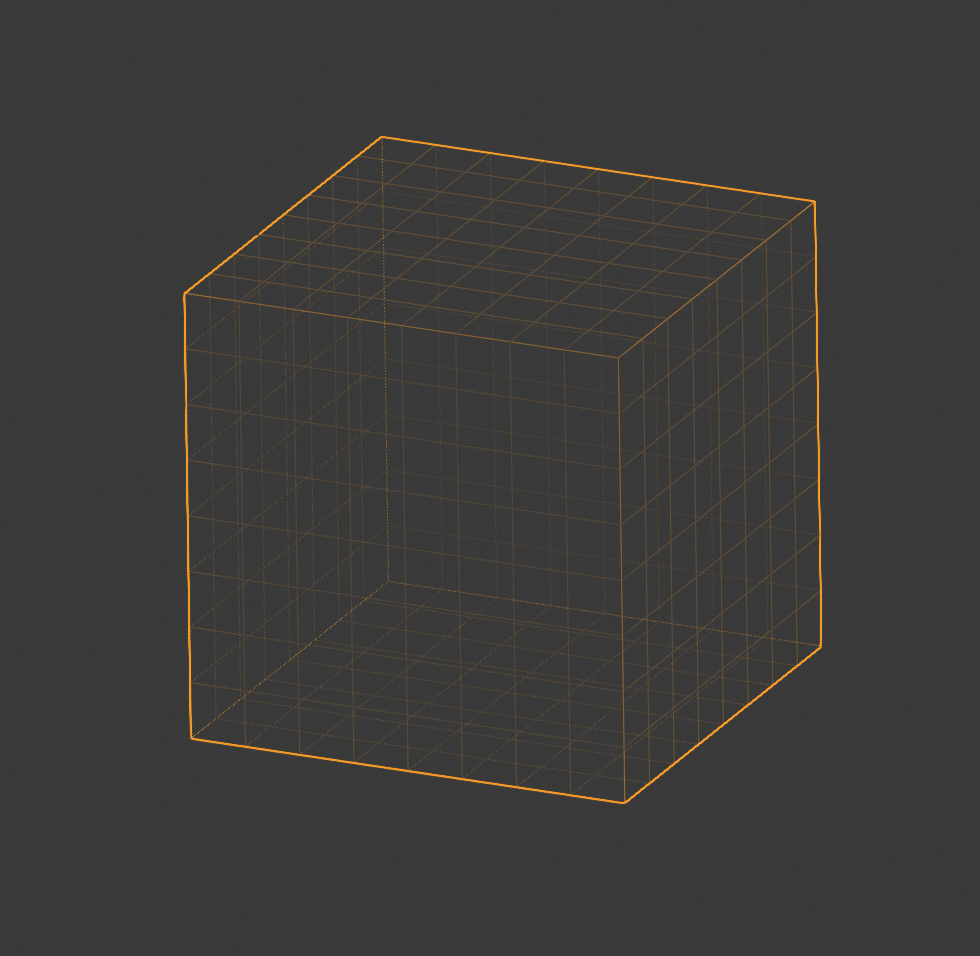
0.85: You see all the wires, but the planar faces are subdued:
As for ‘why is rotate around selection’ not default?
Well, maybe it should be. But I think you’d find that a lot of users would disagree with that too. It’s very disruptive that the camera changes focus every time you select a different object.
In most 3D apps, this is not the default behaviour. You usually have to press F (or another key) to focus the camera on your selection.
1 Like