The text hinting give really bad result on 4K screen, pablo said it was good, but nope sorry, it’s bad.
There are two more platforms other than Windows. Font looks different depending on the platform, which is another reason to disable hinting by default.
What about instead creating special menu for properties editor, maybe better make horizontal headers for all types of editors? For example how it cam looks like with outliner:
Now we have option to make header on top and bottom, in my suggestion you can set it on all 4 sides: top, bottom, left and right. Some text hints will be hidden and replaced with icons
My question is still without answer. It’s still on air. Is at least one developer who work with interface read this thread called " User Feedback - Blender 2.8 user interface design "? No need to hide. I just want to ask few short question & get few clear answers … It is not deadly.
Excellent. Hope I don’t take lot of your time.
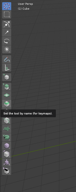
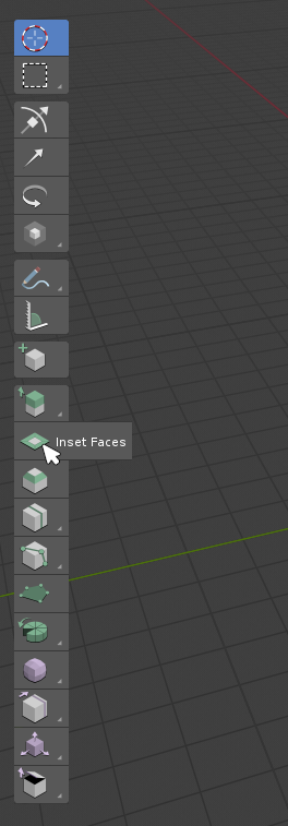
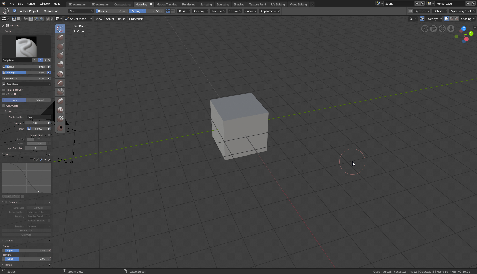
First - I like most of new things in 2.8. But this one completely killing " Tool Shelf " area and replacing by just buttons is still something i don’t see any really reasonable reasons why it was done so radically.
So - few pre descriptions & questions. No need to waste time for very long expanded answers. Short & clear.
Here I already write long description of my own user experience using current Tool shelf & new Top Bar + Buttons/Settings in Properties window. But here is again short " " good in Tool Shelf " - one hotkey quick access to lot of things inside enough big area to show all at one time settings/addon stuff, can be transparent part of 3D window. Especially it is meter when we talk about users who mostly like to work with fullscreened 3D window like me. When I don’t want to hold any " extra " stuff on main screen workspace, maximum 3D, but still want to have quick & efficient access to area with lot of hings I use at work. Tool Shelf right now - good in this case. Top Bar/separate Property window - not enough/same good.
Don’t your in UI team understand all this? If not - why? If your have understanding of all what I talk about - why after so long time discussion & propositions there are still no any compromise solution?
If we talk about solution - as far as I remember there few propositions how to deal with this case. My one to. Key tone of most - we do not ask to remove new Top Bar & Buttons but let us who want it turn ON as an option standard Tool Shelf.
Is all this propositions was so absolutely 100% useless bullshit and not worth for attention? What a point to not let users to choose - compact configuration Top Bar + Buttons/extended configuration Tool Shelf?
If there are some concept to merge inside Properties lot of stuff - maybe best solution for such " Fullscreeners " as me is to let users to use Properties as part of 3D window. Same form as 2.79 tool shelf but even more & better. Such essence of quick access to all u need & fresh transparent design.
What about this one? Made it while write this post.
Probably everyone is tired of my posts about Tool Shelf & 2.8. I apologize for the excessive persistence. I just want to end this discussion for myself. Maybe for someone else. Thank you for answering me.
Here are the reasons and the new design for the tool system (including the tools panel): https://developer.blender.org/T55386
(That’s the official issue tracker. Feedback, feature requests and discussion should still stay on devtalk.)
It seems that in the proposal directions changed for the top bar and the options are now avaiable in multiple places like the custom properties panel.
In my experience this is indicating some design issues and i think instead of putting the options in multiple places we should take a step back and think about the tob bar concept again. So there is definitely some brainstorming needed how to entangle this situation.
Having the same options in different places is really not a good thing.
Maybe its not the worst to have it in the properties panel and remove the top bar?
But also that is concept wise detached from the working viewport, should this be a goal of the new concept?
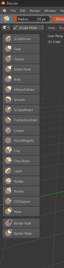
The new active tool icons look great. Also, I rigged a character tonight and really liked how much faster the armature creation workflow was with the new extrude active tool. Good stuff.
I really think the top bar needs to be fleshed out more. I think you guys are focusing too much on what can be set before a tool is used. It seems to me the top bar would be much more usable if you also have some of the functionality of the f6 menu. This is what most people would expect to happen in the top bar. Especially users of photo editing and graphic design software. It is just a little strange having a separation of pre operation, post operation settings in two different places in the interface. Most people using software don’t see the separation in these steps as you guys do. They want all of the parameters of the tool in one place. Imagine that the bevel tool exposed not only the settings it has now in the top bar (Amount Type, Segments, Profile, Vertex Only) but also had a select few of the settings in the f6 menu (Amount, Clamp, Loop Slide, etc.). Before you left click to start the active tool operation, everything but what that drag motion controls (amount) is used to determine the result you get from using the tool (click and drag with the left mouse button). Upon release, the top bar reflects all of the settings just used and also the amount value is populated based on the drag you just did. The expectation for people who are used to these types of tools from other software would expect that any time a new selection is made and the Amount value is adjusted in the top bar, that a new bevel is created on those selected edges instead of adjusting the bevel on the previous selection.
I realize that this looks a lot like a proposal and this is not the forum for that type of talk, but I’m just using this to illuminate the issues with the current design of the top bar.
I fully understand why the top bar functions the way that it does, but if you guys really think about the way the top bar will be used, you would have to see that the settings that are there now will be rarely adjusted since they can be adjusted after the fact. I know what I’m mentioning here will take a lot of programming because it will require each control in the top bar to serve two purposes - the pre and post settings adjustments. That requires a good bit of hands on coding time with each of the settings for each of the tools. I just feel like its a worthy journey though. The top bar as it is, with only settings for your next left click and drag, won’t be used much, if at all. It may even confuse users.
The work that you guys are doing is really amazing and I truly look forward to the future of Blender 2.8x.
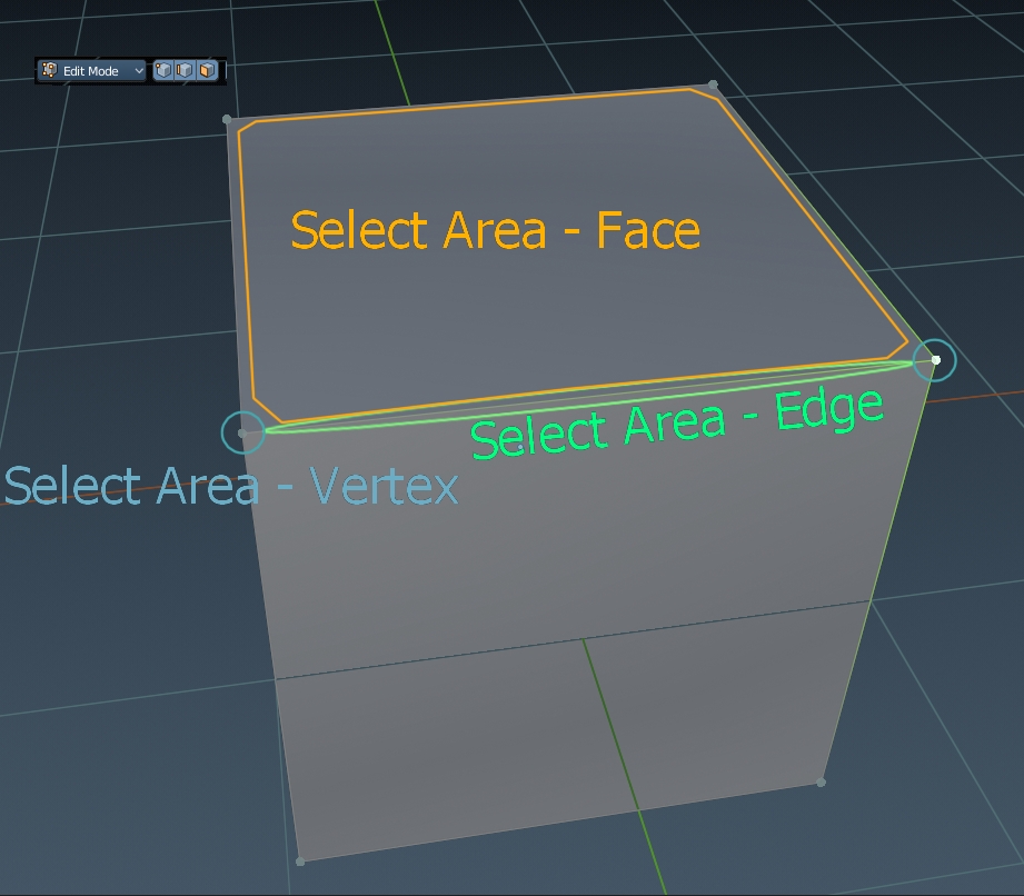
Don’t know if its still in development or not but with editing vertex+edge+face altogether at the same time is hard to select element you want. Selection area for each element is just too small.
Is there a thread for ongoing Blender Grease Pencil UI design? I think the workflow ins’t quite right yet and have some suggestions, but don’t want to repeat ideas that have already been brought up.