I also added to the suggestion that Blender should also unify NLA + Timeline/Dopesheet, so that we could have something more of an “Animation Layers” style of editing. Where I can, for example create a walk cycle, then create a secondary hand motion action separately and add both actions together and see both actions on the same space that I can also move the keyframes around (which is timeline/dopesheet).
Nowadays to add two actions together we MUST use NLA, which not only is a separate inconvenient space, we cannot edit keyframe positions on the NLA editor, so we have to go back and forth between two editors.
Also when you want for example to export these two interconected actions (walk+hands cycles) to a game engine, Unity for instance, the FBX export doesn’t support the NLA workflow, so I’m FORCED to bake a separate action, which is a destructive workflow, since after baking I lose the ability to edit them separately on the baked action. Forcing me to edit on the separate actions then RE-baking again, then Re-exporting, etc.
I believe Maya and other softwares have a proper supported Animation Layers workflow, where I can add multiple layers of actions on top of each other on the same editor and edit them and export them without baking.
I agree that being able to use a wireframe as a overlay can be usful but for most situations its not very practical hopefully the devs add a sperate wireframe mode along with the overlay option
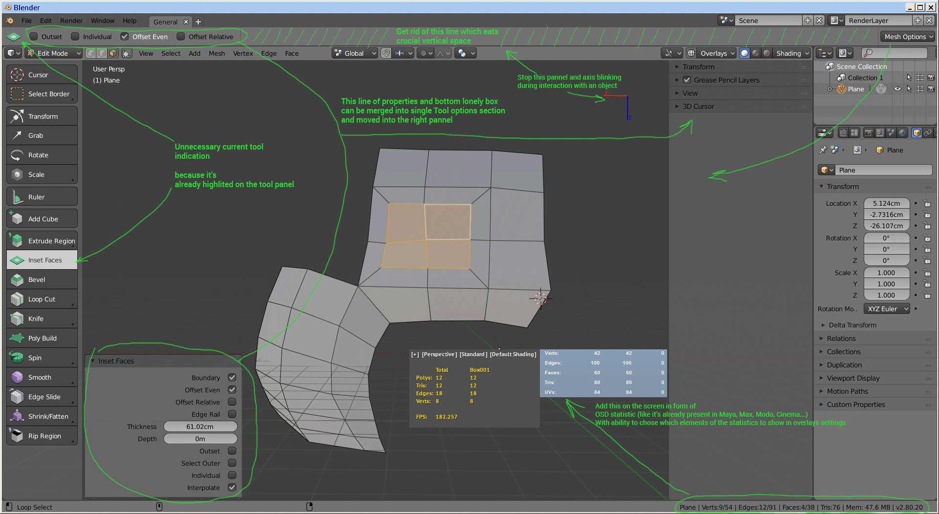
I wish it was possible to get rid of that nasty white info bar, it’s so annoying to tweak the model with constantly blinking lines on top and bottom of the screen. Here how it looks:
it makes my eyes bleed.
I wonder why not to make this info in form of an onscreen Hud
Some example how it can be arranged and shown on the screen:
" The answer is silence " status alert!! You not the first who don’t like NEW interface and try to propose something more usable. But no one care!!! AHAHAHA…
ONLY ONE PICTURE for newpeasants !!! AHAHAHA… Who came up with this stupid rule
Cool, I don’t have the T-shelf. It was an ancient design and the new Toolbar is much more straight forward. The only thing I misses from it is the smooth/flat Shading operator and this is now in the w context menu which is also a good place for it.
I aggree that LMB is more comfortable to use but also I don’t get why so many people are so obsessed with it. The main Problem in 2.7 was, that a useless Operator (moving the 3D Corsor) was bound to the most important Button. This has now changed with the new Tool System. Adapting to right click select takes like 2 minutes. Not that big of a deal really imo.
I mean you can basically reproduce Wireframe mode - but I also miss the fast access of it via Z. There is still the oportunity to make this easier for the devs. The technique is there.
I honestly think that one reason there is so much complaining in forums about the UI changes, is that the users that are happy with something usually don’t voice their opinion about it as often as users frustrated with it. Silent majority.
I can just say I don’t like every change but it’s still a heavy improvement to 2.79 imo.
Using blender2.8 today and not feeling that you are missing half a program is quite difficult. Taking into account that blender has lost hundreds of T-shelf tools because all the addons have disappeared. If you don’t need looptools, selections plugins, normal tools, bsurfaces,… maybe you didn’t use them before either.
Addons have now way better possibilities to integrate with the interface. They can define their own Tools for the Toolbar, they can still use the N-Menu and they can even define their own Editor types now - which is a huge step forward and improvement for Addons that need an advanced UI. So I wouldn’t be too worried about Addons. Of course the Addons have to be upgraded to fit in with the 2.8 GUI and new Python API, but that’s the price of progress.
It’s not the point of the message. The thing is that he didn’t notice the lack of t-shelf because he didn’t use the tools. And it’s selfish to tell that a change is good when you don’t use that tools.
I do use this tools. But ALL Addons are gone atm and this is not related to the UI. They will come back when 2.8 is finished (or the ones that are officially boundled with Blender even before).
The T shelf was a disorganized mess. I’m glad it’s getting an overhaul. Everyone is noticing that those tools are no longer in the t shelf. You aren’t the only person. Up until very recently, you could still get the old t shelf (minus the Tools tab) back just by enabling the addons. My guess is that this probably will come back when the python api is complete.
Please stop hurling stones at people who have a different opinion to you. People with different opinions aren’t necessarily stupid or nonobservant. Sometimes, they just have a different opinion.
Yes, I used tools in the t shelf - looptools, np station and Archipack tools were the most often used - but do I miss that unorganized mess? No. So read this carefully: cool, I don’t have the t-shelf.
Don’t use such arguments in such discussion because the same goes for you.
" Please stop hurling stones at people who have a different opinion to you. People with different opinions aren’t necessarily stupid or nonobservant. Sometimes, they just have a different opinion. "
But no one give no option to choose. There no checkbox in preferences if I as user want to see Tool Shelf on T not this button I don’t need on T. No checkbox in preferences if I as user find not the same comfortable & fast to access & work with tools settings in this Top Bar as before in Tool Shelf organized area. Cool transparent, scalable, comfortable to call on T, quick to access & use at work area just wasted to bring some bells & whistles I don’ need. I feel uncomfortable to use it all because i know how it was before & I know what i feel before when use it for a lot - I feel it better. So what’s now?
Most annoying thing that 2.8 feels for me like 99 % of cool new stuff & 1 % of shit with this buttons & Top Bar …
It all just like here it is - now love it all as it is because it was the one & only option. All who have different vision & feelings - go f* your self… It’s not democratic.
I think Blender needs to have some kind of launcher with voluntary option to send usability statistic. The one & only right way to rework/remove something without endless discussions - have clear usage statistic for each interested feature what gives understanding what to do. Based on such statistic prepare change list concept. Used same launcher to distribute this concept list as questionnaire for voting to all users. Active community part choose what they want & what they not. Give back another statistic to guide Blender evolution. Most of users don’ have time or possibility to spend hours to read forums & write posts. But it’s not hard to spend some 10 - 15 minutes to read something already collected and prepared and just give vote.
To choose way for moving forward somewhere on forum where sit 20 - 30 active users - not representative. Launcher, usage statistic, change list concept, questionnaire for voting - what we need IMHO …
T panel was sure a mess, however it overhaul is garbage and that is popular opinion along CIS communities where there is not a single day without someone trashing it.
The T-Shelf had some problems, but there were literally hundreds of proposals to improve the layout, hundreds, with thousands of people supporting them all. And yet, in terms of arguments and reasons, the new T-shelf has been destroyed, even by its own actions… Because the creation of the new toolbar on the space key is the realization that the new T-shelf is worth absolutely nothing and you have to put in a new toolbar for people to use the activetools.
It’s surprising that after undoing so many changes in the UX some people still think that “if the users complain it’s because we’re doing well”.
I really didn’t want to take part on this discussion, 'cause it is months that this is getting nowhere.
I’m part of the ones that do not miss the old T-panel, apart from the brush settings in paint modes (I made a proposal for that myself somewhere up in the thread).
Now, instead of just saying that you want the previous T-panel back, can you explain why is it so?
Which panels, which operators do you always use from there, and why in your opinion those should remain exposed as in 2.7x instead of being part of a user defined favourites list, as currently planned?
Huge amounts of arguments have been put forward to keep the old T-shelf
Interface
Allows to have all the tools in one place in the program. Favouring the structure of the software and simplifying its use for new users (amateurs and professionals)
Allows the user to have only the tools at a glance without having to write code.
No need to use the rest of the blender interface for tools (now there are many new areas dedicated to what used to be simply T-shelf)
Allows advanced use of the interface and parameters in commands that the new T-shelf does not allow.
It keeps the internal coherence of the whole program between the different areas, as they all have a similar structure. At present, the coherence of the programme is being undermined for no good reason.
Better use of blender interface space and overall visual efficiency
It favours visual cleaning by not having to stack all the tools in the N-Shelf next to the property area.
Learning / First contact
It favours blender learning instead of hiding 90% of its functionality (commands) from users.
Since everything is unified within the T-shelf, it makes it easy for new users to find all the tools, instead of expanding them through the blender interface.
Break the knowledge of previous blender users, also tutorials and tips, so make more difficult learn the program and share experiences.
User Experience
It maintains the current user experience and does not unnecessarily break down a decade of muscle memory.
Discovering and using the tools is much easier than it is in menus where the user must search within submenus.
By not using menus or extending the tools the use of the program with a tablet is much more comfortable.
Make easy to use the program with tablet because you don’t need to move the stylus by all the interface, reducing the arm fatigue.
T-shelf behaviour is the same in big monitors, little monitors,… the new toolbar create a lot of handicaps for users of little and big monitors, specially for the last. Because it was design without a 24’ - 32’ monitors in mind.
Functionalities
It allows to hide all the user tools with a single hotkey, favoring the simplicity of the interface.
Allows the use of tools within a multitude of workflows that are not simply ActiveTools.
Allows you to work in full screen without any loss of functionality.
Marketing and public image
It gives the image of stability that is so much appreciated by companies and professionals, who appreciate the fact that the programme is not changed by occasional whims and empty motives. It gives the impression of insecurity and lack of confidence in the software.
Safeguards the comfort of users, which improves the image of the program.
It does not give a false image of simplicity/toy that frightens the professionals.
The two programs in the industry that have grown the most in recent years have been just programs that had a T-shelf (Blender and Modo). So to say that T-shelf is an impediment to the growth of the amateur and professional user base is not true.
I could tell more but I think these are a good number of examples and arguments in favor of not eliminating T-shelf. The new T-shelf don’t keep a basic rules of Software and UX design.