You have an alternative activating various options but the wireframe mode is removed and it is the final design.
2 Likes
It seems like they are catering the ui for a group a people who will use it once and never touch it again and not the people who use it professionally which is sad because the community has been making suggestions one how to fix the ui for years and now we will have to wait many more years again until they decide to “fix” the ui again. I think 2.8 has many good features but the ui is a major step backwards. 8 want to see blender become a bigger part of the industry but i dont think it will if they continue to ignore the community in favor of people who will never touch the program again
3 Likes
Can we just merge the timeline to the dopesheet, it seems like now its at a weird midpoint, and its just annoying, can we just have one of them with the functionality of both, its almost there already
1 Like
Could you specify, what do you mean? It seems I’ve found wires.
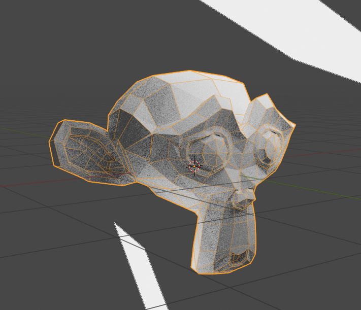
that is not a wireframe mode. You activate the wireframe overlay and make transparent the X-Ray.
2 Likes
I agree completely. I’ve brought up that point many times. I created a proposal on rightclickselect.com for this and brought it up in a live stream. I don’t understand why it was left as is. My thought is that if you reduce the height of the dope sheet, it only shows the selected objects keys. If you have the transport tools in the dope sheet and tweek the shortcut keys a little, then there is no difference in functionality, other than having to set it up manually to show only the selected tracks.
And what’s the difference?
All that needs to be done here is make it easier to select through the transparent faces and turn off antialiasing to make wireframe mode work like before. Am I right? I know that before it could be toggled pretty quickly with one key, so that would probably help, too.
To begin no current user in the industry will be able to find the wireframe without help. Something that was really simple like clicking in the icon…
1 Like
AA, dithering, hotkey, separate mode…
3 Likes
They definitely need to add more setting for wireframe and need to make it a seprate mode with the same level of customization as the other mode like the proposal i made at Wireframe mode mockup and suggestions its quite concerning that it was removed in the first place since it is such a basic feature that every program should have in the first place. Hopefully if it isnt added in 2.8 it will im 2.81
3 Likes
I have no idea what’s the sense of removing the wireframe mode too.
2 Likes
I think that initially taken from the emphasis of modernization with eevee and with the use of opengl 3.2 they thought it would be useful to modernize the methods of interaction and visualization … i remember that he will talk about it in a conference a few years ago … and on paper it seemed like a good idea not to use the wireframe in favor of transparency, but in practice it is proving inconvenient
1 Like
Why were Shift+S hotkey (Walk Navigation) removed?
2 Likes
We don’t want something just because it’s “modern” we want something that works
5 Likes
Turn of objects for render is kind of annoying right now. There is a semitransparant scrollbar covering 2/3 of the camera icon which makes it very difficult to turn objects of. Individually it works ok, but turning of many is a nightmare.
5 Likes
I believe it will be reinserted later in development …
same thing for single object display ("/" on numpad)
1 Like
Hm. I think, that the reason to “remove” wireframe it’s not in the removing, but in moving it from display mode to overlay, to make it appear not only in as single wireframe mode, but also on top of matcap and render mode:
And it’s cool feature to have ability to edit model in render mode. I think, it’s great solution.
But, in addition to this (this cool modes) I think we need to get back wireframe and box modes (nobody needs box mode?) as separate display mode. There is a lot of advantages of this mode, starting from selection issues to geometry checking, and it described below. Now we can make an analog of wireframe mode by tuning around 3-4 properties, but in 2.7 we can do it just by pressing one key. Of course, we can make a shortcut for this like an add-on, but it will be great if it will be in default.
2 Likes
This is one of the reasons I don’t like the new hiding scrollbars and would like to have at least an option in the preferences to turn on the proper classic wide scrollbars that are always visible.
I don’t understand one thing - 2.8 got the new vertical toolbar with the huge buttons that waste a lot of space and at the same time it also got these tiny hiding scrollbars that try to save every pixel of space but at the expense of usability and ergonomics.
1 Like
Hm. Try click on one icon and drag over all icons. It’s very quick, and you can move cursor over the scrollbar. And it also helpful in 2.7x