hey man at the current state of development the top bar is not optional at all.
This is what has made many angry, they have seen the tool shelf vanish and forced to use the top bar and this greatly upsets the workflow of blender at the power user level. I’m glad that the developers have noticed this and are going towards adjusting the regression.
THERE ARE POWER USERS working with 3d software for decades not fan boys.
Power users who heavily use shortcuts according to the original philosophy of blender workflow. This is why the top bar is very inconvenient and needs to be made optional. But because it is optional it is necessary to have the parameters of the sheelf tool accessible again without having the toolbar.
that’s all.
1 Like
at present, when a sphere is created, for example, and more segments are added, it is not possible to see them because the wireframe function is not accessible … while with the 2.79 blender, just press the Z key and you quickly see the wireframe status
1 Like
Facepalm
Yeah, fanboys because we ask only that new areas follow the same rules that all areas followed more than ten years…
i have been following the development and im not sure what to think of the top bar at this point. As i can see it, its not a “tool” top bar but a place to show options/ functionality of tools, which are still in the side tools panel.
It might be that the initial concept discussed this situation, it might also be that the direction needs to be adjusted if it turns our something doesnt work out they way it was planned.
From my perspective it makes more sense to make the top-bar a tool-bar and put the tools in there that are currently on the tool shelf, and then the side panel, the current tool shelf, could be used for the settings and also for the operator settings which are currently in a floating state.
Im probably am missing quite a bit of context with different workspace and layouts when it comes to the overall functionality of such a change but it seems a more logical arrangement for me than the current state.
I also think this would make it optional since the advanced users can access the tools with the keybindings and have the options in the sidebar.
That might of course be different when the concept is fully implemented since i dont know all the details.
1 Like
my problem is not the top bar at all it does not even bother me that it’s the default configuration for new users as long as it’s quickly removable.
the power using regression upsets me.
I evolved into blender following the main philosophy that benefits a fluid workflow: many shortcuts, lots of display space, tools available when needed, high configurability of windows screens, minimal simplest and immediate interface
(it is not really a problem, but with the new icons on the shelf tool instead of the text, even if I have been using for many years the first approaches to recognize the various tools, I had to re-learn position and association with the new icons)
as I wrote above, at present this philosophy is interrupted, I know that the developers have already noticed this and are about to remedy it.
My problem with top bar is that currently it’s complete waste of space outside of sculpt/paint related mods. Which brings question why it’s not part of 3d view port and not merged with settings at top of viewport that are object/edit mod related. Lets face it, if user is sculpting he going to maximize viewport. Zbrush have one viewport, 3d Coat have one viewport. So I don’t see “what if user uses something else than just view port and it doesn’t fit” as viable argument. Further we have T panel as part of viewport and user working in edit mode is most likely going to use more than just single viewport.
2 Likes
If you look at the original designs for the top bar, there were a lot more options there for object and edit modes. I’ve been assuming all this time that those options would be added into the top bar at some point, but expected to see those materialize before now. Basically I’ve expected the top bar to have the same options as the F6 redo popup at all times. So the extrude tool would have Vector XYZ fields, Constrain XYZ toggles, and an Orientation Dropdown. As it is now, the extrude toolbar has no options at all.
I’ve yet to see an example though of things that can’t be done when the tool bar is hidden or any solid examples of why the top bar can’t be hidden.
2 Likes
Good picture… Lot of top bars.
Now stop and take a look. What you see? Most of top bar contain … icons. Lot of small things putted in to long small stripe area. Yes? It seems to be clear to understand - large area for large thing ( settings, addon tabs, etc. ) small area for small things ( compact settings like brush size & hardness, tool icons )? Isn’t it ?
OF COURSE IT ISN’T!!! OF COURSE IT NEED TO DO ALL INSIDE OUT!!! Gigantic buttons instead of extremely efficient tool shelf area, all the setting in to small useless top bar wit all this popups.
How many times for today how many people bring how many arguments that this twist with tool shelf was shitty change?But Code Quest is end. You have what you have. Now live with it…
Of course those who do this understand that it’s all useless mistake - they bring back tool shelf as part of properties. But this is not the same…
2 Likes
Switching between smooth/flat shading became uncomfortable now. I think these options should be returned to T-panel. And ‘Remove doubles’ too.
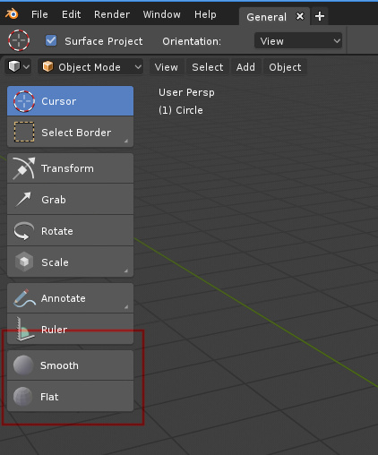
4 Likes
This would conflict with the “Active Tools” Design of the Toolbar. Imo this Operators are quite approachable in the new dynamic context W menu.
And what about hotkeys for smooth/flat shading and remove doubles? It would be appropriate: these options are using often.
1 Like
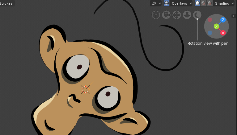
What about rotation view in navigate Gizmo? (analog shift+num 4,shift+num 6) It can be useful in 2D drawing with pen. Many application like Krita and myPaint have this feature.
7 Likes
Smooth and Flat isn’t that worthy to be there on that panel when it missing so much and even more so if new meshes going to be created smooth by default since it’s basically only time anyone uses Smooth shading for. Yet it also should not be hidden.
Sharp marking, UV marking, merge and so on on other hand need somewhere where they quickly accessible. But as mentioned T panel is active tools… which i’m not fan of and probably will never even open that thing for poly modeling, simply uncomfortable to use and missing lots of instruments.
Remove doubles is W R further it isn’t used that often and probably can even be part of merge options.
T that we need and T that we get… and is there even plan on where they going to put all missing settings? Because it looks like they still have no clue what to do with them…
7 Likes
I still don’t understand all this dance with buttons. No one really hard worker users who use Blender for real work don’t need this buttons. It is something like " first thing to hide & never use " for me. Not because it was something bad. Just because we have hotkeys & PIEs for most cases. For all other cases small text buttons work enough good. Click buttons by mouse slow work. It need to move cursor to this button, point it & click.
This super mega extra beautiful colorful buttons with long text description feature for who? For A - extra lazy user ( don’t want to use keyboard at all, kind of " casual " users ) B - newcomers ( just because without any experience ) C - one hand user ( less than 1 % of users ).
For all others it is " after download and install hide & never use because of inefficiency in compare to hotkeys & PIEs " feature… So why so many dancing around like children with colored toys? Just to make Blender a bit more beautiful?
In other side to implement this buttons from me was stolen ( without option to bring it back, without same good analogue ) something I use, I like, I still need & miss it in current 2.8 builds.
Why it was so necessary to " kill " tool settings & addon tabs inside tool shelf area? Is there some one who find it inefficient? Useless? It was really so extremely necessary to transform it in to this " always compact mode " Top Bar? Always needs to do this slow action " move cursor, point it & click to get popup with only one part of setting " Top Bar. Show " just nothing " in Edit mode Top Bar.
I guarantee If someone did a survey among Blender users with questions about tool shelf in 2.79 - results was something like this:
- You think it is something wrong with tool shelf ? 90%+ answers NO
- It necessary to replace current tool shelf with only tool buttons but very beautiful ? 90%+ of course NO
- Etc.
Am I wrong?
5 Likes
Hotkeys are hotkeys, they aren’t removing option in commands being accessible without them. If anything hotkeys should be alternative of buttons/drop down menus not other way around. Simple concept to grasp.
I personally don’t remember every command or don’t like some combinations and it’s more simple for me to click button in panel then reach for far keys for some operations. Further they show that those commands exist to begin with.
There is plenty of things that can be improved in 2.79 T panel as showed above. Icons don’t need to be mega colorful but adding them to text allows panel to be collapsed in just icons like in Photoshop.
1 Like
undoubtedly one of the main indirect features of blender is that so far there has been a sort of incentive to get used to using shortcuts and this indirect teaching has accustomed users well to a fast and effective workflow …
with the new direction I think we are going to slow down and make people lazy
This forum was created because of the criticism that the interface and UX of Blender2.8 were being designed by people who don’t use blender, and to be able to listen here to the users giving feedback. And I think it’s clear that this is the case. All the complaints have been from the new UX, which have been practically unanimous and in the same direction. In the end, what users are happy with about UX is all that has been undone, however sad it may sound. I don’t think I’ve seen anyone say “cool, I don’t have the T-shelf” yet.
I believe that on the one hand, many complaints have been heeded and resolved by simply bringing back the features that had been removed or by reversing the changes in hotkeys, but almost all are minor changes. But on the other hand it seems that the main issues are untouchable and what is sadder, untreatable. Because nothing is ever explained or answered, there is a sepulchral silence and I do not understand why.
The fact is that the program has been mutilated unilaterally and contrary to the opinion of users, disregarding the changes in UX that people have been asking for years. And the worst part is that without reasoned reasons, I still haven’t seen a single argument in favor of the main changes… What is the reason for removing the wireframe mode? Seriously, someone should explain it, what are all the improvements that we are not noticing. The same with the T-Shelf, with the background images,…
And the worst part is, all this is that it hasn’t done much good. The other day I spoke with a friend of the industry. He tried blender2.8 because it had reached his ears that blender was improving the interface and usability… he downloaded it, tried it for 30 seconds, saw that the click to select was still the right one, he sent it to hell and closed it. And he didn’t care about the TopBar, the active tools, the changes in UI… So in the end all these extreme changes in the interface are worthless because the main problem of blender, the right click, is still there and all the rest are patches to try to hide this problem and that has been there for two decades. So they have thrown resources into changing hundreds of things instead of spending 5 minutes changing four hotkeys and putting the left click by default.
8 Likes
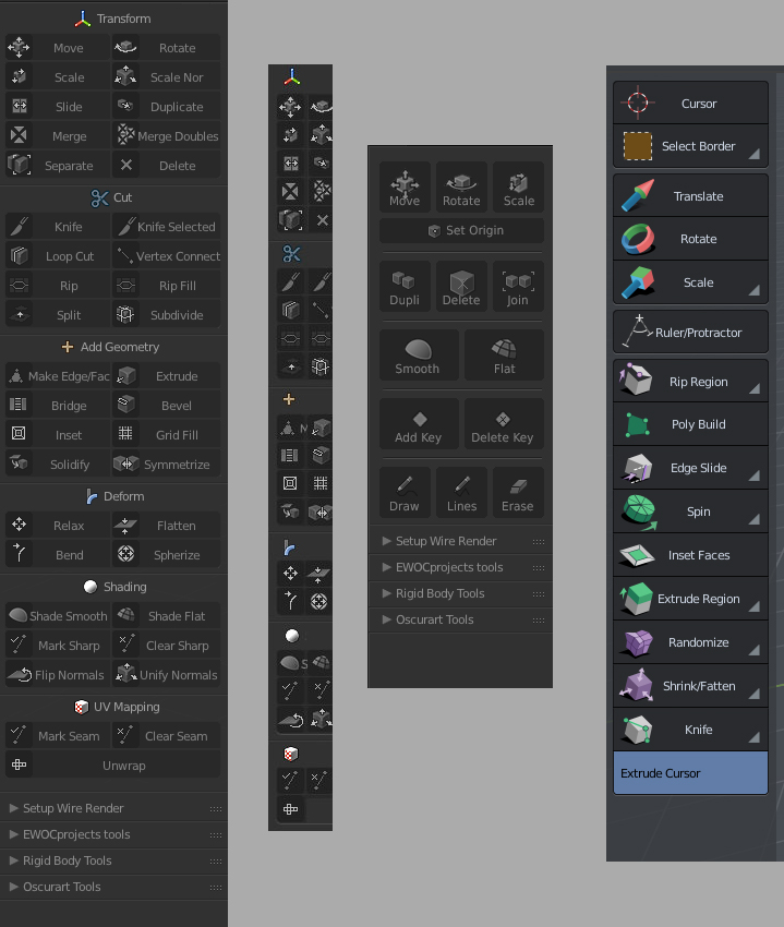
The first panel looks great!
Was it removed? Or just unavailable yet in alpha?