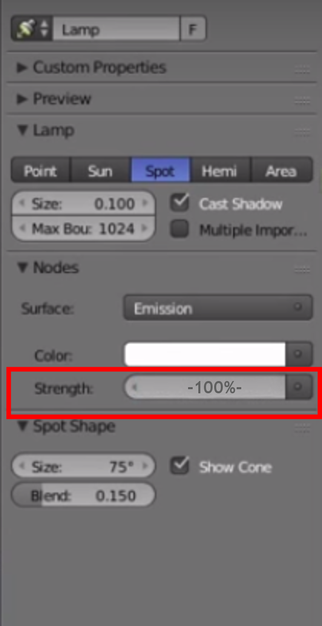
What do you mean? Percentage of what? What would be 100%?
Maybe an additional Exposure Slider would make Light Strength more intuitive to handle.
What do you mean? Percentage of what? What would be 100%?
Maybe an additional Exposure Slider would make Light Strength more intuitive to handle.
IMO the only thing is that the Z button does a different thing in object mode and in edit mode, and it should be unified. But we have to wait for the presets to see what is possible to do with linking the shortcut to the preset.
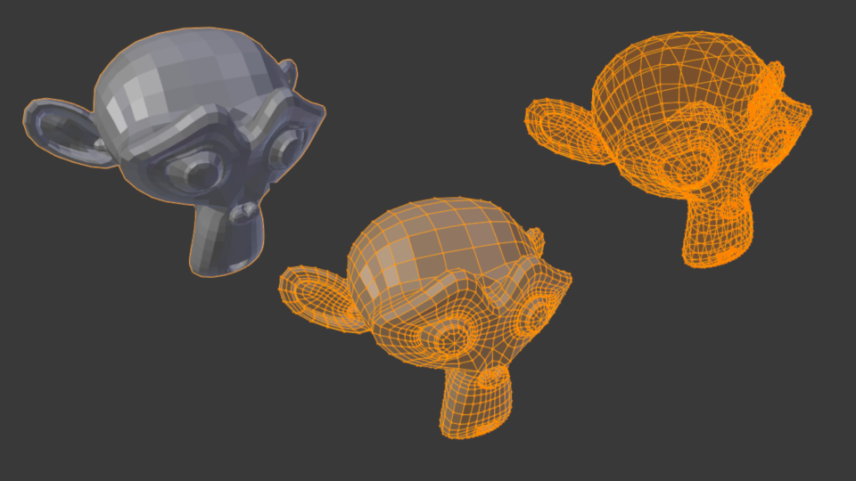
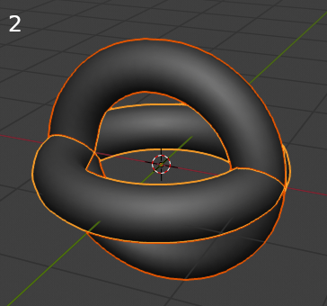
Now I can’t switch quickly between shaded mode with wireframe and wire-only in Edit Mode (Suzanne 2 and 3 in the screenshot above). It is possible with a checkbox in shading options, but it is terribly uncomfortable and slow! Is it temporarily issue or new “feature” of the interface?
Hi,
I’m not sure that it’s the right place to talk about this.
Everything is here, it’s about unit display for physical properties:

just change the numerical value as shown in the second image, for someone who just started, it is difficult to understand what is the value that I must place for an illuminated scene, to have a percentage is more clear what strength value do I have? answer 100% or 200% … before you see what strength value do I have? 1000000 … is not it a bit strange?
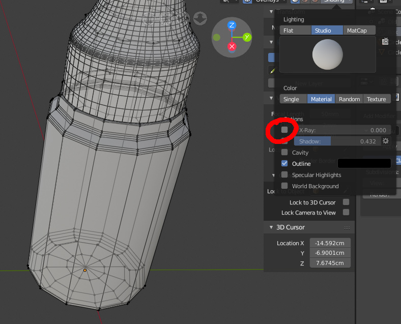
Please do not abuse the effects of transparency, they make the interpretation of the forms very difficult.
Here is an example that shows that when only one element is selected it is more difficult to visualize the shape because of the effect or sensation of transparency that gives in the border line. Plus you seem to lose the feeling of three-dimensionality and your vision gets dirty. Besides, they already have an x-ray mode for that.
I don’t see any consistency because selecting several objects doesn’t do that (image 2).
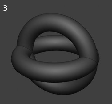
this is the real unadorned way (image 3):
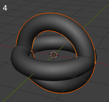
My suggestion is to do something similar to 2.79 (image 4) something like this clearer to see without semitransparency effects in the border line, at least put an option on preferences to make it optional, the truth is that it distracts and annoys me a lot.
Thanks.
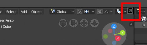
I propose a new icon: this icon would serve to open and close windows. (very useful for ordinary people or new users) open and close windows with a single click on the button, eliminating the click and drag to open and close windows (first difficulty of new users), probably Alberto hated me for proposing this but the objective is that more people can use blender and fulfill their dreams !! do not believe?
XD
I don’t see bad the idea to make visible the controls of the area for user. I proposed a similar idea but inside of area menu (because join, separate and undock are more options and only one button is not enough).
That’s not true, topbar uses a lot of screen, many users have told that, when you work in little monitors is a problem, but also is a problem in big monitor where the topbar separate main tool from user comfort zone.
If you need to code, patch and compile Blender to make what you made all life without any limitation it’s obviusly an error and regression. Blender developers strange excuses to take decisions never have been a good argument, like the carpal tunnel to explain why blender use right click. 
Strength property is already a physical value, it’s in Watt (in Watt/m² on meshes and sun lights), but we don’t know it without the documentation. So the unit display could be useful to know that this value is in Watt.
For the beginners intuition about this Strength property there is maybe something to do with the default value, but I don’t think there is a problem because it is a physical value in the standard unit.
Oh  , so if I get it, it’s having a value in Watt and a second value (a multiplier) in percent a little bit like the % property in the rendering resolution ?
But in Ps when you switch to percentage values for measurements you do it for specific reasons, and you always know that there are physical values behind them and what those values are.
What you’re proposing would be more like using a percentage to define the brush size, keeping the Ps example.
You have hundreds of messages from different people in this forum complaining about the changes, most of them about the topbar that almost nobody liked. I made my videos in English when I originally made them in Spanish because I had dozens of people asking me to make them so that developers would notice the problems Blender2.8 has and the regressions.
If other programs are more limited than blender it is no excuse to limit blender. Also within the major 3D suites, no other program has a fixed topbar. Maya, MODO, houdini, cinema4D, Zbrush,… are 100% configurable in that aspect. Blender is the only one that limits your freedom to use the interface and contrary to the wishes of the users.
I compile weekly several times, even the build I use for production is a branch. That doesn’t mean it’s foolish to argue that something as basic as topbar being a customizable area has to be done by editing Blender code and making a patch. Which I don’t think the developers will think because several already said they were still looking to see if these areas will finally be movable.
In fact current Top Bar is limiting the possibilities of configurations in the Workflow that Blender before 2.8 had. This is practically forcing people to have 3D View up and occupying the length of the screen. If you are used to downloading .blend files from users, you will see that it is very common for them to choose 3D View at bottom. As I explained here:
https://developer.blender.org/T55386
Topbar concept is good, but it should be much more configurable. I just hope that “Top” part of the name is not a limitation for developers to do it much more configurable in terms of position on the screen.
Yeah, its clear that you cannot understand a simple message and try to put a lot of images that nothing have to do with the topic to argue something…
many of those are shelfs organised into tabs to separate tools or tool types or mini blocks of tools icons placed in a bar type space, at the moment nothing similar to the top bar in 2.8 the tabs above in 2.8 have a different purpose, not sure if in the future the top bar its going to be driven more towards those in your pictures.
The closest example to blender 2.8 top bar, as far as i see, would be the 3DCoat one, multy use 3d app that has that, but even there the concept its more developed and complex.
you do not understand that blender has a twenty-year usage philosophy.
all the workflow is focused on this philosophy, the ability to configure the window space disposition as the user best prefers has always been a prerogative.
now, because many other programs have a topbar, then we must all follow the mass and upset the philosophy of use is not a justification, but arrogance from unique thinking that wants to distort and break the philosophy of using blender.
I do not know how much you use blender but to me after 20 years my balls are shaken if the philosophy of use is interrupted. I have preferred blender to programs that were maya or max or softimage xsi for its usage philosophy.
good to know that the developers have noticed the regressions with the topbar and that they are working to fix it
thanks for the link to the planning, I had not seen it.
the new improvement proposals seem interesting
I just want to say there are a lot of angry voices about the completely OPTIONAL top bar. And these people argue that no other software uses it despite overwhelming evidence to the contrary. But as is usually the case, the angry people who voice strong oposition to change are in the minority. Please continue developing the top bar as it was laid out in the original design docs. It will be a great step forward. The angry minority can just stick with 2.79, since that seams to be what they want you guys to develop.