could you elaborate why it makes no sense? what issues do you see with it?
Just see the number of settings that appear in the topbar when in other modes/tools. That would require a large panel which would be pretty much a duplicate of the tool settings in the properties editor. So, pointless.
That would mean we could get rid of duplicated settings as they currently exist which would be a good thing in my opinion.
The thing about the side bar is probably debatable but if its already existing in the properties panel we can also get rid of it completely and users can pull out their own tool properties panel if they like to have one^^
I don’t like the topbar either. If it was up to me I’d change it completely, but it seems like there are some few fans of it
And i’m one of them, me likee the top bar 
Doesn’t this just shuffle around a larger problem with the header, topbar and tools?
2.79, general use map
2.80 general use map
Why you dont like it? this is a great idea!, we could get rid of the tool settings panel and the topbar and throw it all to the T-panel (No duplicates!), the tools themselves are better in the middle, at least they are easier to reach!
1 Like
I’m against everything related to the T and N panels. Those are the worst things in Blender imo.
Oh, and the redo panel in the viewport is about to join that list.
if you dont like the T and N panel, where would you put the tools and settings? there must be a place and I dont think outside the 3dView is a good bet.
2 Likes
The tools should have their own customizable panel/palette so we could put it whatever we want in the interface. And the settings of course they belong in the tool settings.
1 Like
there is flaw in that design what about other modes like edit mode? the list gets bigger and addons can also add tools to the list making visually annoying to work with, we all like the viepwort to be clean, personally i like to use hotkeys to call the tools, or even hide the T panel and call it with it’s shortcut…with this design u can’t and status in the top-bar doesn’t make any sene it’s one of the weird things that blender should avoid as much as possible like many things it already has.
I like the design as it is right now, sorry. Hopefully the panels wont be moved again.
2 Likes
Any updates on how and when this is going to be fixed?
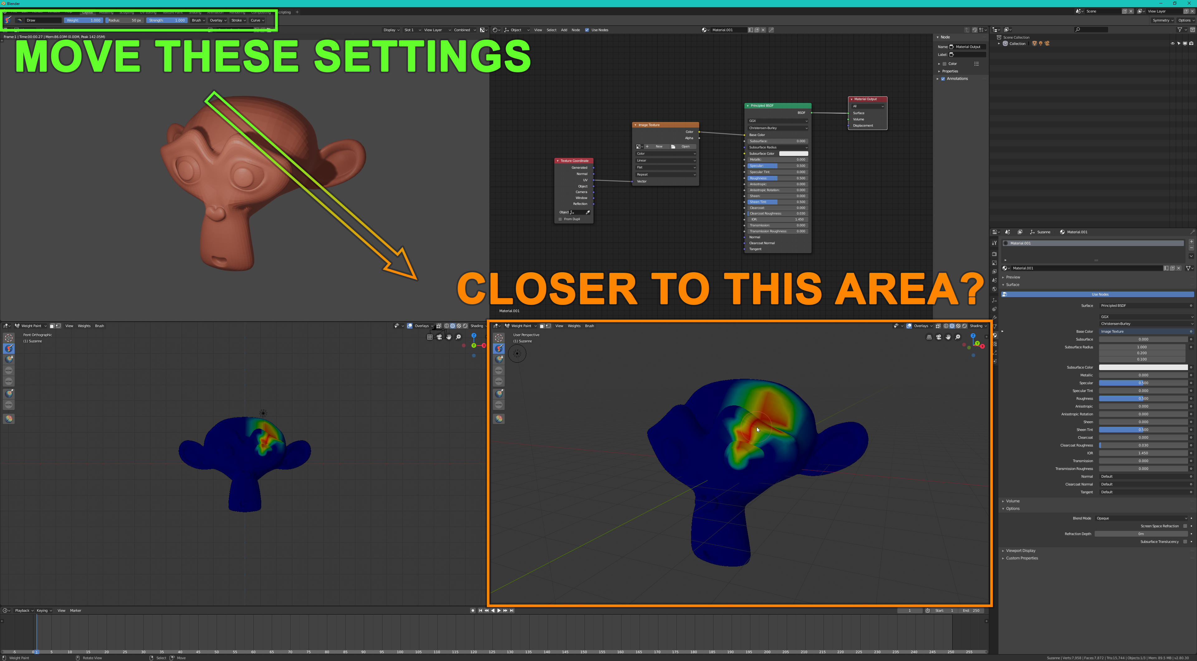
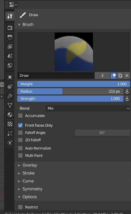
When using a brush, all the brush settings are too far away from my preferred working area.
This is a huge problem for users who like to split their viewport.
Also I think the Add Cube -tool is bugging when you have more than one viewport. (How should I report a bug or check which bugs are known?)
2 Likes
without news about this, although I know many of us have asked for it.
Nor has it been commented if it is possible, if not, if it is not wanted to be done…
Don’t bother with the topbar. The tool settings is right there on the right for it.
are you talking to me? because i am not calling for design changes…u tagged the wrong person i think.
By far what you like is a much worse solution.
No. That’s the best solution. The topbar as it is now is pretty much useless.
Start using the tool settings and forget about the topbar…