Very useful and fast
I’m a games industry dev whose been using blender for years, ever since blender 2.8 decided to make the nav bar icons B&W it takes me a solid 30 seconds to locate what I’m trying to click on. This modernist minimalist trend is absolutely absurd and unprofessional. So far blender 2.8 promises to kill my workflow with its slow shortcuts and training-wheels focus. I don’t need nor want cartoon childish icons to eat away at my focus when working. What I do need is colored icons dedicated to muscle memory and not intrusion. Every icon in the old ui was completly unique and instantly identifyable in peripheral vision. If icons in blender 2.8 take longer than 10ms for professionals to recognize than the ui is a waste of time for speed modelers and asset producers. Also, forcing me to decide only between placing the nav bar icons on the left or right side of the tab, and not the top, takes away from personalizing blender to my own ergonomics.
5 Likes
10 Likes
Hi, so t’s 2018, I see a lot of good and fancy stuff in terms of UI, we have a slick GUI, pie menus, widgets… but there is something I’ve felt missing for a long time in texture paint mode… a color widget popup! we have shortcuts for the brushes, we can easily add shorcuts for symmetry and other options, and well, we can create a color popup with python, but… how about something like this built in by default?:
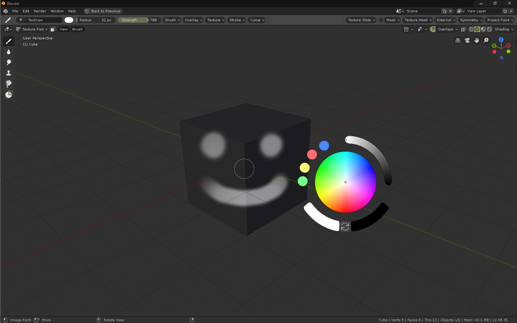
Anyone who paints textures by hand will agree it is a real slow pain in the ass having to move the cursor to one side of the window to choose a color constantly… I think it is about time to give texture paint mode a bit of love in that regard…

P.S.:
Suggestion for the color popup use:
- “C” displays popup (opens with a tap on c, but holding and releasing to close it would be nice, otherwise, RMB/ESC/click outside, same as pie menus I think?)
- Double click on the color circle adds a new color to the palette on the left
- Double click on the palette circles deletes them
- Click and drag from the palette circles to the color circle to change the sampled color.
- It would be nice to also have an optional X icon to close and a Pin icon to hold it on the viewport.
- As well as being able to manipulate position scaling and rotation with GSR keys.
28 Likes
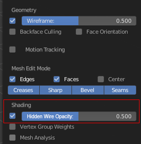
Hi, many things have changed in the user interface. I have a small feedback about the new icons in properties editor:
The small colouring helped differentiate icons, maybe the new icons could have some colour also?
12 Likes
https://devtalk.blender.org/t/adding-an-image-to-themeui/3410
I personally thing it is a matter of building muscle memory, position is always the same, but…
How about adding an option to colorize each tab? Both in the theme settings and with a RMB option on each tab, and just as we can change shortcuts, we could quickly change the color of a particular tab…
Pretty sure that is planned already
That does seem interesting to me, if possible extend that to any UI widget?
Tabs of colors are fine but, if you study visual perception you know that the colors are relative to the context, usually in the software related to the visual arts it is important to avoid the color in the interface, since it can generate a distortion in the general color balance of the composition. Info: https://vimeo.com/26788521
But anyway it would be interesting to try it since it might not influence so much. And maybe you can leave a desaturated rendering tab.
It might be a good idea to show quick favorites on the RMB context menu too.
4 Likes
That’s typically an issue with large blotches of colour or backgrounds, small icons aren’t likely to cause an issue, especially if they’re not over the top of the compositing work. So colouring the tabs might interfere, since they’d be large blocks of colour. But if you coloured the icons it shouldn’t be an issue.
Unless the interface turns into a rainbow of highly saturated icons or blocks of colour, I don’t think there’s anything to worry about.
1 Like
Posted maybe better solution for quick favourites https://blender.community/c/rightclickselect/Gvcbbc/
Long time proposal - Quick Favorites Pie Menu
When it comes to improving the monochromatic icons with colors, I’ve written my proposal here:
1 Like
The consisency is need not only about ordering and icon design.
What I really need is same “clear high-light” Active status about those tiny icons.
I do not know, why proportional editing keep almost same dark or grey color when it active.
It must need to show more clear change when it is “activate”
After set proportional editing, and use for edit mesh, then finish it.
nextime I often forget, proportional edit have been already active.
But current “on and off” high light is not clear. I do not say about each opton design.
But at least please show same blue clear high light when it is “ON”
as same as other icons “transparent” or “Snap” or “Overlays” they are clear. so I can see current activity.
It may just need to change back color of the tool as blue, I believe,
5 Likes
It is because it’s not a toggle when in Edit Mode. This was the case in 2.7x also. It would be nice to turn this into a toggle, and put all the options into a popover.
There’s a task for it here. https://developer.blender.org/T58081
Nobody has coded it yet though. If any developer is interested in tackling this, would be very useful.
3 Likes
Thanks you already piked up these. As for me, even though it offered as drop down
hope to change background or the icon color for enabled 3 options.
I do not know, where those icons are packed, when I build. can we exchange easy?
At current I simply hope, (default, project, connected) icons show blue (background or change color as same as 2.7 style)
Then, “2d prcject” and default work differently, really hope it is clear dstinguished.
And I remember there are user feedback, proportinal edit actually show vertices as colored which will move.
(lookslike vertex weight )
The most complex thing about proportional editting, blender not show us clear, whch vertices may get effect
for transform. when we use each option and change pivot.
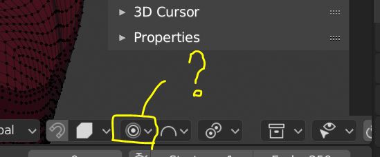
Since the 3D cursor became 3D, and is used for orientations, it should have a more detailed appearance in my opinion.
My preference is to have a grid in the x-y plane and the axes shown. This will allow users to use the cursor like the work plane in other softwares.
1 Like
I would like to have an option to make the grid finite, like blender 2.79. The infinite grid makes the scene look to busy.
6 Likes
Can we do this?
So it will be the second new retopo tool after draw poly 
3 Likes
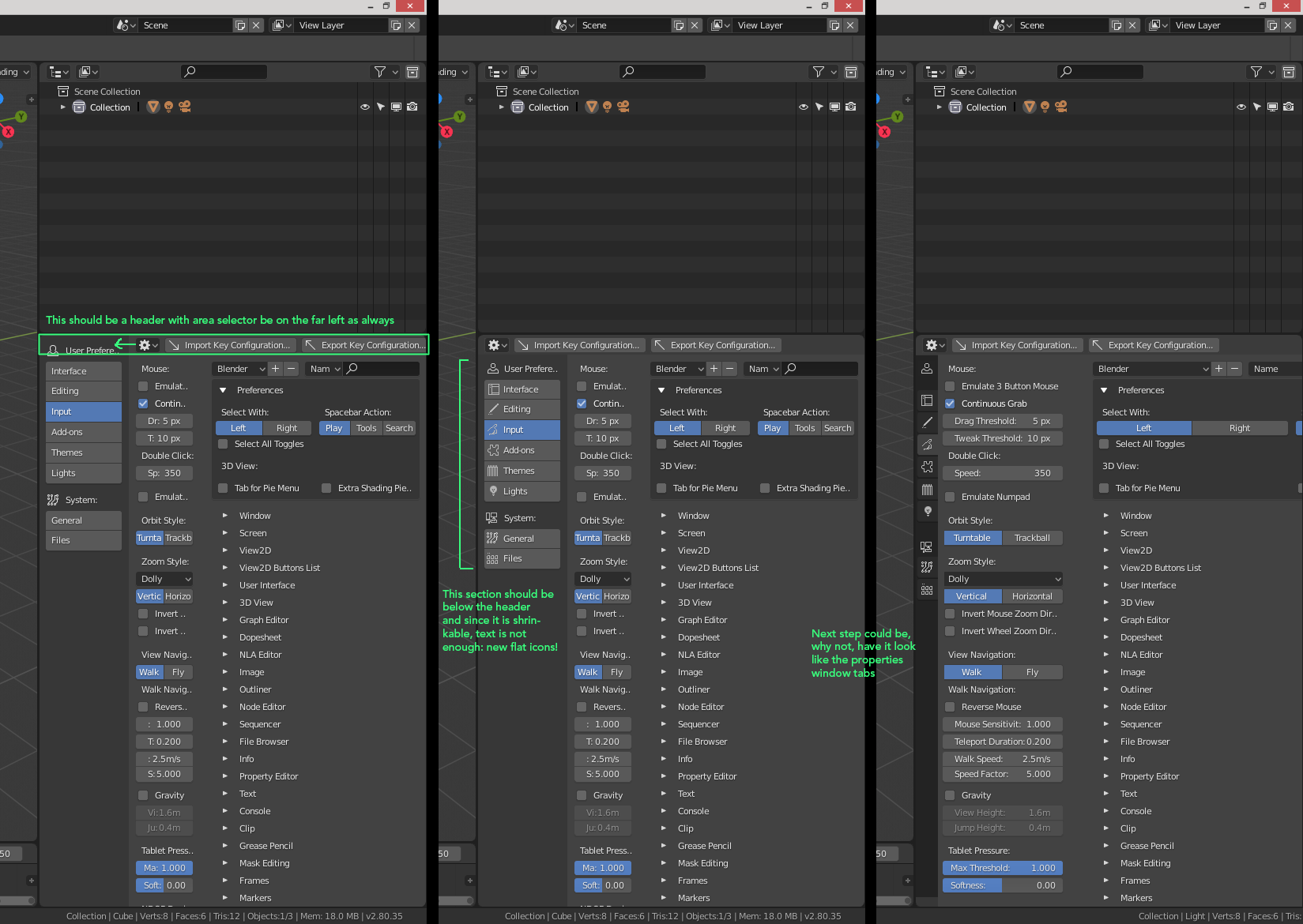
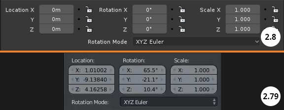
New responsive design is great, but one thing is bugging me every time I see it.
It is reading like Location X, Rotation X, Scale X. Its wasting space and reads wrong.
Lets at least put this titles on top of each column like it was before?
What do you guys think?
22 Likes