Blender Pro did it better, i really wished they made the collections with something similar…maybe someone will do it later on.
HI, just some comment on my first experience with Blender 2.8
I understand the need for UI-change, but I want to share with you my first contact.
Pressing the z-key, gives you option located around the mouse location. The layout is hovered over other UI items when the mouse is located near the border. Difficult to see what is what. Especially when they are formatted around in a circle. There is no physical clue, which are belonging to the mouse.
Menu / option numbers are difficult to remember.
I am used to press the SPACE-bar and start typing (this is muscle memory). But now it is interpreting commands. It confused me, because at first I wasn’t aware of this. Instead of search, other things where happening.
Somehow in edit mode the a-key for select all or deselect all, doesn’t work always. The same for grap zz, xx, yy.
The window corners, to split or merge windows, are hidden. At first I thought the options where gone. But then I discovered they are still there, but smaller and hidden.
Why spending window space on explaining mouse buttons. While these actions are the first things you learn and then these info stays on your screen the whole time, consuming space… So show these hidden buttons instead. Drop mouse button info, there is no real need.
The Ui is not consistent with actions on screen. When I move an object (grab) to an other location. I see a ‘move’ window ( a cancel button would be nice here?)
But the button icons still gave me some hints, like “Left mouse-button: Set 3D cursor”. But that doesn’t work, because I’m in the move mode.
I understand that I need to learn, but these things break my work flow.
also if you change a color on a “material” in grease pencil, when you undo your first line it will change that material back !!!?
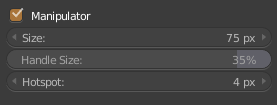
Bring back hotspot for gizmo, please.
1 Like
I’ve tested the issues here.
Apparently there are two ways of “deselecting all” now. One is the known “Alt+A” method. Another that I didn’t know is pressing “A” Twice quickly. Maybe you are having trouble deselecting because you are simply pressing once or waiting too long before both A presses.
The transform XX/YY/ZZ commands, I noticed only work while on the Transform, Translate, Rotate and Scale tools, If you don’t change from Cursor tool to one of the Transform tools, you cannot use them.
I agree that the alternate axis transforms maybe should work on Cursor mode (otherwise why allow regular transforms on that mode?)
Maybe there should be a consideration for some visual distinction for different type of wire-design elements in the 3D viewport? I noticed they could look like a jumbled mess and just not look visually pleasing:

(Source)
There’s a color coding discussion for the icons, maybe color coding these widgets is a solution.
Or perhaps just visually distinguished designs in general utilizing various line thicknesses and fills. Maybe even having some of these elements dynamically changing by z-depth from camera (e.g. having lines be slightly thinner/transparent as they become further away from camera).
5 Likes
Coming from other 3d apps, I see no problem with that, they all look like this. Having them colored would be a mess to me. and dynamic thickness that probably would kill some viewport performance is not a good idea either imo. 
2 Likes
Just because it’s a mess in other programs doesn’t mean it has to be a mess in Blender. I remember never really liking these widgets in Maya either. I’m all for Blender one-upping other programs where it can.
If done right, I don’t think color coding would contribute to the mess. And I really can’t imagine having dynamic attributes to these simple line designs would affect the viewport performance anywhere at all significantly.
If somehow both these approaches are a no-go, slightly modifying the designs with varying thicknesses/fills would be a good idea.
2 Likes
I’m a blender user from the beginning, and I do not think it’s a defect to add an element that facilitates the perception of things, and then ultimately it is not really a big problem since blender is already very customizable and each one changes it as it seems best … or am I wrong?
Having said this I think it should be a golden rule that “the default state” should first of all facilitate those who are more in trouble because of some disease without necessarily falling into lack of elegance
edit: I wanted to answer to @ThinkingPolygons
1 Like
I see that the Proportional Editing in Object Mode can not be edited but it can affect. It can be deactivated after performing the transformation in the properties of the last action, but not before as in Edit Mode. Either I’m wrong, or I think something should be done about it.
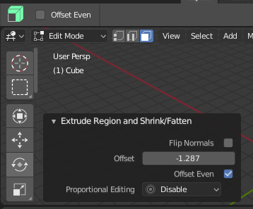
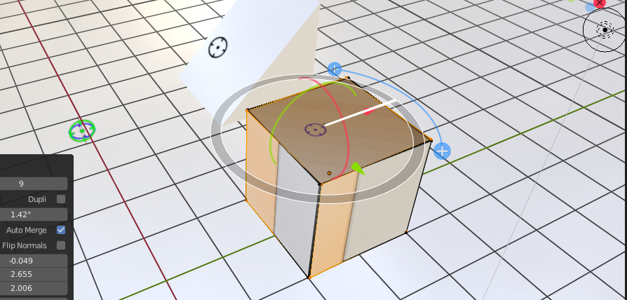
The Extrude Along Normals tool settings are wonky at the moment. The Offset Even tool option seems reversed. When checked the offset is definitely not even. You can see this reflected in the F6 pop-up. Unfortunately the Offset Even toggle in the Pop-up doesn’t work when you click on it, however, if you click on the Flip Normals toggle, the Offset Even toggle also…toggles.
Also, is this supposed to display “Extrude Region and Shrink/Fatten” instead of “Extrude Along Normals?”
1 Like
Blender 3D Cursor Concept:
Here is my idea for Blender’s 3d Cursor.
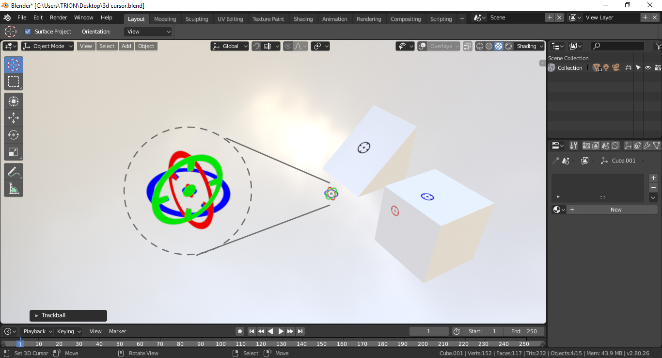
The Idea:
In Blender 2.8 We have a cursor with the 3d look. But if we represent that with three color variations with the directional circles it would be easy for the users to understand in which direction it is pointing.
For example: If we place the cursor on the 3D workspace it has to show 3 directional circles with 3 different colors (right now it shows only black lines, red and white circle).
If we place it on the mesh it has to show the directions like Red for X, Green for Y and Blue for Z with the position and angle values on the top corner or somewhere else. Show one axis when a face is selected and the rest of the axis can be hidden. If we place the 3d cursor in another direction instead of X, Y, Z (like 45° on the mesh) the cursor has to change into black color and placed on the surface.
That’s All!
9 Likes
That’s a solid concept. The RGB axis colors help you connect the item to the axes well. Removing the dotted lines is another benefit.
1 Like
It’s a bug, not a purposeful thing.
Thank You @billrey
Few more pictures of my Blender 3D Cursor Concept:
- Position Values on the Top Corner (or somewhere else) like we have now when moving objects.
1 Like

Yes. This makes the work plane clearer.
1 Like
blender is the most beautiful social engineering experiment I have ever seen.
it hypnotizes me.
1 Like