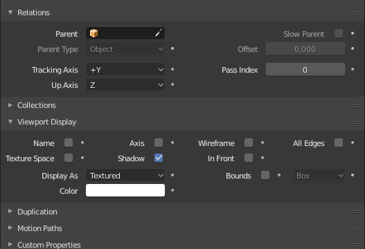
missing Z axis in side views
1 Like
At least, if this info stays in this bar, it could be centered on the middle of editor.
This isn’t a bad idea actually.
Hi.
I feel very comfortable in TopBar if I choose from the user preferences “Interface > Menus > Open on Mouse Over”, both values to the minimum = 1. But I do not feel comfortable with Open on Mouse Over in the rest of the menus. Would it be possible to obtain that configuration so that it only affects TopBar and not the rest of the other menus?
Did you enable the Z-axis in the overlays?
its not the same, i don’t want to display Z axis in perceptive view, only in side orthographic
Several suggestions about move to collection menu (M)
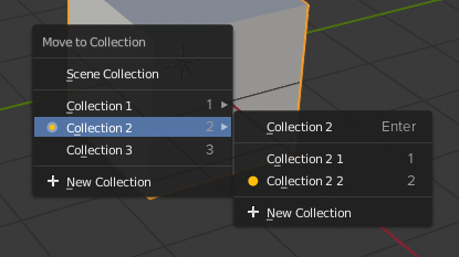
For now when you have Scene Collection at the beginning, digital buttons (0-9) are not corresponds with default names of collections and hotkeys to change layer in object mode. So it will be better if key 1 moves object in the Collection 1 instead master collection.
When in sub-menu, for Sub-Collections same practice. But if you don’t want to move object in sub-collection, press Enter, because you want to confirm moving object into this collection, not in sub-collection.
And about markers, that displays in what collection objects now. Orange circle indicates current collection, Orange circle inside gray indicates a collection within another one.
Also Shift to select several collections (like in 2.7x) are not working now. Is it will be fixed?
6 Likes
Also, it would be much more intuitive if it followed the industry standard of “selections” which is:
Shift + select = select everything from the previous selection til the last selection
Ctrl + select = add to previously selected (nowadays it’s rename, same as double click)
Maybe keep double click to rename which is much more convenient than the standard Select + F2, but one doesn’t exclude the possibility of adding the other.
I’m talking about “Move to collection” menu, so it’s about sending object to 2 or more collections, that now in 2.8 can be possible only in Properties editor.
Oh sorry, I thought you were talking as well about the shift+selecting the collections on the outliner.… which is what my comment is refering to.
Please report a bug for this in the official tracker and poke @fclem about it there.
Please also mention if this happens both in orthographic and perspective view.
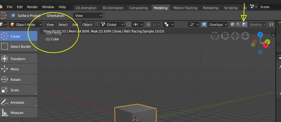
It seems like if we could still give editors a horizontal layout (Right Click > Horizontal) like was available in 2.79 and lower, then the top tool settings bar could almost be completely replaced with a new, wide area at the top (or bottom or anywhere else we want to put it) that is just a Properties editor with the Tool Editor Active. Could it not?
It would take the ability to toggle on and off the row Editor Icons at the top of the Properties editor, and maybe a little tweaking of how elements in the horizontal layout appear. This would make the user able to put the controversial top tool bar anywhere they want and give the devs less code to maintain. Just a thought.
1 Like
It happens in all views.
Is not time to report bugs for 2.8?("…For Blender 2.8, please only report crashes.")
Because i have tons of them, like messed up UVs when entering edit mode(adding one more channel fixing it for a while), seams over sharp edges…
When a developer (brita) asks you to make the report, you can report.
You simply mention that “brita” of this forum recommended you to make the report and assign it to @fclem (Clément Foucault)

Hey Guys,
Quick update from me.
This is how my theme looks now, I customized the UI layout to my preferences and also the colors.
I have 3 important questions to the Blender Development Team.
1 - Can we include the Weight Paint Mask preview along with the Shading caps / it will display any current vertex group selection/? --> If there is an existing one, please tell me where I can find it? Really difficult so far.
2 - Where I can find the interpolation mode properties? --> before that this option was available under the Key tab. Now I can’t find it there?
3 - I found strange behavior when I’m switching between animated objects. The issue is appearing as slow UI rendering, the UI is refreshing only when my mouse is hovering the Dope Sheet Summary properties.
Should I report this as a bug?
Best To all,
Ivaylo
I hope this is the place,
I just got todays 2.8 build and I realized you guys did the “responsive” for the single column layout, which i think could be great, but should be a bit more “predictable and defined”.
I would say that every panel should have the same threshold for it, and go from one column to two columns, and i think 3 and above is overkill.
if you go under object and compare “viewport display” with “relationships” the responsive in relationships stays in 2 colums still sort of easily readable, but the viewport display goes a bit crazy, getting in some areas to 4 columns, and others to 3.
first, i think the properties to go on the second column, should be just the half of the panel, and probably just in the order from top to bottom, so if you have 8 properties that will turn into to columns of 4 and 4, I believe its best to pick the first 4 to go in the first column, and second 4 to go in the second, to keep the logic of readability consistent, up to down, left to right (you dont usually read the first line of a column and jump to the next column, you jump to the above line.)
that`s it…
its a great thing btw, love these efforts to improve the UI.
- Also: will it be possible to view rendered eevee with all the stuff “solid” adds?, cavity, Xray (very important), outline
- How can i assign hotkeys for overlays on and off (i mean general and specific) ?
thank you so much!
2 Likes
Hello! I tested out the 2.8 alpha and wanted to share my thoughts on the new UI. As some background info I use blender daily for every aspect of my 3d projects and this work is my main form of income.
Likes:
I really like the addition of pie menus
Eevee looks promising and I like how the shaders are shared between it and cycles
Some of the buttons were moved to places that make more sense. While annoying to refind them I think it’s better in the long run.
Dislikes:
-
The buttons on the left are huge and take my attention every time I switch from object mode to edit mode since a bunch of large colorful buttons appear and disappear each time. The old style was better in my opinion and had more buttons that were useful.
-
I’m really not a fan of this. Having it appear in the 3d space instead of on the side bar is in the way and jarring.
-
At the top instead of having a drop down menu for layouts it’s been changed to have all the layouts already open and spread across the screen. To make room for this the object/poly counters are now at the button on yet another bar with the blender version always on display and an arguably useless tutorial (right click to select!).
-
Buttons in general have been spaced way out to hug both the left and right side, making it harder to figure out if I need to scroll the bar to see possible hidden buttons. Personally I’d revert this change to hug the left again.
-
A side button was converted into a large bar with an incredible amount of wasted space. Why?
(Not present in picture) Why is the selection border visible even when behind other objects while in solid mode? That’s what wireframe mode is for.
-
The gizmo is basically a ui for what the middle mouse button+numpad already does. Considering it’d only be useful if someone didn’t have a middle mouse button or keyboard I don’t see the point having it enabled by default.
With most of the changes to the UI mentioned I have to wonder who exactly is the target audience for these? Most folks in the indie crowd and professionals who aren’t locked down to Maya already use and recommend Blender. Thank you for your time.
2 Likes
Why seams displays on top any edge data?
It should be like in .79
seam -> sharp -> bevel weight -> crease
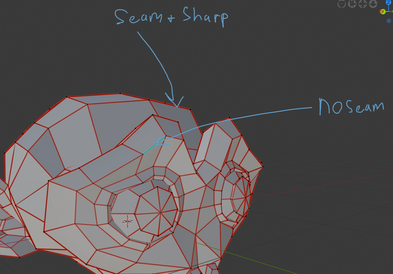
It should be possible to distinguish visually sharp with seam and without.
At least like some custom build do:
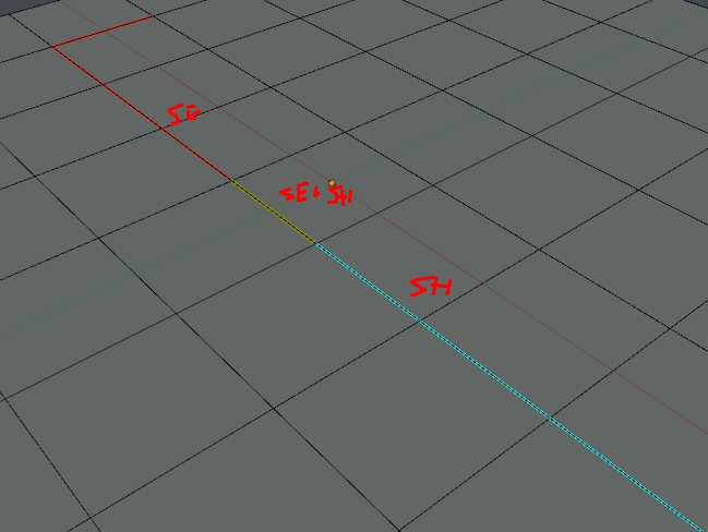
For gamedev it is especially important.
Sharp edge without uv seam on custom textures leads to artefacts.
3 Likes
Ideally you could be able to see all at once: https://blender.community/c/rightclickselect/nPbbbc/

3 Likes