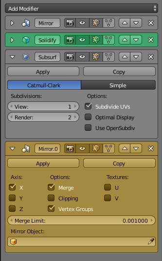
Also, it can be useful to select a modifier’s color (for example, to mark one of the modifiers).
5 Likes
I recommend you follow the Blender Developers YouTube channel. This was covered months ago when the feature was added.
2 Likes
This is indeed legacy from the old system and it’s planned to be removed. However since it doesn’t really bring many benefits besides hiding a button, and there are so many other open topics it is not the highest priority at the moment.
1 Like
+1 vote for T sidebar coming back in a similar capacity as it was to house all the command tools and one click actions. Even without tool properties
I propose for it to be automatically generated from all the menu options of any given mode. Each menu and submenu thus being a panel and subpanel. Add-on developers could still use it. It should be a third different sidebar or area, different from the Active tools one and the N sidebar, or the toolbar should be split in two vertically, one side narrower for the active tool icons and the other wider for the commands.
I once said to Pablo and Dalai on stream that it would be nice to have the commands in the toolbar back as more of a “pro” option, but they replied that the real pro option is to use the keyboard. Self reflecting in the use that I make of it, it is true that I use the toolbar for commands unfrequently. However, I use it a quite more than menus themselves, particularly in weight painting. Not every command has a keyboard shortcut, particularly in the new minimal keymap, but not every command needs a shortcut or quick menu entry either.
It’s good to have more options, so the user can decide depending on the frequency of use for each command. Keyboard > Quick menu > Toolbar > Regular Menus
5 Likes
What about wireframe, texture shadeless modes? (wireframe mode like old one, u hit one button its become wireframe with possibility pick up backfaces)
Now when u go into edit mode with texture on mesh it disappears.
1 Like
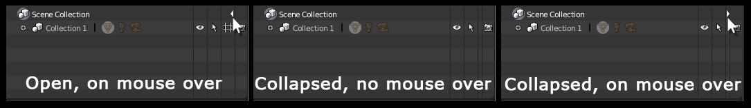
Hey Pablo, just as jonlampel, I was also confused about the purpose of those outliner hashtag icons. But I had watched the video and still forgot, had to rewatch it to remember.
I know it’s a work in progress and you guys are figuring out the icon yet, but don’t forget about the tooltip as well.
These are the tooltips as of my latest version:
eye = Hide Collection in Viewport (Ctrl to isolate)
hashtag = Disable Collection in Viewport
Honestly at least I cannot differentiate the words “Hide” from “Disable”, as the only difference I see on screen is both disappearing from view… Also I may be wrong but I guess not a great portion of users use the Link feature as frequently as the Summer Project people are using them right now (the ones who probably requested this feature).
Therefore I have two suggestions:
1- Option to hide the Hashtag column, with a button on the interface itself or on the User Preferences menu.
Example:
Maybe this option could be present on the other Columns as well.
2- If unhideable on the interface, adjust the Tooltip to indicate that it’s useful only on scenes where the collection is linked.
Example:
hashtag = Disable Collection in Viewport for all Linked scenes
This will be even more confusing to newbies and other people who didn’t go to the video to see what’s the purpose of those hashtag icons… and for people who doesn’t use Link features as frequently, which I’d guess is the majority if one were to made a poll to check it, it’s kind of a wasted space…
1 Like
The hashtag is also useful without linking objects, at least for me.
At first I had also difficulties to understand the difference between hide and disable.
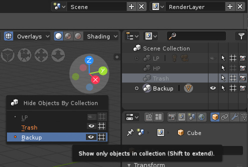
In my workflow I often hide and unhide objects (I’m eagerly waiting for the local view “Numpad /”…). Sometimes I hide different objects in a row. The problem with unhide is that ALL previously hidden collections are then displayed again.
But sometimes I want to hide collections and objects for a long time, because they would only interfere with modeling. For this I use the “hashtag” because these are not shown again with alt-H.
What I also miss from 2.79 is “Toggle All Layers”. I don’t know if this is the correct name, but in 2.79 you can toggle between the current layer selection and all layers with `.
5 Likes
Then maybe add disable/visibility icon on Ctrl+H, Also highlight visible/active collections?
Regarding outliner, could it show order in the stack with a small number? In Blenderartists forum we had proposed this mockup:
Since we have infinite collections in 2.8, one of the advantages of this system would be to be able to quickly identify the numbering of a collection or nested collections, and be able to quickly perform actions with Numpad part of the keyboard. By being able to use a Numpad, we can quickly write combination of numbers for collections and dot “.” for subcollections (Enter key to confirm), and we will not be limited with numbering from 1 to 0 of number keys at the top of the keyboard.
2 Likes
This is indeed a great use that I didn’t think of. 
Very useful. Thanks.
Suggest new type of UI element:
Popover+slider
When just click - opens popover,
When click and drag - changes the main value from popover.
1 Like
so personally I’m not really sold on the new toolbar, I think it does a great job at showing basic tools very clearly for new users and all that, but it hides too much to be a proper toolbar.
for instance, the UV operators don’t even have any real buttons in UI rn, and UVs are not some small thing that can be hidden away in the search menu, it’s too important for that.
that and some other features should really be in the toolbar as beginning users need to be able to find them quickly without having to wonder if it’s even possible to do within the program.
(edit: i see it’s now fixed! UV buttons are now present in edit mode ui, thanksss)
3 Likes
There is a concerning lack of development in terms of properties panel layout. It has been changed to a significantly worse state during code quest, so that it shows a lot less UI controls on the same screen area, and in double column layout, wastes a lot of space, and is visually and aesthetically harder to read, yet even though we are approaching beta, it still hasn’t been fixed or reverted.
I am starting to be very worried that the inferior layout may make it into final 2.8
2 Likes
It was tell months ago and appear that nothing had change the developer’s mind.
I know this forum is not for requests, but since @sergey.vfx are going to work on multires for sculpting in Blender 2.8 and. I would like to ask Sergey to consider that the multi-resolution modifier should have layer support if possible. It would be a drastic change in the way of blender sculpting and would leave it inside professional pipelines. I was told in the past it would not be very difficult to implement, I don’t know, but if make this petition help to change something in this part of blender, will be good.
5 Likes
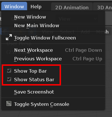
Why the option to hide the status and top bar are in a menu only?
They should be on right click too.
The text hinting give really bad result on 4K screen, pablo said it was good, but nope sorry, it’s bad.
2 Likes
Is there any developer here in this thread who can give a clear and completely answer about Tool Shelf - it completely gone & no one never ever bring it back or it might be bring back as an option in future?
Question only for those who work with interface and from who it depend. All others - sorry but do not write any answer please.
2 Likes