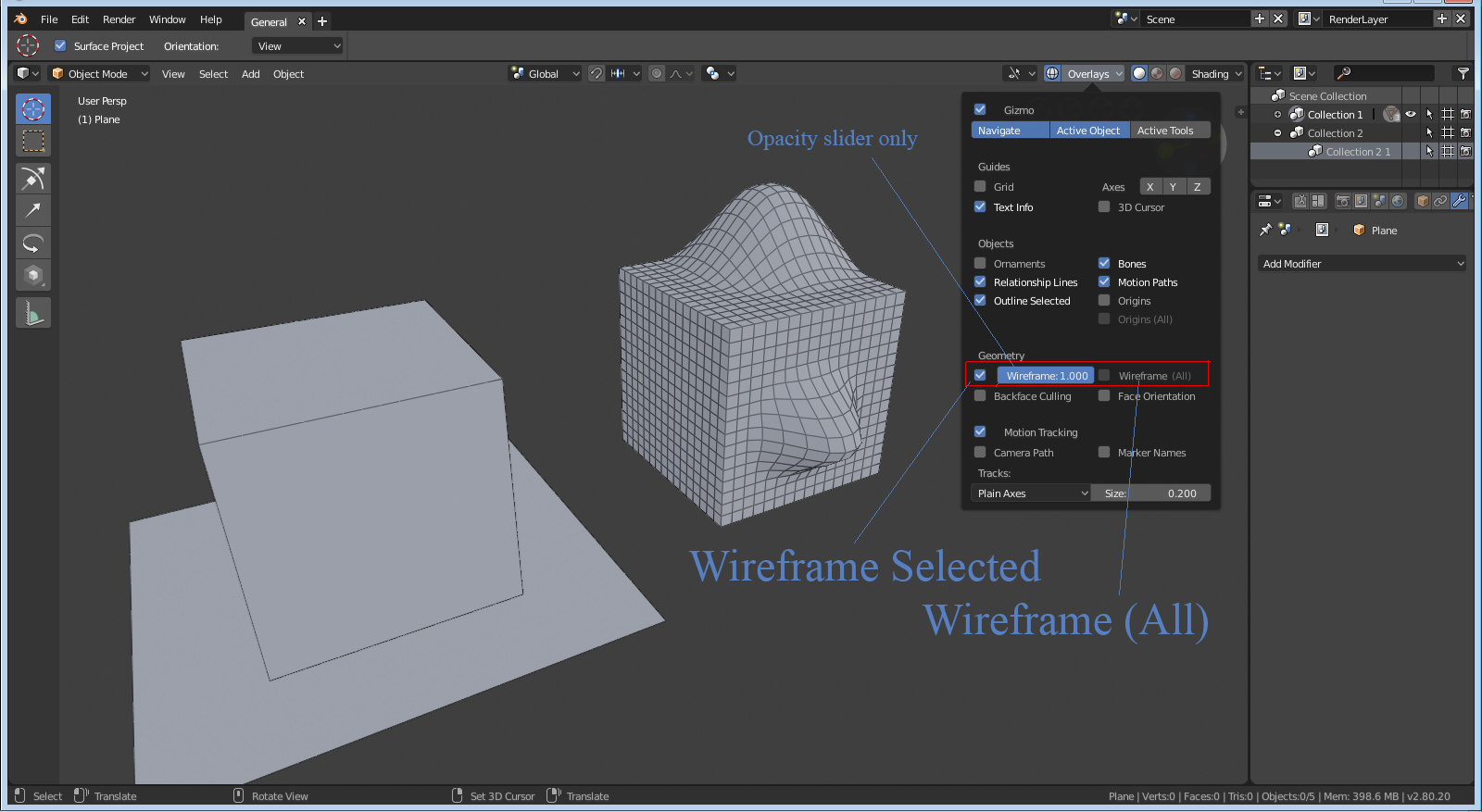
I will use the wireframe to 1 but it can be great in fact.
I would like to have an option to keep the subdivision, but when decreasing the wireframe, that will decrease the interation.
That could be nice, like the optimal display for example.
I will use the wireframe to 1 but it can be great in fact.
I would like to have an option to keep the subdivision, but when decreasing the wireframe, that will decrease the interation.
That could be nice, like the optimal display for example.
Then where do you select your rendering device? (CPU/GPU?)
User preferences?..
It’s in the performance panel, and you can animate it too!
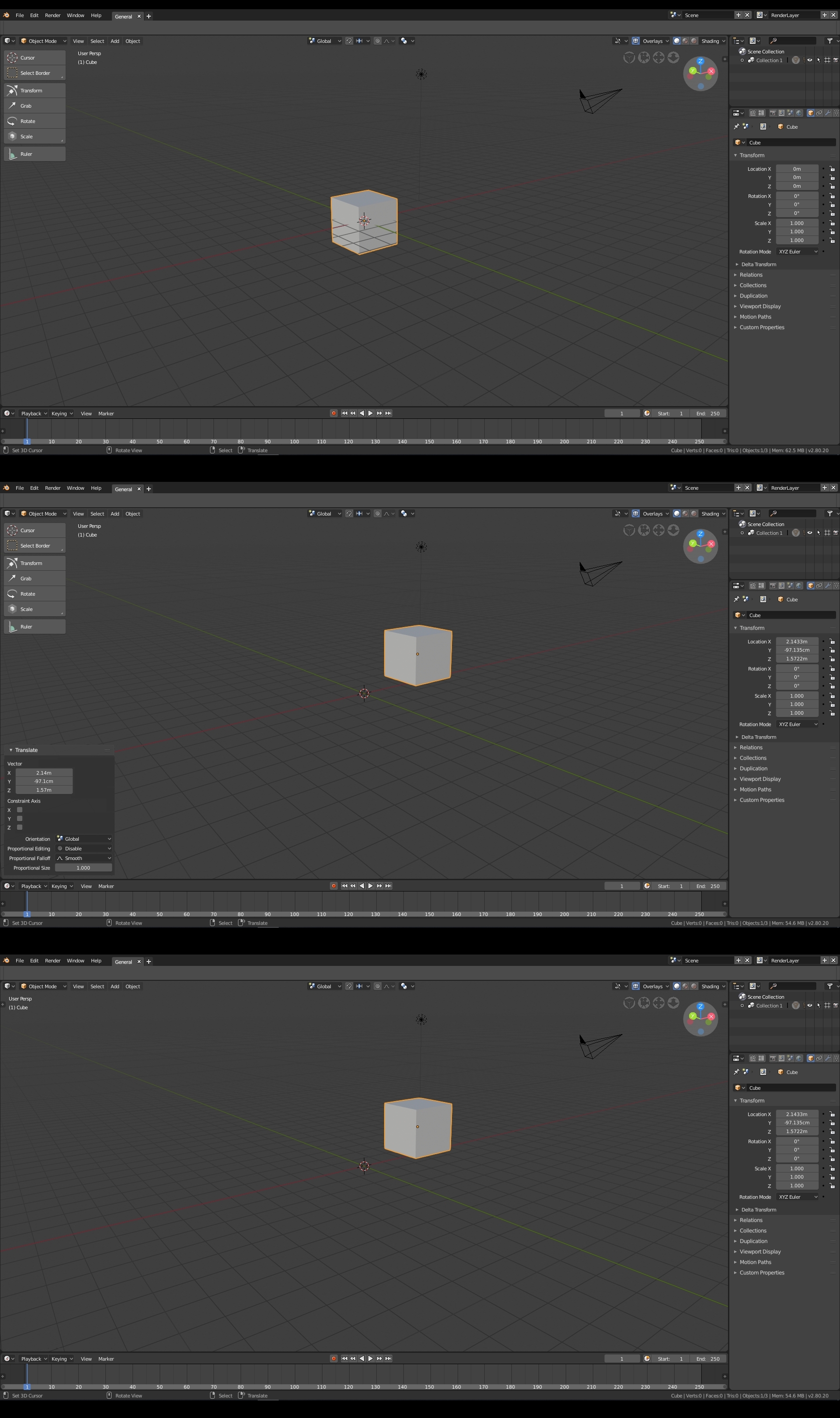
Will the properties panel layout be reverted back or fixed? The current state is still a significant downgrade compared to 2.79 both in terms space utilization and readability. Both of these got significantly worse.
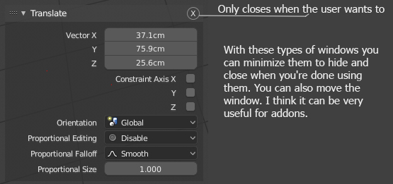
Here’s a little suggestion for floating windows.
They could be used for add-ons and are only closed when the user presses
exit by clicking on the letter “x”
I really think the 3D view port should have the least amount of clutter. This is what makes me think we should have this box back in the T panel. So when we move an object or create an action, that box that now pops up should pop up under the tools. That way, it doesn’t get in the way of the 3D view.
At the moment it is quite taxing I feel. Then you can always hide the T panel and it hides the tools as well as the action box. I just feel this will give us more screen space. I did a mock up but it’s totally wrong, just the idea  The colors could match the Tools colors, so a light grey with white type maybe, so that it feels like it belongs in the T panel.
Showing only some of the wireframe is better for performance and visibility on very dense meshes, but an opacity option would be great too.
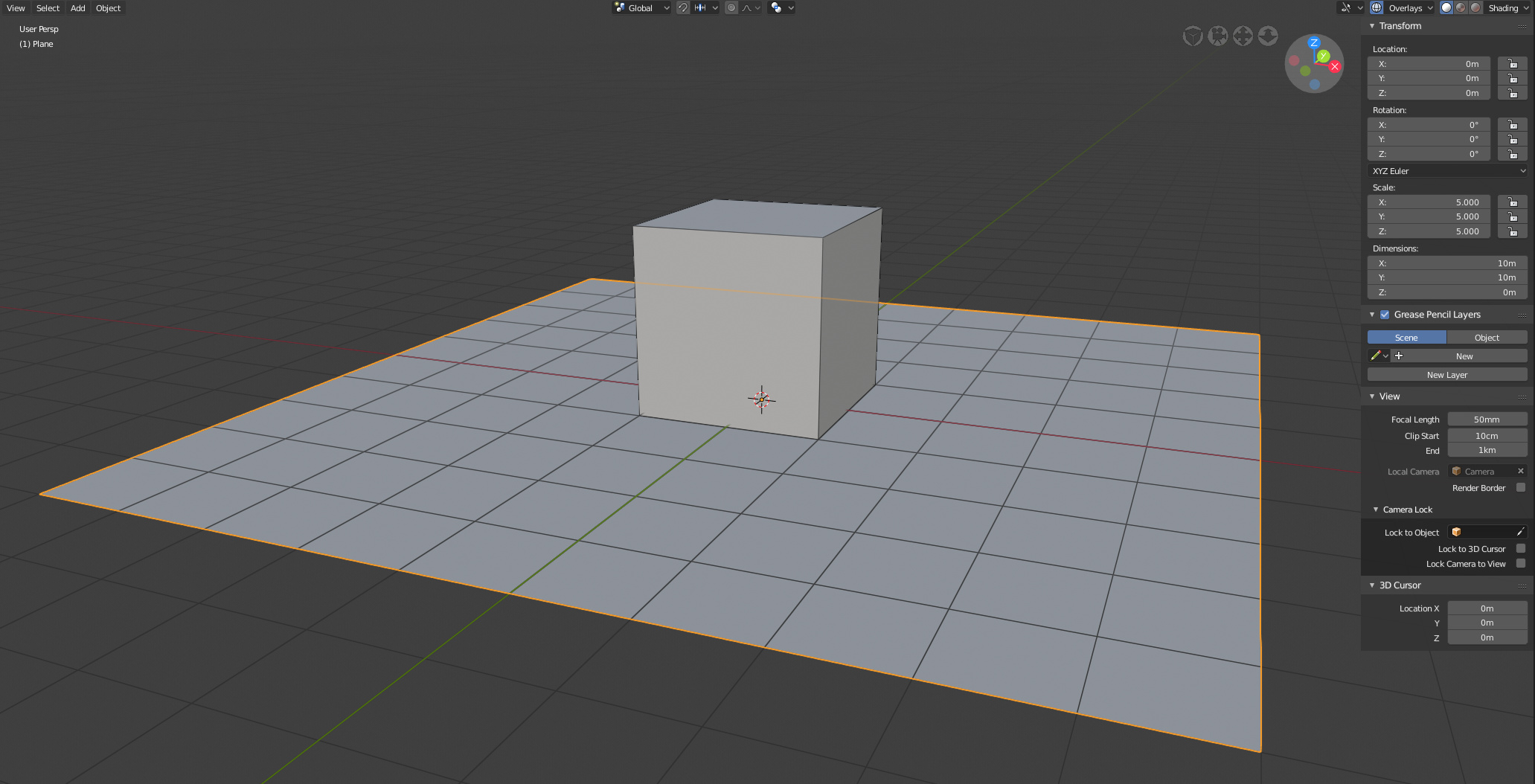
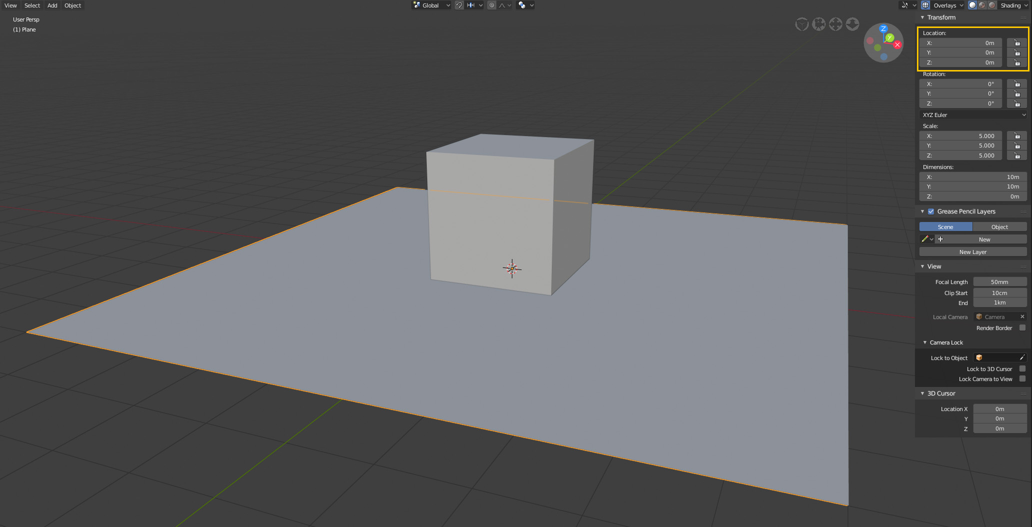
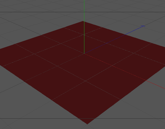
I think this was brought up before (I’m looking for the exact post), but it would be visually helpful if the grid was drawn below meshes that are overlapping it.
In this example, a plane at 0,0,0 appears to be below the grid floor even though it is not.
current:
suggested:
Hi @pablovazquez!
I tried to rearrange the shading pop-over following JonDoe’s design, but keeping the single row for “Color” selection (and with some terrible code style).
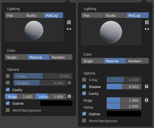
It seems that if you squeeze the gear enough then the arrow next to it vanishes and it looks kinda good.
I was thinking that maybe a solution could be to make those pop-over pop-up instead, this would make the buttons behave like the ones above (if I’m understanding this correctly).
hmm. In the second screenshot it looks like it’s above the grid - so it’s a lose lose situation imo.
Gotta pick one or implement a fancy new drawing type this case - which might not be worth it.
Nope. The current behavior is correct…
@TheRedWaxPolice Correct seems relative here unless I’m missing something. Please expand, I’m curious to know why.
hmm. In the second screenshot it looks like it’s above the grid - so it’s a lose lose situation imo.
@SimonStorl-Schulke I treat my grid like a floor or like graph paper, and build off of it that way, so it’s always felt weird when things appear to be below the “floor” or are drawn underneath the “paper”. My mental image could be off though, is there a better way to think of it?
The plane has no thickness, it can’t be above or below the grid.
C4D example:
It’s the same on all 3d apps…
Just as some people consider that the alt + a (deselect) keys can be useful to prevent accidents in scenes with a lot of heavy geometry, I also propose to put a stop and pause button especially when doing fluid simulations or heavy dynamics, have independent stop and pause buttons can also avoid heavy processing accidents.
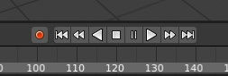
I wouldn’t do toogle but if it’s essential for some animators you can also put then.
It is also possible to keep the toogle with the play fordward and pause do the same effect that it does now of replacing two icons by a single icon of pause. When you press stop it will automatically stop the animation and go to the first frame.