please avoid moving every action to mouseclicks and do not forget about the notebook users. for me the chane of the keymap and especially the change in how to reach editmode looks like a big step back, maybe it will be possible to toggle the keymap between ‚2.79-mode‘ and ‚experimental-2.8-mode‘?
Is/Will it be possible to display a tool tip with the shortcut when hovering over a tool button, menu, etc. That will significantly ease the learning curve.
3 Likes
About the workspace tabs situation -
Right now you can’t close a tab unless your in it.
I think it would be nice if we could close a tab without clicking it first. Maybe the X button should appear when hovering over a tab? Or maybe always be there?
4 Likes
Maybe better to stick with Jacques Lucke approach about columns?
Responsive Layout and Search in Blender (Prototype)
Also reading labels aligned from right to left is really distracting.
4 Likes
That plan is to remove the X button from the tabs and move them to a right click menu. These are not meant to be opened and closed often like tabs in a browser. You’d typically add/remove workspaces when setting up your startup UI and user preferences, not while you’re working.
5 Likes
Hi guys, you might have already seen this, but there are some really amazing organization and streamlining ideas here: https://www.youtube.com/watch?v=FAdiGHwfDkQ&feature=youtu.be
3 Likes
It’s really a great solution for people that use wide monitors. The columns, I understand that are only an aproximation, because with one column youy need same space to see the names
3 Likes
Hi everyone!
First of all wow, it’s amazing how fast you developer are working on this, just last week’s builds feel already very old; I’ve been following the project on developer.blender.org for some time but, not being a developer myself, I didn’t want to clutter the tasks. So, thank you for opening this forum and for being so open to suggestions and critics, that’s something you don’t see very often.
Now, on topic  , I like the consistency of the new single column layout, but I think there are a couple of problems at the moment:
-
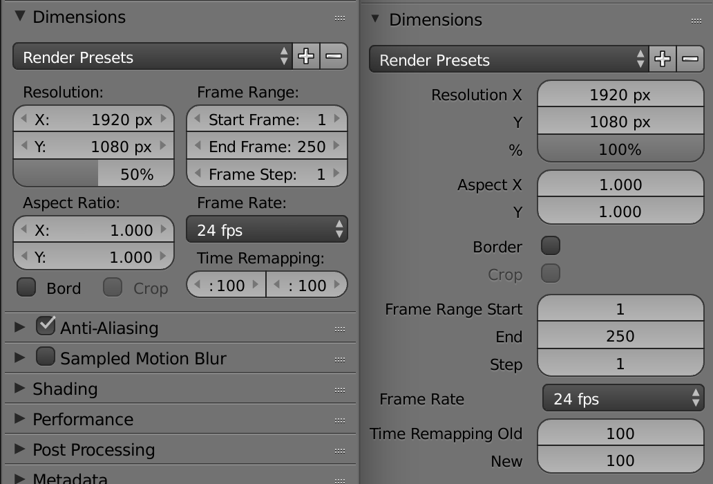
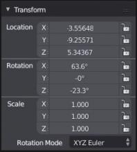
For the properties that have more than one value, like the Location of an object, having the property label right next to the value one (“Location” “X” for example) makes it difficult to understand IMO, and can also create situations like these ones (1), where you can’t read what the value is about.
So maybe it could be better to separate them in some way, vertically centred or with something like a line (2) -
A second thing is about the on/off buttons, I find them a bit ugly right in the middle of the tab, and there is also a lot of space not used on both sides, maybe one of these (3) could be a solution, the first one I think is also in the task mockups.
Found out I can’t post more than 1 image, so I’ve collapsed everything together.

2 Likes
I will be honest, I think we should be utilizing the top bar even more. I feel like having a bunch of different drop down menus from a top bar is… alright but I think if we really opened it up and maybe started putting some more settings in there or possibly tools, that might help.
What I would really like to see also is more animatable properties and parameters, and it would be great if you would be able to Identify them easier in the UI, instead of having to right click on them to discover if you can keyframe them or not, I am an ex Softimage user slowly switching to Blender and looking forward to making it my main DCC app when 2.8 is released.
Look, hate on my all you want and I realize this isn’t 100% UI related, but I think we should be using left click as the default for select. Then we can easily implement a right click menu and open up the door for a whole new way for users to work. We can easily make the cursor placement something else. Additionally, I think the cursor icon in the toolbar should just be a standard mouse arrow and not the 3D cursor.
this is basically a repost of what i said before about the hotkeys on the developer stuff. since this is the proper place for it. i’ve tried to condense it and word it more clearly and to the point. not sure i accomplished that. it’s just reasoning as to why i think using tab for active tool switching is a better choice than spacebar.
active tool swapping isn’t something that is going to be constantly used by advanced users who know the shortcuts because it would slow them down to tap two keys then activate a tool with click and drag rather than just activate a tool with a single key press.
because of that advanced users are likely to pick a single tool to use as the active one constantly or fairly constantly as the active one depending on the task they’re working on in order to speed up that specific task (type of modeling, retopo, ect). the tab key was already used when changing between those types of instances so i think it makes more sense to have active tool swap be on tab for the hotkey because active tool swap would tend to happen when changing between those types of instances.
tab also seems to be on the left side of the keyboard in pretty much every language keyboard so reaching for tab also has a bit of a visual connection to how the tool shelf is on the left side. this combined with the connection to when we already used tab vs when we’re likely to swap the active tool can make using tab for the active tool swap hotkey a little easier to learn.
active tool swapping may be used constantly by new users but wil they use the hotkey for it? new users don’t know all the hotkeys so even if they did activate the hotkey for it they’d have to look for the tool in the list to activate it’s hotkey. this can present a negative use because the toolshelf is always in the same place on the screen. the popup hotkey menu isn’t in a standard spot so it would be a more enjoyable experience and feel faster for new users to move towards the general area on the tool shelf they know what they want is at while they find it more specifically with their eyes. granted neither case is that fast for the total beginners but having the tools in a consistent place for choosing and swapping is still a boon for them rather than using the hotkey popup.
so for the listed reasons i don’t believe the active tool swap hotkey benefits more from being the slightly more comfortable space bar than it does from being the tab key.
what little benefit being slightly more comfortable the spacebar is for it also doesn’t seem to be worth the discomfort of moving the search function off of space and destroying old user’s muscle memory for it.
i think the intermediate step of having spacebar being the new active tool swap hotkey while the tab key was still edit mode may have skewed the dev’s impression of what a terrible jump it is to displace search feature with a new feature when they cleared up tab by moving edit mode. it essentially rearranged 3 things when they only had to rearrange two.
that intermediate step isn’t something most users are going to have. without that intermediate step you’ve kind of jumbled everything up more than it needed to be and at least for me tab felt so much more natural for the new feature (explained in above wall of text) than spacebar did.
i didn’t mind editmode changing to 2 near as much as i thought i would but tab and spacebar just weren’t working for me. it was just a hard NoPe!
i swapped tab to active tool swap and spacebar back to search and i was just like mind blown this works so much better and is much easier to adjust to.
so for the love of pete, please change active tool swap to tab and leave search on spacebar.
2 Likes
I have been watching Pablo’s daily updates on Youtube, and quite frankly, I am blown away! I am LOVING every one of the UI changes you have made; not only are they making Blender easier to use, but they are also bringing the whole UI into the 21st century.
And the wireframe changes that were announced today - WOW! That alone is a HUGE improvement.
There will always be those old-timers who don’t like change, but please don’t let their complaints hold you back. These changes have been so badly needed for so long, and I am glad to see them!
Keep up the AWESOME work!
- Michael
3 Likes
Here is a proposal for unified 2d/3d alignation tool widget, but it requires for proper CAD snap system update
https://developer.blender.org/T45734#506696
2 Likes
Here is the actual implementation of automatically aligned layout, done on 2.79 without any changes to Blender’s source.
I think it is good to have a thin single column layout for thin areas, but people with wide monitors can afford less scrolling by taking up space form their viewport.
Another proposal I have is finally making a always-on-top UI widgets. Some addons (including mine) implement UI heavy custom editors in those invoke_props_dialog windows which fade away the moment you click on the other region. Please make it stay until it is explcitly closed.
9 Likes
I’ve already written my proposal for the menus here
But I don’t know where it could be read. So I’ll just show you screenshots of what I’m proposing to keep the colony system while keeping the readability fast. Without having to focus on the interface.
Here is a proposal I created :
I honestly think that keeping the variable name in its box really makes blender easier to read and faster. Adding a thin bar at the bottom of each part also makes the interface more understandable.
8 Likes
Why not just keep it like in 2.79? It worked great.
The only thing that should be added is a button in the editor toolbar for closing the editor, dragging the triangle back might confuse new users (but since it’s used so much, removing the option to drag it will be confusing for old users, keeping both options is better).
2 Likes
I have a few issues with the current design, I’ll try and break them down here.
Tool Shelf
While the new tool shelf fixes a few of the problems in 2.79, it doesn’t provide nearly as much function.
To start with, it completely throws away the secondary tools, keeping only the tools with the simplest hotkeys available. This can be fixed by allowing users to add or remove tools as they please. Another addition I’d like to see are the tabs from 2.79, but with the ability to add more tabs, to allow users to separate their tools rather than have them all in one place.
Secondly, icons with drop down menus should either be opened by clicking the arrow in the bottom-right corner, or have all tools available from the get go (or perhaps have a possibility for both, customisability is one of Blender’s strongest points).
Thirdly, and most importantly, the tool shelf was used for brush settings in the sculpt and painting modes. It now consists only of brushes, and the settings are placed in drop-down menus, slowing down the user. There’s no easy fix for this, which is why I believe the old tool shelf was superior to the new one.
New Horizontal bars
The new top toolbar and bottom project info bar are a huge waste of vertical space.
The top toolbar is left unused most of the time, its only use should be for extra settings that can’t be placed elsewhere, such as the Knife Tool’s “Occlude Geometry” and “Only Selected” settings.
The other tools present in this toolbar (interaction modes and transformation settings) are editor specific, and as a result, should be returned to the editor toolbar.
Nevertheless, the top toolbar has its use, it should just be collapsible like the N and T panels (not only when switching workplaces).
The project info bar takes up precious vertical space and should have a less wasteful way of displaying its information, perhaps it can be displayed in the window’s title bar.
Overlays
Having more control over overlays is great, I would like to suggest adding the option to use different overlays for different shading methods (e.g. removing overlays for rendered mode) and the option to limit the grid floor’s draw distance. The grid floor also seems to fade into objects, which is confusing when using it to measure scale.
A few more things I noticed whilst using 2.8:
- The new interaction mode hotkeys take the place of the old hotkeys for switching sculpt brushes.
- The T and N panels no longer push aside the 3D view when scaled, forcing the user to move around the scene every time they are scaled. They also fade in and out when activated/deactivated, this, in my opinion, looks worse (it also takes around half a second to appear, while the old method doesn’t).
- The Editor Toolbar is now moved to the top in most editors, while it is possible to easily move it down, it no longer flips the Editor Type menu, causing the 3D view to be farthest away from the cursor, rather than closest. I would also like to suggest having all Editor Toolbars at the same side by default, (right now some are at the top while others are at the bottom), as well as the ability to move the Toolbar around by dragging it (in a similar manner to Windows’ Taskbar).
- The Stereoscopy tick box in the Render Properties Editor opens up options in the Output tab, confusing the user. It might be better to move these settings to the Stereoscopy tab.
- The small triangles in the editor corners and the arrows in the sliders are gone, and it’s up to the user to find out where they are (or if they even exist).
- Background Images, Matcap and the Render Active Scene buttons are missing from Cycles, I assume these are temporary changes, though.
- The renderer now open the rendered image in a new window, which, in my opinion, is worse, perhaps you can allow users to select between both methods (I’m fairly certain this was done in an earlier build).
I also have a few personal problems with the new UI:
- The object outlines are too thick, they look similar to a cartoon character’s outline. They also appear to have a gradient of some sort?
- The resolution percentage slider in the Render Properties Editor should have the value written in the right side, not the middle.
- Node Editor type is moved to a drop-down menu, which is slower than the buttons from earlier versions.
- User Preferences are moved to the Edit menu, which, unlike the User Preferences, is used for project, not global, settings.
2 Likes
I don’t know who is deciding, but they are making very bad decisions by trying to completely change the way they work with blender. We are going to lose speed of work unjustifiably, changing things that nobody was asking for changed. Please listen to the professional sector that we use blender for our daily work.
5 Likes