current theme inner selected modifier, it’s not consistent with others :
change to black :
current theme inner selected modifier, it’s not consistent with others :
change to black :
A few silly little things regarding menus…
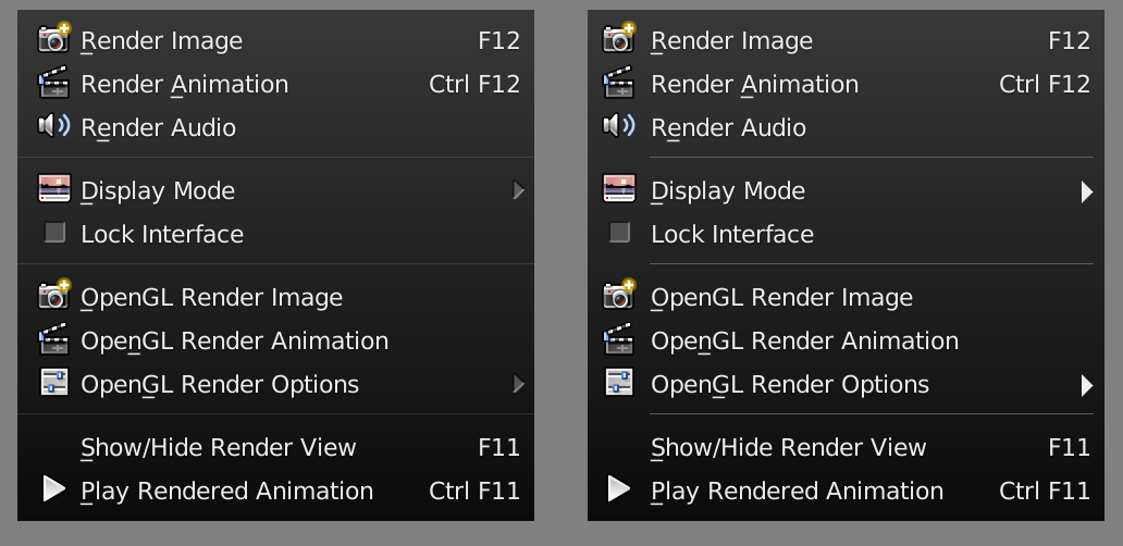
The placement of icons is a bit funky. If you look at the left side of the image below you will see that they are not centered well in their areas and are crowding the text beside them. They need to move a bit to the left.
The “More” icon, used to show there is a submenu is drawn as an odd shadowed thing when it should instead be a solid shape drawn with the text color. They are also placed a bit too high.
It looks better to not extend the menu separation line into the icon area because it is best to not add other graphical items, like lines, near them. So it is okay to separate text with a line, but best to separate images with extra margin. Also better to not extend all the way to the right either, but leave a bit of padding.
Will go back the old localview / feature???
The Facedots are also very useful to know quickly if we are working with Vertex, Edges or Faces without having to look away from your model. For that reason they should appear, not only when you are in translucent or transparent mode, but also in solid/opaque mode.
Well, a release date for 2.8 was made public, yet developers are silent in regards to some questions pointed here (and in various Interface Proposal topics). I’m worried if things like the Top Toolbar (topbar) will remain like it is, unchanged, until 2.8 release… when even on Pablo’s most recent videos he appears to prefer it hidden. If even developers are not using it, why keep it like it is before launch?
Wasn’t the purpose of an UI change to make things better and simpler?
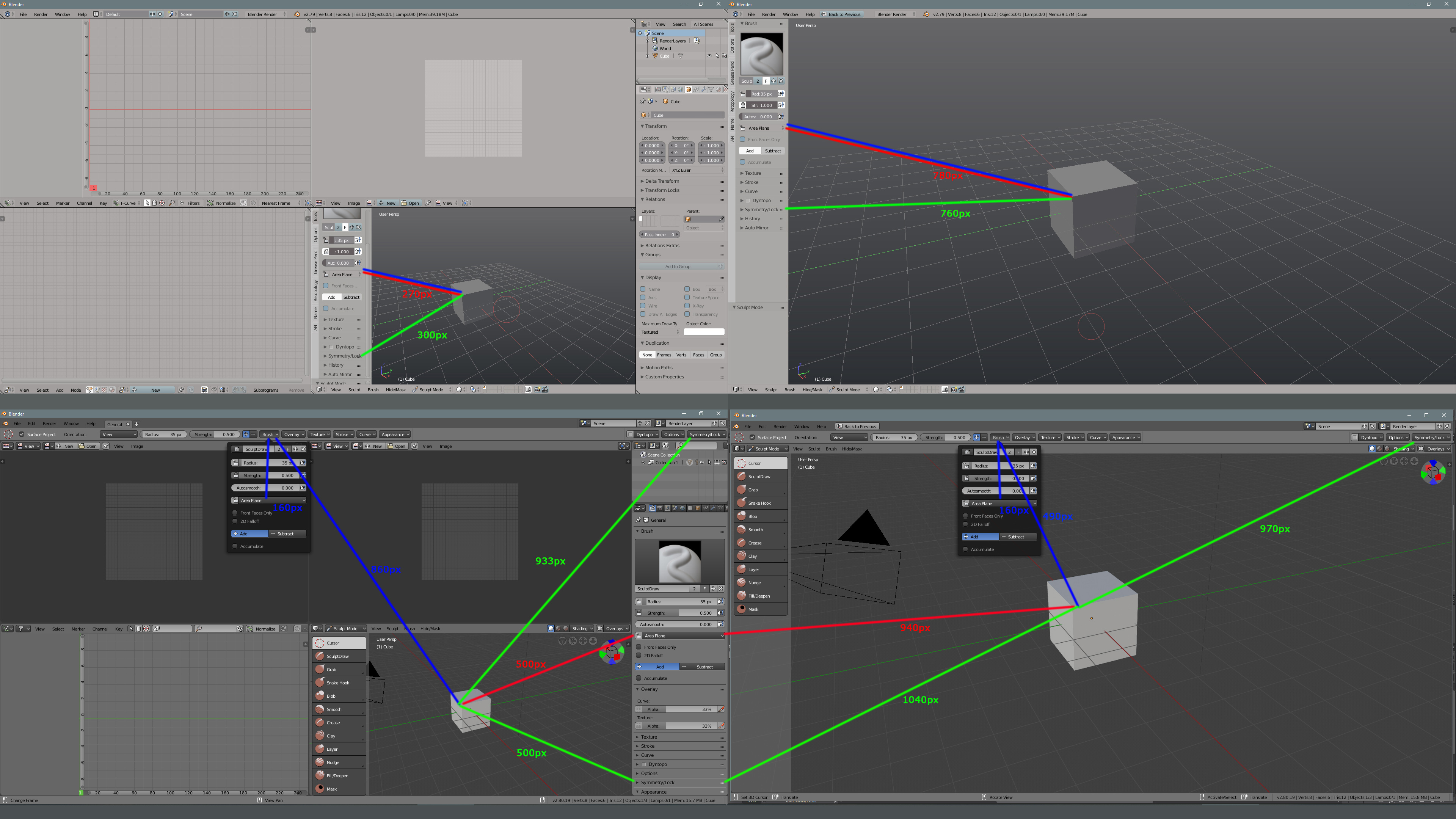
Here’s an analysis of mouse travel time to reach certain options with the removal of Tool Settings options from the Toolshelf (“T” shortcut) on the left side (splitting some of them to the topbar, and some to the Properties editor panel) when using a dual-monitor setup:
The Red and Blue paths are to reach Scuplt Plane options. The New UI has the new Blue path.
The Green path is to reach the Symmetry Lock option.
As one can see, by using the Properties Tab options on the new UI, we have to travel almost 2x longer (500/270px) to reach the option Sculpt Plane on it (red/blue path).
To reach the same option on the new Top Toolbar (blue path), one has to travel almost 4x longer (1020/270px) on the first monitor, and 20% less on the second monitor.
To reach Symmetry Lock on the Properties Tab (green path), on the first monitor one has to travel 60% farther (500/300px) on the first monitor, or if you use the topbar, 3x farther (933/300px).
To reach the same option on the second monitor, the user also has the option to move the mouse back to the first monitor to the Properties Tab to reach it, which is 40% farther (1040/760px). or use the Topbar, which is 30% farther (970/760px)
Result: only 1 of the 8 travel distances exemplified gained a minor time reduction (20% faster), which is to reach the Sculpt Plane options on the second monitor under the new UI.
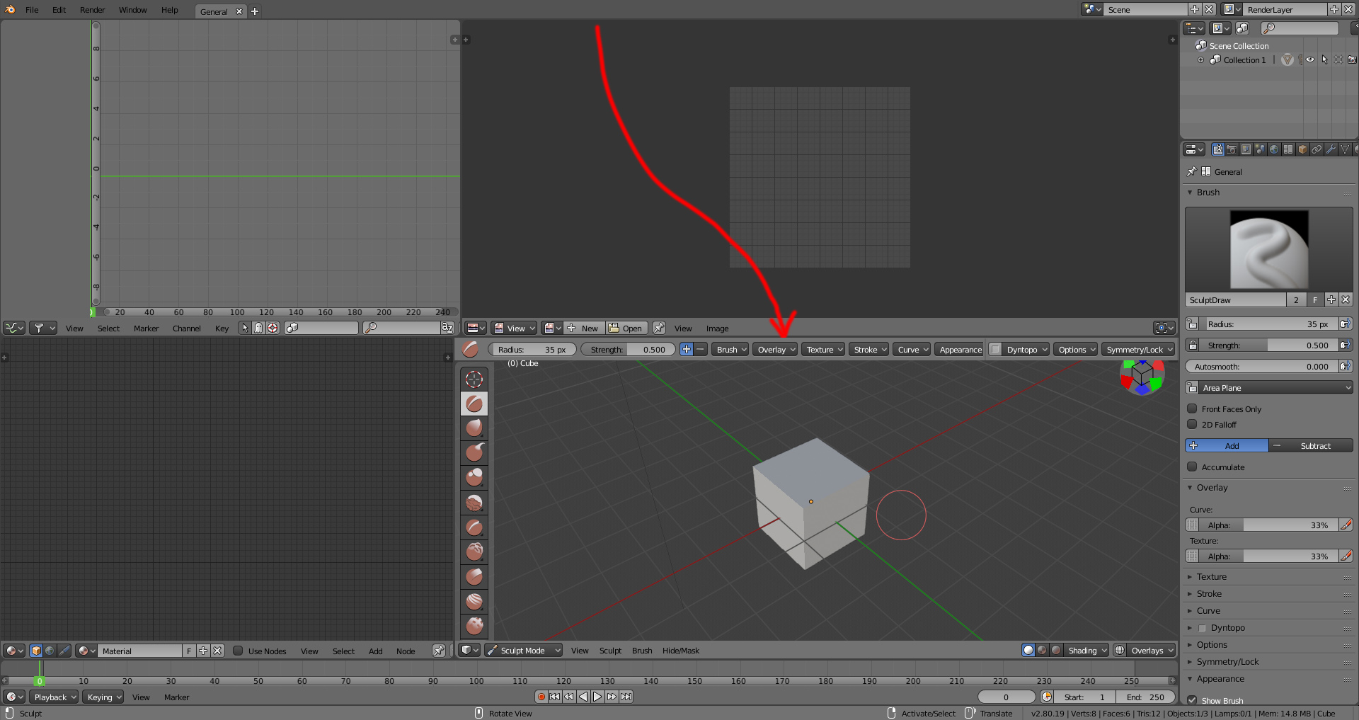
This extended travel time could be partly solved by having the Topbar not fixed on the top, but located on the top of each Editor as needed. For example, sculpt options located on top of the 3D view where they are needed:
If you question: “Why travel time is important?” Well, this is a workflow velocity measure. Increase a little bit of time here and there and you are looking at dozens of minutes increased in regards to the previous workflow. And remember, the philosophy here was to make it better and simpler.
ADDONS DEDICATED SPACE
I didn’t hear anything about it, but where will addons dedicated space be now that tools options are not on the Toolshelf? The same mouse-travel distance problems will appear since we maybe wont be able to access Addons options on the second monitor (have to go to the first monitor)?? I cannot see how complex addons like Animation Nodes would be properly placed on the Topbar. Either they bring a dedicated addon space on the Toolshelf like before, or a floating popup that can be hidden and brought back with a shortcut.
Having Addons limited to the Properties Editor Tab is bad, because on a second monitor it would waste fixed space by not being quickly hideable like the old Toolshelf was (or having to move the mouse to the first monitor to access it).
In case people think that I’m only complaining without offering a solution, to me good solutions were presented on some UI proposals, like this one, which reinstated the left Toolshelf tool options, and used the old Toolshelf Tabs space for addons and other stuff: UI Proposal
Yeah and IMHO, topbar was by far the first most useless invention ever put into blender.
I want to share some comments about hotkeys.
Z-key make different things in different modes - this is confusing. Especially, if you are a big fan of full transparent mode - after enabling full transparent in shading settings, It’s looks like Z-key makes nothing in edit mode.
Maybe Z-key in edit mode can disable X-ray option from shading settings, if they are on? This moment is not considered.
Also, “Limit selection to visible” button are not shown if x-ray option are enabled. That makes it lot more confusing, because you can see back-side geometry, but can’t select them. Maybe combine “x-ray” and “Limit selection to visible”?
I really like the combination of the usual tab and pie menu. But we need to refine one point.
Tab now works as usual tab only if mouse not moving. The pie menu only works if a certain distance has been passed. But if the distance is small, neither works.
I think, if Pie menu opens, but if the distance is small to determine the menu item, this should be treated not as an cancel of pie menu, but as a return to the usual tab
I need to be able to exit render mode by pressing the z key, I’m very used to that. I think the behavior of the z should take you to wireframe mode and from wireframe to solid as in 2.7. So far I have written an addon, because it makes me very nervous not to have that behavior on the z key and the behavior of ctrl + tab. It doesn’t mean that the addon is the ultimate solution, but if blender still doesn’t return the behavior of the z key, I will have to use my addon for life. I also think it is very important to be able to see the facedots in solid mode to know how to differentiate if we are selecting faces, edges or vertices, at a glance without looking away from your model.
In case anyone is interested in trying or improving my addon I’ll leave it here: https://gitlab.com/zebus3d/varios_blender/raw/master/zebus3dWF.py
Very well explained, Evandro Costa 
There will always be a trade-off between a well-organized UI and one that’s optimized for mouse travel time. For those learning 2.8, having things easy to find is the most important thing (even for those of us who have been around a while) and once the shortcut keys have been memorized, mouse travel time is moot.
@rontarrant
An organized UI, as you said, is meant to make the workflow faster and easier to find what you need, so there is no logic in your statement,
Also, you can have both benefits, the toolbar on top as you had till now (by default), and the possibility to customize on different workflows.
I think you missed my point. I wasn’t down on your idea, just wanted to temper it a bit. I didn’t down-vote you post, either.
For illustration purposes, I was talking in extremes. A 100% mouse optimized UI would have every visible control within such a cramped space that you’d have to squint to make out one from another. You might only have to move the mouse a few pixels between controls, but you’d have to put a lot of effort into hitting the one you’re aiming for.
A 100% well-organized UI will disregard the amount of space between controls, no matter how far the mouse has to travel, so you might end up spending most of your production time moving the mouse instead of hitting controls.
To be honest, the current topbar layout is fine. Useless but fine, I just think its odd how it takes settings from the 3D view without actualy being coupled to the 3D view.
I completely agree, also thanks for creating and sharing your addon!
I agree, that’s why I made the simple proposal of transferring the fixed Top Toolbar to be indepentently on the top of each editor (ideally being hide-able as well).
This proposal brings the following advantages over the fixed Topbar:
Sometimes I think that a better option would be to flip the Toolbar buttons to the top, and the Tool options to the left (as the old Toolshelf). This way Addons could also return to the left as well.
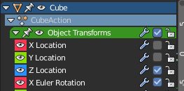
current fcurve contribute icon it’s like sound :
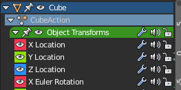
i think checkbox it’s much better than sound icon :
Idea to keep searchbar in the space
I pick the proposal of @lsscpp in developer and make some mockups expanding the idea. I think that it’s a really good proposal because improve the reading of shapes and help a lot in the tool settings widget inside 3D view. It could be improved using the wide checkbox that somepeople have proposed.
A little idea, separate tabs in properties by context.
Some people proposes to separate properties editor in two, World and Object, but I think that could be enough for users to separate tabs in this two groups of tabs to explain that it are different things.