I think, most of the time, when using one monitor, you want one tool bar/tab for the tool you are currently using. But if indeed, the user is in a case where they want to have two tool bars, you are right: that’s probably because the user wants to use two tools or workflow at the same time (alternatively).
I can see two directions toward a solution here:
we could have a droplist in the tool editor named “link tool editor to:” and you could chose between: “last used”, “3d viewport”, “image editor”, etc… Hence your tool editor could behave as you need it when you need it.
the tool editor would be always linked to the last tool used in the current workspace, however, Blender could manage several workspaces: for instance, the user could have the sculpting workspace on one monitor, and the texture painting workspace on the other monitor.
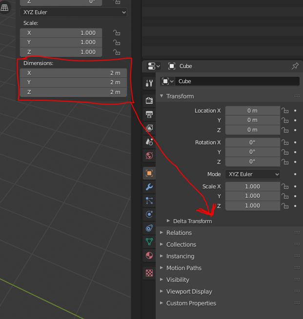
Somehow I agree with you. I don’t think that removing it completely could be ideal. But… what I do agree is that would be nice to be able to access to all the options that are present in the N panel in the Properties Editor.
For example, over the N panel when we add an editable object (Mesh, Curve, Surface, Metaball, Text, Armature and Lattice) the Dimension field is missing in the Properties Editor. In this way we could do a littler bit more without opening the N panel.
It only need to change the default value and show by default. And yes, is a problem.
It’s solved with show it by default
You can reduce the width of the sidebar and hide it completely.
It use the same space that user will need
Blender must to work in fullscreen with multiple monitors, not only with default layout in one monitor.
Also that with your solution blender users will be clicking continuosly to see any thing, instead of had specific panel for each thing. And a lot of other limitations like don’t allow user to put the panel in the left.
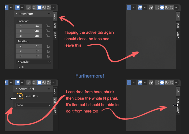
Regarding N-panel, with 2.8 I often find myself clicking the tabs headers figuring they can hide the panel, then realize they don’t and click N or drag the panel size to zero.
Solution might be (as someone mockup-ed in the past) to have the tab headers always visible and having to click them to open/close the N-panel (besides the good’ol N key of course)
Hello, I believe you are speaking about the tool tab related “bug”? I created a bug report here if you are interested: https://developer.blender.org/T71114
exactly…
Plus my (and others’) former proposal that it should hold square icons instead of vertical text.
You should be able to work the very same way with them as with “collapsed to icon” windows in Photoshop. Clicking on the icon should open and close the info in it.
I elaborated in this post:
and this post:
and IMHO N shouldn’t hide everything - it should do the same, just collapse it back to the icon column.
Hiding it completely should be a conscious act with right click menu or dragging - same as with the top bar. The current behavior is just not enough.
Here’s one of the image from the posts above just to make this one more flashy
pls give an option to keep the icons monochromatic (black and white) for properties panel like they were intitially without affecting the multicolouring inside the Outliner. The initial style was pretty close to flawless and a bit more elegant. While I uderstand the colouring is a bit more informative, I think is a bit redundant to have colour separation in other very visible and permanent areas in the UI outside the outliner and maybe some menus (from which multicoloring also seem to have been dissapearing).
I actually want this so that custom icons can be used here without turning off outliner colours.
The colour picks for the properties bar are terrible and have never served their initial proposed purpose in 2.8, the idea got taken over by some idea to categorise everything.
The underlying code has always supported taking any of the mono icons and recoloring them to any color you want at the point they are drawn. The central problem is that we don’t carry that optional color information from where we actually use the icons. So we might define that a specific icon is used for a particular operator or in a particular place, but there is no opportunity to set a color as well that gets passed along to the drawing functions. Instead it is just the text color that makes it to the end point. Wherever an icon is set, there should also be an icon_color that simply defaults to text color.
Whenever I brought this up it was like I was speaking in a foreign language.
Instead we have something that is thought “good enough”. When icons are initially loaded by blender each one can be optionally recolored to something at that time. So the “world” icon is set to red once, early on.
And for a little while we saw that “world” icon as red everywhere in the interface, including on menus and in unrelated panels. That was not ideal so later there were some exceptions added that are per-area. So if in particular areas that world icon will be red, but will be the text color everywhere else.
But that does not mean we can have the World icon red in outliner, text color in menus, but green elsewhere. Unless more hacks are thrown on top.
you will chnage them globally so youll lose coloring in the outliner as well. Plus you have to kinda guess the values that were used for the non coloured icons.
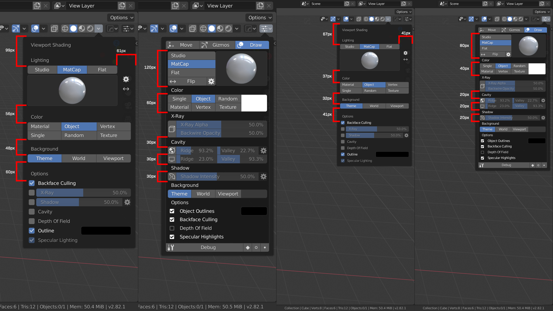
As I’ve been poking away at an alternative layout for the viewport shading popover, I’ve noticed a few quirks in Blender’s UI that appear stem from design decisions instead of errors or engine limitations.
The shading popover is composed sub-panels (some of which are re-used in the render tab of the properties editor) that use inconsistent sub-layout nesting.
With the margin and padding rules that Blender applies automatically, the combination of sub-panels that can’t be collapsed, one-line layout.row().prop(... properties, and superfluous layout = self.layout assignments can lead to some rather strange spacing.
I marked up some screenshots at 1.0 and 1.5 UI scale that show some of the differences between the current shading popover and the layout that I’ve been experimenting with.
I’m not sure which thread I saw this in, but regarding potential icon requirement for add-ons instead of a difficult to read and space consuming name in a vertical tab…
There is already a big and thriving community where multiple icons are required per add-on and it works just fine, and most people even adher to set design guidelines.
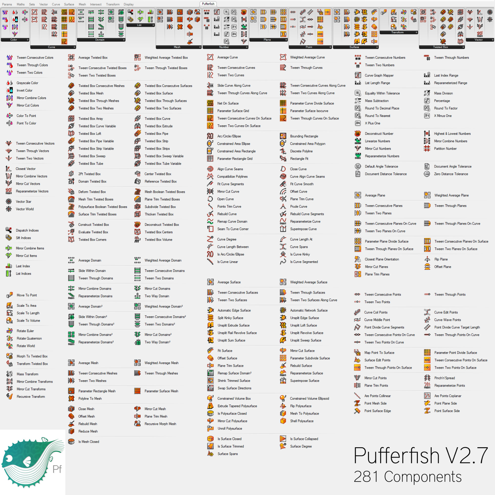
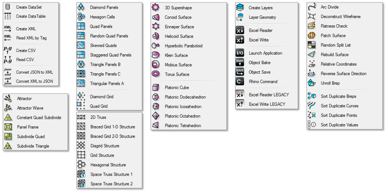
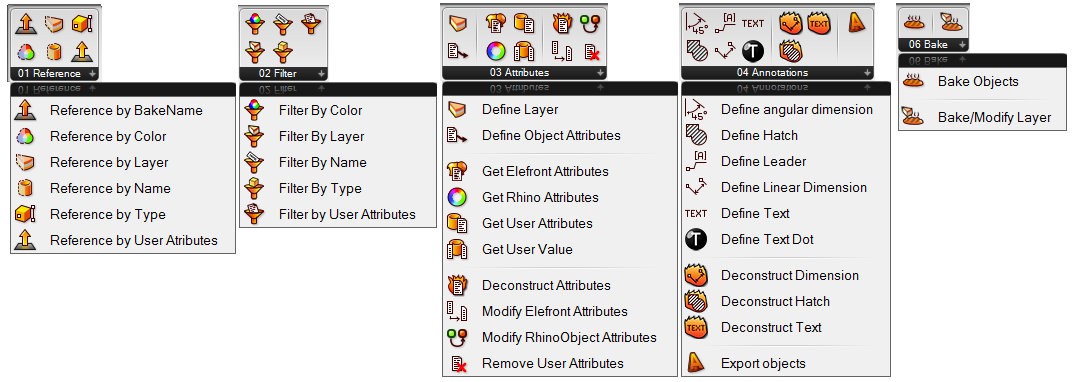
So, just as an example, here’s some screenshots from user developed add-ons for Grashopper:
So if the developers want to introduce an icon requirement for add-ons, I don’t think it will be that big of an issue. People will step up and do them.
(Btw, this is from basically a program that is 100% “everything nodes” and every. single. node. requires it’s unique icon.)
Those are more single-button functions than addons.
Local devs are people who make coding way better than drawing like jendrzych
As you may know, I made entire icon pack for FreeCAD in Blender 2.8 style, and also several Blender addon packs.
But it will be too tough even for me to provide icons for every addon I produce.