Try to remember that in blender all that is little, you don’t have the 2x factor, and you don’t see all things in same way.
I feel like memorising the position of something in a long list is way harder than if that list is split up into several groups.
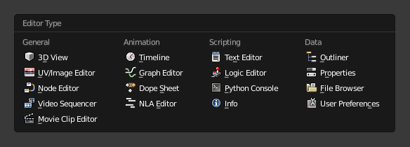
I prefer the horizontal based menu because it’ll be easier to memorise and parse.
FYI it’s not a unique-to-2.8 thing, it’s in the 2.79 experimental (gfx card forced me onto experimental, has a few other menu movements that are awful, though. Edge data submenu I’m looking at you…)
2.79 (experimental) vs 2.80 (with some colour, I’ve got my icons installed)
They actually made the text harder to read, and the icons pop less, too. That dimming of menu items I ran into is everywhere in 2.8 menus it seems.
2 Likes
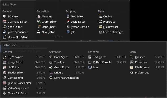
Yes, the original idea was this:
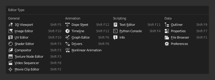
and it looks very good, no problem here, and like this:
also looks very good, and no problem with monochrome icons here.
That’s because the columns are very clearly separated (32 px of empty space between columns), and the columns themselves are almost the same height.
But then the developers added more options to the first column, and later, even more, absolutely unnecessary (in this menu) hotkeys.
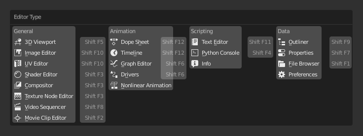
Notice how the hotkey labels are closer and grouped to the next column than to the title to which they belong. And 40% of the menu area is empty.
There’s also the idea of categorizing to make search easier. But it doesn’t work, especially for beginners. Only animation group is clear and logical (well, maybe scripting too), the rest are too abstract.
I use a 2D program where exactly 30 blend modes and this is the most ordinary menu, and no problem, it always fits into the screen. The blender has 24 blend modes, and for some reason it broke this menu in half. And in a completely illogical place, between Hard Light and Vivid Light modes.
10 Likes
I think that the hotkey suggestion should come out only if you leave a few seconds the mouse over.
1 Like
The best idea could be like in Zbrush, that you see details when you pulse a modifier key (shift)
Link to a proposal for node editor
summing up,
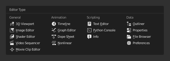
I don’t think the extra space to show shortcuts is a real problem …
the real shortcoming is the lack of colors that help to distinguish and better identify the icons.
5 Likes
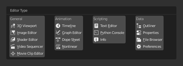
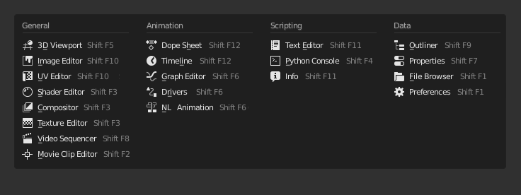
This is another variation that I find easier to use. The four columns look like four columns rather than eight, and each one the same width.
13 Likes
Maybe Color Management have to go to Output from Render tab.
Mostly because it’s setup is more about output of Render, instead of Render itself.
Suggestion for the topbar like a header
It really does just look nicer and clearer if we didn’t have the shortcuts in here at all. I wonder if we could just show the shortcuts while hovering?
7 Likes
Color Management affects the render and viewport, not only the output files.
1 Like
Does anyone really use those pretty unfriendly shortcuts or even trying to remember it? For me it seems unnecessary to map editors at all.
1 Like
I would like to rearrange the editor menu into something like this, I find this grouping of editors much more clear and logical.
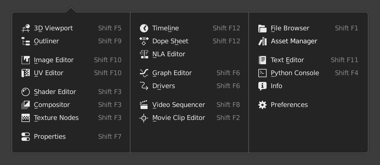
And another example of multi-column popover.
12 Likes
just dropping this here.
the tool header would be editor based.
1 Like
No, it’s a list. Show a list you can scan in one eye movement. Vertical list is really the obvious choice here.
This is really overengineering something that should be really simple.
The second popup example makes sense because it’s sort of a kitchen sink ribbon of options that needs grouping. This isn’t it.
Edit: in fact the more I look at this second screenshot, the more I think it also makes no sense.
Let’s all take a minute here and regain sanity:
2 Likes
I agree with you. The hotkey is not important there
1 Like
Actually, no. It is kinda postprocessing, it’s setup don’t influences render process.
So it is more related to Post Processing in Output tab, than Sample, Perfomance, or, for example, Light Paths in Render tab.
It is more about how rendered image will look, than about how to render image.
shift+f3 - shift+f10 - shift+f5 are a must to know (for a modeler generalist) use all the time.
optionally Shift+F6 and F12 or Shift+F7 or f9
If you work ala industry standar (only one thing one interface at a time) may not be usefull at all, but if you do a lot of tasks and constantly changing setups or moving among a lot of diferent things, those shortcuts are extremely usefull, especially those first three.
1 Like
@NahuelBelich That’s why we have workspaces.
You probably most of the time need to see at least two editors. Then you can easily switch them to full screen by Ctrl+Space.
2 Likes