if it is not too complex to encode …
I would agree to set it up optional …
I certainly do not intend to prevail other people’s preferences ^ __ ^
I’m moving this here.
I do indeed use shift+drag, though I rarely use dragging at all. I know the values I want to input and it is simply faster and more accurate to type them in.
I’m not going to just believe someone who says “It’s slow, because”, without evidence, reasoning, not even a theory. I’ve been using blender plenty long myself (I’m not going to check), but atleast I provided some reasons.
shift/ctrl+drag wasn’t in the original proposal, though it solves some issues, it doesn’t solve them all. And as @Harleya pointed out, the largest issue is simply consistency in the ui field elements.
But, to the main point, in real scenarios, The suggested new way is only faster marginally, if you want to go and change a bunch of random sliders to vague values.
this is a much clearer explanation … you do not want sliders of any kind, only to be able to set parameters as quickly as possible …
so you do not ask yourself the problem of slowness to stay to drag the sliders every time ^ __ ^
so…
1 Like
There seems to be some overlap between this thread and the paper cuts thread, so…
There was a huge discussion about the top bar in here earlier, and perhaps someone already mentioned it, but I couldn’t see someone pointing out this particular issue I have with it:
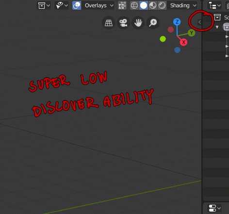
Also, I think this deserves its own thread, but it is really disappointing the way that add-ons now are very hidden by default. And, if you look at blenderartists discussions, some add-ons want floating dialogue windows so badly that they roll their own, which doesn’t feel very consistent.
18 Likes
Did you see the 404 maxon.net page? I guess it’s a attempt of pressure on unconscious. Or just a declaration of something. Something like “we see blender rollin’, we hatin’”.
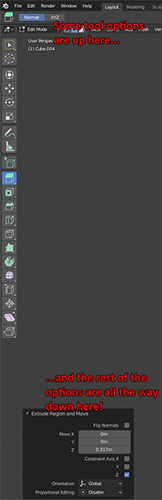
sooo… when are we getting rid of the “responsiveness” on the preferences and properties panel, and everywhere else?
What you mean?..
that when you drag the panel’s with the ordering of everything gets messed up.
Can you explain in more depth? Panel behavior seems fine here.
This is the mess im talking about
1 Like
This issue has no solution, unless this project here becomes a reality…
Right aligned stuff are the worst thing ever.
1 Like
it has at least a decent solution which is “have it NOT be responsive” like 2.79, at least have it optional.
Isn’t it handy to have contents rearrange dynamically to their container ?
1 Like
not when it’s messy and inconsistent.
Like depending on scale some become 2 colums, some 3, some 1, some no matter what always stay being one.
So it makes keeping track of were stuff is very difficult, either do it right or dont do it.
1 Like
I think some places are not adapted to this layout yet, that’s why we’re not seeing them react at all. I agree that it’s inconsistent and I would like for instance, to see transform panel jump directly from one-column to three-columns without this intermediate step where only rotation tuple gets nudged to the right on its own.
That would be nice, to go from 1 to 3 columns directly. Currently the system doesn’t support this, but it would be nice in these cases.
2 Likes

hahahaha man! 

this is something that I have always wanted …
everywhere … both in the panels and in the sidebars and in the preferences