Both of us are volunteers. We’re not being payed to “maintain consistent communication with the community” or something. And anyway I’d agree with Howard that there was no inconsistency there. Besides, there’s no real data on any of this. I’d appreciate it if you kept the discussion focused on bevel.
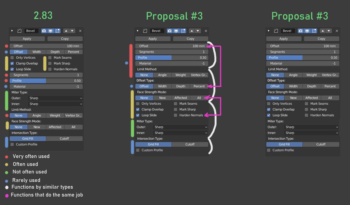
In order to keep the UI relatively more simple, one of the goals post 2.8 is to not put too many controls on one line. Even the offset drop-down I proposed is a bit more complex than most other UI. Also, personally I’m not sure that making the modifier panel shorter at the cost of readability is worth it.
Perhaps this makes ui simpler. But this makes the interface more fat, and navigation on it becomes not simple.
I suspected that compiling four drop-down lists in a row might not be the best solution.
Then they can be marked in two rows and two columns:
No Limit______No Strength
Offset________Grid Fill
This is unbelievable, and the work that you both do is worth paying
Sure, I didn’t realize you were volunteers, with all the money flowing into the Blender development fund recently. So the standards and practices will then hopefully also apply to volunteers in the future, and hopefully there will be a centralized process to handle UI design decisions as well, which I also really hope will be public so we can read about it.
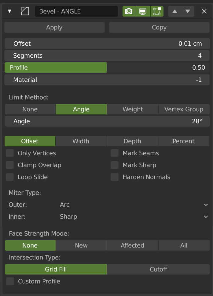
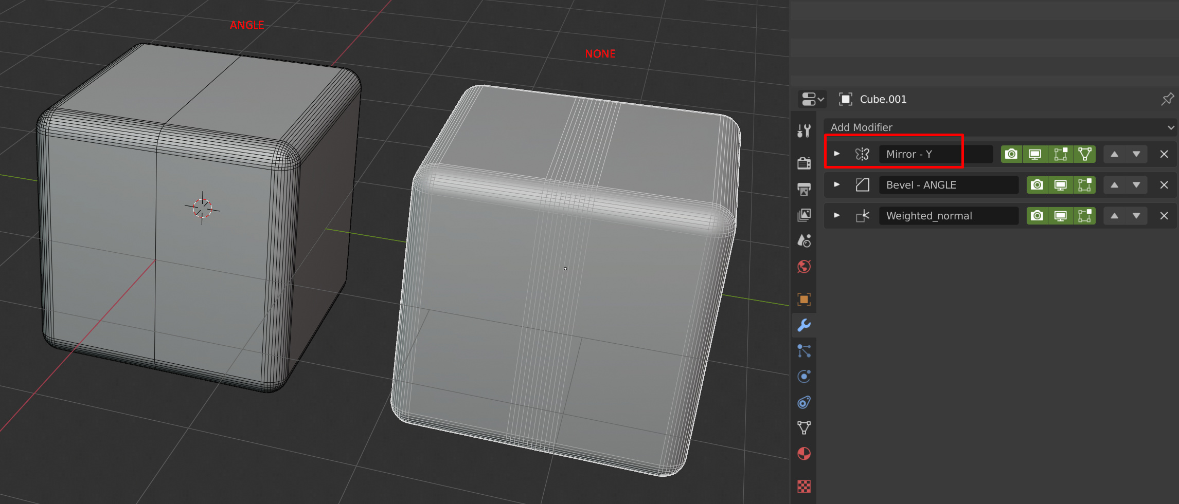
Im using booleans and bevels a lot, during blockouting, finding shapes while working on my assets, but I miss one feature. I was thinking if there is any possibility for “infinity” bevel/chamfer? I made a small video just to show an idea:
could we get some weld / remove doubles with bevel when clamp is on?
I love how the edit mode behavior now looks like the modifier itself but now that weld is a thing we’re able to use weld with clamp off to allow for quick bevelling to limits without issue but it relies on following all clamped bevel mods with weld.
My goal is not to make the menu shorter. The main task is to place all the most frequently used and tweakable buttons together and at the top.
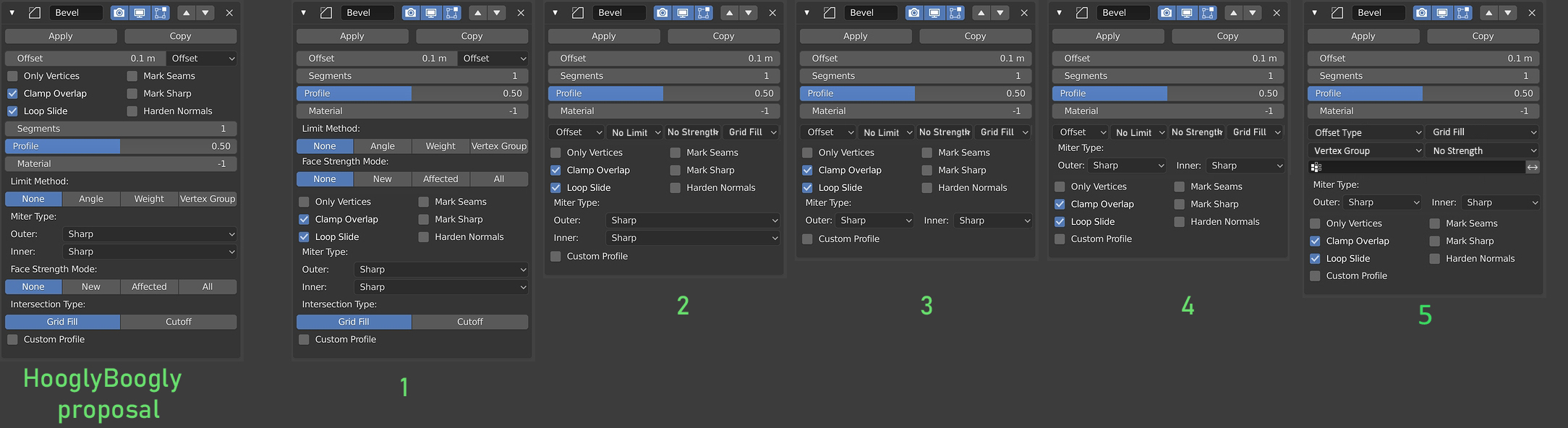
Yes, it is possible that in some places the readability has decreased, but due to better sorting and ordering, navigation through the modifier has become easier. In this concept (5), all buttons are located exactly in that position with the workflow that I personally use and by many other users. Of course, this can still be changed and improved.
Additional labels disappeared, but instead you can come up with names shorter and better describing the purpose of the buttons (just my English is very bad and I could not come up with good names). In addition, Extra annotations do not always provide a clear understanding of the purpose of the buttons. You will have to read tooltips and instructions, and try in practice what all these names mean.
I face the same problems with bevel - I even changed the UI theme just to try to make the important parts more visible. But it barely helps.
It’s very bad UX if I have to search for the most basic parameters of a modifier.
That said, I seriously love your 5th proposal.
I might add back the limit method as a toggle button row but that’s it.
It should happen.
Visually and functionally speaking, I like any mock-up that does not sandwich those 6 check boxes between other UI elements especially long sliders. With my preference being to place those check boxes at the very bottom (mock-up 4 or 5).
The current Bevel UI is the absolute worst right now; aesthetically unpleasing to look at, cumbersome to use, and placing options which aren’t used very often (seams, loop slide, sharps) above something very fundamental (number of segments).
You both should have spoken up when we were working out the UI updates in the summer of code thread…
And sorry but we’re not going to put 2 or 4 dropdowns on the same row without any labels. Maybe it works for people familiar with the tool, but please recognize you’re not the average user.
The feedback of the most important options is useful though.
hah great culmination of the thoughts above, Wazou. I’d like that!
And @HooglyBoogly, how could we all be there in the exact moment when coders (kind of) accept feedback? Why can’t we have feedback now?
This topic is just another example of a critical mass accumulating when we realize that many other people have problems with the same features. We amplify each others voice and that’s a good thing.
Unfortunately, we cannot control every step of the developers, participate in all discussions. Under ideal conditions, we should not do this at all, sorry :). Developers should have experience or access to comprehensive information about the subject they are working on. For example, when the developers decided to replace the TAB hotkey with switching from the editing mode to something else, the users had to very long and persistently dissuade the developers from this step. This situation should not have been.
And this is everywhere. Here are some more dubious decisions:
replace hotkey ctrl+1,2,3… for edit mode (subdiv lvl)
subdiv modifier. viewport subdiv lvl follows after render lvl.
Object transformation sliders are on the Item tab, 3d cursor transformation sliders are on View tab, although the objects and the cursor work together.
This list is endless.
Blender UI paper cuts shows it very well.
About removing labels. You are right, but forget about the other side of the coin. The label does not provide complete and comprehensive information about the button next to which it is located. A new user, after reading the label, will not understand how the tool works.
For example. Limit Method: None, Angle, Weight, Vertex group. Limit for what? For bevel size, for segments, for profile, for what?
The label does not provide information to the new user. He still has to read the prompts and remember what this label means. These labels do not explain anything; they serve to create a unique name for a series of buttons. In my example, they are not needed because uniqueness is ensured by the position of the buttons, this position is very easy to remember.
In addition, you easily placed 4 buttons in a row (None, Angle, Weight, Vertex group etc.). Devs have done this three times in this modifier.
This is similar to another “Blender Paradigm” which harms more than it helps
I am not saying that any of my concepts is unanimously correct and should be accepted. These are just ideas. An idea with a number of drop-down menus is just an iteration of the idea.
For example, here I tried to explain how and why buttons should be placed in that order.
Hi, I like the proposition 1 because it’s clear and well organized. Also there is less dropdown menu which is a good thing for a faster direct access to properties. @Wazou I like the first image for the same reasons.
Sure! Comprehensive is easier said than done though : P
I’m going to disagree that people can easily remember the order of different items. In my experience people usually refer to a setting by its name or its label rather than its order among the others.
I agree that “Limit Method” is a bit ambiguous, but I do think any context rather than none is useful.
That’s different, they’re just selecting from the same enum!
I do appreciate your in depth mockups. I do like aspects the proposals posted here, although I would change a few things.
I’m nearly finished with a patch to change the way modifier UIs are drawn. After that I’d like to make a pass over the UI for all modifiers (or as many as I have time for), starting with bevel. I’ll make a thread to collect feedback first.
That patch, ironically, will make it much, much, much more difficult to generate such mockups in the future as well as prevent some forms of customization without recompilation won’t it?
Sorry that we’re getting off topic from bevel improvements, that’s my bad…
It would be simple to make it possible to override the layout in that python file so the layouts can still be custom, maybe I can add that. If you already compile Blender it’s not much harder.

 So the standards and practices will then hopefully also apply to volunteers in the future, and hopefully there will be a centralized process to handle UI design decisions as well, which I also really hope will be public so we can read about it.