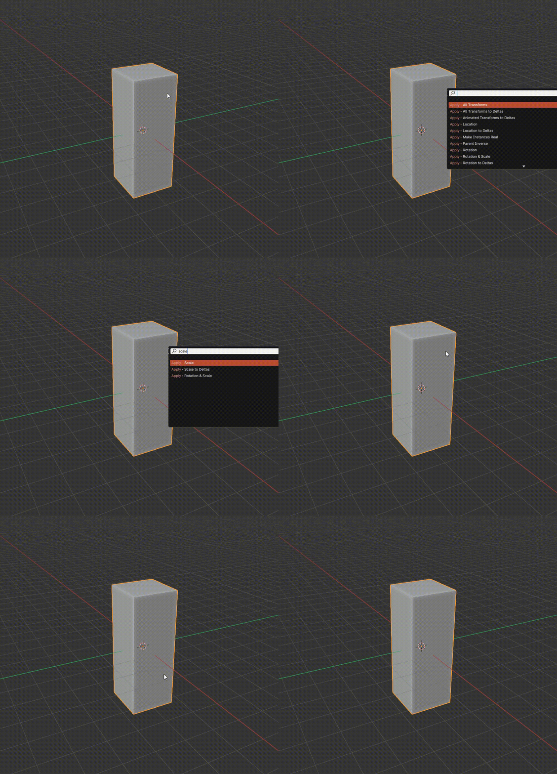
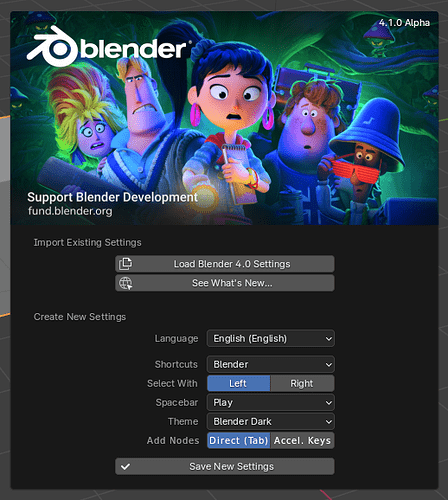
You can change Add menu shortcut by yourself in the preference though.
I have a question on this change, which I’ve mentioned here:
“Is there any concern that because the spacebar is a default hotkey for “play animation” - and relatively easy to even hit by accident, that a user is going to misplace their cursor when attempting to search? This can cause large problems, when dealing with frame-specific edits.”
I believe if this, which I posted on RCS - will somewhat mitigate the problem… at the very least, the user won’t hover too far from the menu (which closes it) in the process of hitting the spacebar.
I know “feature request” is an unpopular topic on this site, but in this case I see it as a solution to a problem that I think the new “space search” feature is potentially going to create. Otherwise, the solution appears to be to de-assign SPACE as the playback key.
Yeah… been trying to test it. Other than the discoverability issue, as a UX, the new method is also technically 50% slower.
New UX with the new system:
- Trigger a menu 2. Trigger the search 3. Search string
Former UX
- Trigger search 2. Search string
I can agree with a few of the voices here, searching the menu directly is nice, should be an additional perk, great - but when not needing to call a menu to directly search, not have the ability to assign a direct hotkey, and not making the search menu a discoverable GUI entry you can mouse over and find (without an accidental keyboard stroke for unexpected UX on first use from other systems - ei, opt-in search)… the former old search systems is missed.
I would consider menu searching an opt-in optimization and an additional UX to legacy searching.
How you filter the legacy search could be defined by editor vs menu group. And filtered by menu group is triggered in menu per the new standard.
Suggestion:
- Trigger search with an editor operator filter from a GUI discoverable entry, hit by a hotkey or mouse click. Add the tooltip to show that you can also search directly in a menu. (legacy)
- Keep the new system with menu operator filter, potentially have an opt-out or opt-in toggle in preferences (new)
Keep the old, keep the new. Target discoverability, target direct callbacks, and target the new menu filtering convenience all at once. Try not to replace.
That’s the problem. When I checked, there is no way to assign search menus to shortcuts in preferences. This is different from the shortcut change when moving from 2.79 to 2.8. You can change the f3 search shortcut to spacebar, but not now.
Ok, so it seems to me that people would be happy(er), if:
- The spacebar shortcut was customisable.
- The search could also be easily called directly, without having to open the menu first.
Seemingly, this would fix the issue of changing muscle memory, and also wouldn’t sacrifice time having to open the menu before searching.
That doesn’t seem that difficult?
That’s sort of where I am on this. I see the benefit in places such as node editor or the newly-compacted modifier list, but can’t recall thinking "I really wish I could just start typing “Limit Total Vertex Groups” instead of choosing it from the menu. At the very least, because I cannot remember the proper name for every single command in the program, so… yeah, I pull down the menu and go for the command I’m after.
Ironically, on a regular basis I type “multiply” in a menu search, and then reminder myself there is no such node… ![]()
Yikes, I only just found out about this reverted behavior and am as disappointed as the others commenting here. Would also love to have seen a tab option as most other node based packages use. Shift A then space is super awkward when doing hundreds of times a day!
The other thing I will miss is how much cleaner the menus looked without the underlined accelerator key. Would be great to at least have an option of turning those off.
Wait what?! They removed the ‘Shift A + just start typing’?? I was so looking forward to that ![]()
To be honest, I just think they should revert this change, 4.0 is already late into development and to completely change the behavior of the search for a third time will be super confusing for users.
Most people have already got adjusted to type to search, also look at social media where for instance the new modifier menu has almost become a meme that you can just type to search. When 4.0 launches and you cant do that, it will leave a lot of people confused and disappointed.
The majority of user would be happy if it was just reverted to how it was before this change, later an button for search in the menu by default and a option for no acceleration keys at all could be added to preferences.
There seem to be almost no one in favor of this change and is just the worst of both worlds, the solution we had beforehand was a nice compromise for most people and also was closer to how many industrial standard software work. Also it made the menus look way nicer and more clean.
I made a poll:
- Go back to previous Type to Search
- Keep current Spacebar Search
- Revert back completely to 3.6 search
This is a great example of how much UX debt making wonky, unique UX decisions creates in the future. Accelerator keys are very unique feature. Not completely unique to Blender but almost. They were a crutch to help with overcrowded menus. But once you implement unique feature, you pay for it by users getting used to it. Then you cannot just simply remove it once you implement proper solution. Even if it and the proper solution can coexist side by side.
At this point, too many users are used to accelerator keys so they can not be removed. I am not saying they should. I am saying that next time someone tries to reinvent the wheel and implement something unique to Blender rather than adhering to industry UX standards, it will once again create a great UX debt for decades to come. If accelerator keys never existed, implementing a proper universal menu search would just be so much easier now.
Even if accelerator keys were completely removed, it would be probably easy for many people to access the menu item quickly, because you don’t need to keep massive mental library of letter<->operator association unique for each menu. You need to remember just the name of the operator and press first or maybe first two letters to find it. But if accelerator keys were removed, there would be some people complaining.
Here’s a proper solution:
Add User Preference to toggle between Accelerator Keys and Instant Search:
- If the preference is set to Accelerator Keys, every single menu will show the “Search” operator entry, and acceleration keys will work, but search will have to be initiated manually.
- If the preference is set to Instant Search, all menus will be instantly searchable and won’t show the search operator, but accelerator keys will not work.
This way, user is not in constant minefield of keeping track of which type of menu they are in, and they can use the very same muscle memory across the entire Blender.
(And please make the manual search shortcut Tab, not Spacebar).
I fully agree with this, but I feel like there should be a third option for keeping acceleration keys while also having type to search in some menus like it was before this change. I feel like its the best compromise for pro users that use acceleration keys while also having type to search where it makes sense.
Otherwise I would have to got to preference and switch the search behavior multi able times a day depending on what I am currently doing since I use the acceleration keys all the time when modeling, but when I am using shaders/geometry nodes/modifier stack I want instant search when typing.
Or, just make piece with the fact that Add Menus are inherently different from others and its ok if they behave differently. That’s how this change started. Jacque proposed different behavior for Add Menus since they’re VERY different, accessed most frequently. And they accepted, but got so stuck on the fact that it was “inconsistent” across Blender, that they reverse engineereed button-to-search feature.
Arbitrary definition of “consistent” took precedent over good UX. Just keep accelerator keys for regular menus and have type-to-search for Add. I’d rather have good, but incosistent UX rather than consistent at being shit.
But the good thing is now I’ll never forget where “Scale” operator is in Apply menu. Now that is a good UX!

Looks like they’re doing exactly what I said. Props to Harley for once again being a savior for Blender users. I won’t die before I see your statue at Blender HQ @Harleya P.S. thanks for new font.
EDIT: Ha, already obsolete as @Harleya came to save the day ![]()
After using this patch for a while, I find it to be a great solution! ![]()
Another amazing patch by @Harleya
I guess one thing we can all agree on is that spacebar to search is worst of both worlds ![]()
Just gave it a try as well and I love it!
@jacqueslucke and @pablovazquez already approved the patch.
Now only @dfelinto and @julianeisel have to give their thumbs up.
Ah very nice it got reverted, feels great. Thank you @Harleya! ![]()
