2.8 Outlined/Coloured Icon Adaptation

I’m just giving my honest opinion on this. Looking at the screenshots, with the dark theme the outlines are mostly making the shapes less clear (maybe an acceptable trade-off for better light themes) and the colors don’t have enough contrast to make them easier to spot. On the light theme the outlines help but the colors don’t pop out enough, the icons just don’t look very distinctive to me. The white text on light gray background is barely readable as well which maybe makes it looks worse overall than it may be for just the icons.

It may well be possible to improve them without huge changes, or maybe the other UI designers disagree with me and think this is mostly fine. But I don’t want to give the false impression that I personally would accept this with fixes to some specific icons, I think there’s a bigger design issue.

Yes, never sure what to do with patches that aren’t specific fixes or features, not WIP, but more illustrations of a technique. I marked a recent one with “For Discussion” so maybe that is something to use going forward.

Actually I first ensured there was adequate space around all the icons, no matter the scale factor or line width, long ago. Here is another sample taken at 1X, so you can see how it works on smaller icons.

IconOutlines3

2 Likes

The white text is because at some point, the icon colour was tied to the text colour, so everything turns black if the text is black. This is the only theme change, programming-wise, that would need to be sorted.

As for the other points, I don’t know what to say at this point. They’re all factors I had already come across, considered, worked around, and optimised as much as is possible in the space available - And frankly, I think I’ve come away with an exceptionally good result given the number of design parameters, and benefits thereof. Any icons that lose clarity in shape is honestly minimal, running these icons on 2.8 and on the dark theme the difference is barely even noticeable, not to mention a good portion of the icons weren’t actually shrunk or even had anything coloured over the original white icon - they were always kept intact where possible. And the colours are enough if you consider they’re not meant to pop out and scream at the user so much as be mostly-subconscious signposts, guiding the way. I’ve received positive feedback on the saturation choice, from people who sit in either camp (those wanting coloured icons, and those who like the mono icons).

Regardless, the reason I posted here was to get the discussion happening between you and the other UI designers. The only other one I run into is @billrey, and he’s made it clear that he just flat out doesn’t like the idea of outlines. So my recourse is to ask you to introduce this topic of conversation to the UI team.

I would point out the reason why this works with minimal editing, is because it does effectively make all the icons 16x16. The ui technically has space for it, but it’ll affect negative space on light themes.
I’d also point out that the icons for 2.79, from what I can tell, generally averaged 15px, including outline, with some teetering over a little higher, others lower.

2 Likes

If you have to stay within the limited space it is challenging. But we could go a bit larger as @Harleya proposes. As a test, this is the icon PNG modified in GIMP. The icons are blended over a black Gaussian blurred copy of the icons to create an outline:


It’s not perfect and the icons are somewhat cramped, but it preserves the shape better. These outlines could be optional for dark themes and any glyph-like icons that follow the text color. Color could possibly be added to the icon SVG without shape changes.

1 Like

It is tight, basically just one spare pixel around and no more when at 1x scale. Less than that is better, as in a one-pixel outline that is less than full opacity.

I redid that patch in case you want to play with it. Does outline and creates a “disabled” version as well.

https://developer.blender.org/D4670

1 Like

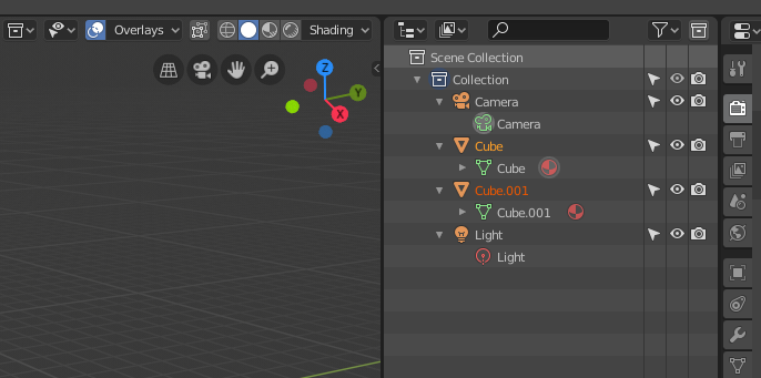
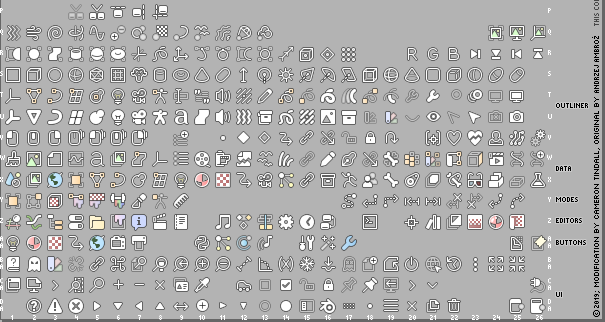
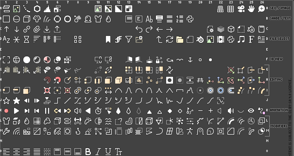
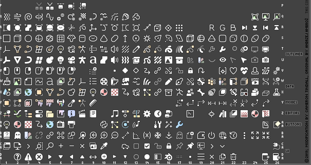
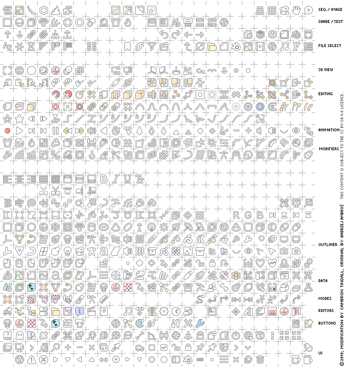
I don’t think you understand how many points I’ve hit with this sheet. And I’m really tired of the dismissive argument that shape isn’t preserved, when that’s absolutely not the case:

image
image
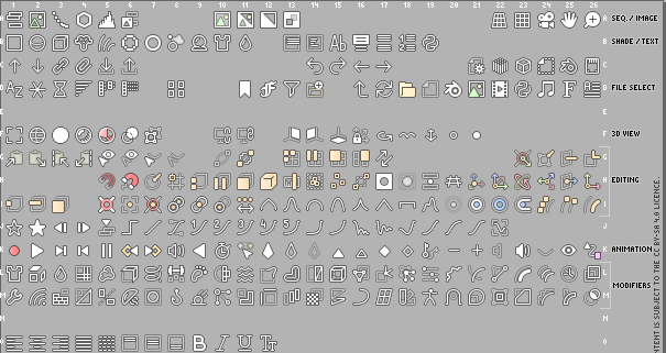
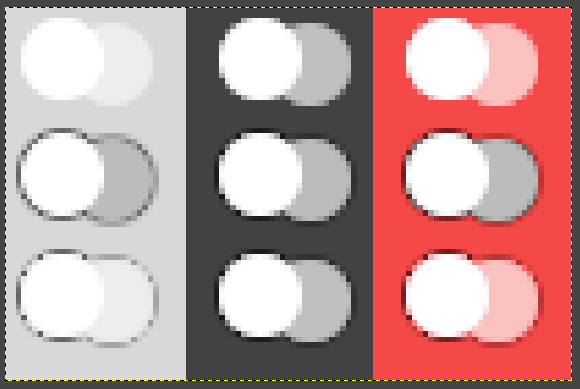
Please tell me which of these icons have such terrible shape preservation.

You’re fixated on the fact that some of the icons are slightly smaller, over-emphasising the difference it makes, and you picked the hardest icon to get right as your example.

The sheet I’ve made hits all of these points:

  • Introduces colour
  • Isn’t distracting
  • Is well received by people who like flat icons, and people who want colour
  • Uses an easy-to-reproduce style
  • Requires as little code changes as possible to implement (new icon loading code, extra icon rendering code etc)
  • Doesn’t require two or multiple icon sheets, layers etc
  • Doesn’t encroach on negative space
  • Maintains shape, shrinking icons only where necessary, and even then, keeps crisp, clear, lines with few exceptions.
  • Has outlines/shadows interfere with the default dark theme as little as possible
  • Doesn’t require hundreds of colour settings, for each individual icon
  • Has someone supporting it
  • Works on many backgrounds without modification or settings changes

I’ve seen a lot of good proposals pass by in the BArtists thread on Jendrzych’s icon set, but every one of them had issues with simply requiring too much work to implement, typically being unrealistically long term idyllic and elaborate implementations.

I set out to make something that runs on the system we have, that works now, or as close as possible. And I’m sorry @Harleya, but that patch doesn’t actually do the job, it only creates an outside outline at best, because from what I can tell it just scales the icon up by 2px. It also doesn’t solve the issue of having hundreds of colour settings in order to introduce colour - nor does just adding a shadow to the entire sheet, And that has it’s own problems anyway that lead to the idea that it would be optional. Again, more settings, and you’d either need two icon sheets and the code to load them - or alternatively the code to gaussian blur and layer the icons.

Unless you’re willing to have all the icons be 16x16 with outlines on both themes (some icons actually still need to be shrunk in that case, such as the camera), there’s a bunch of programming work to implement these ideas.

I don’t know what you did in your mockup @Brecht, the camera icon didn’t get clipped. You also have to be careful with blanket-ly applying filters like this, because lines that aren’t straight get darkened by the outline - in the sheet I had to set some of the white lines to 1.2 or 1.3 thickness to overcome it. Also be careful about adding a black layer underneath a partially transparent line - these lines are everywhere.

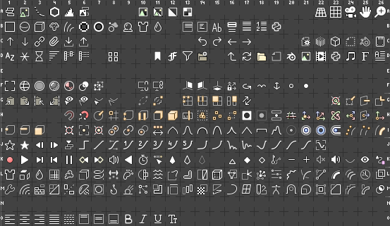
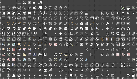
Here is an actual comparison, with all the icons having the same opacity, values etc. And can we keep things to 1x (I had to do my own mockup because scaling down yours would make it blurry, and you have theme settings there that would affect the impression).
image
image
Again, in a fair comparison, slightly smaller, no less clear, and the colours pop just enough.

Every time this or anything like it has been discussed, the response has been that the old icon sheet was old, and you had to use what you had, suggestions for fixes that might require some work were given no credence because you couldn’t work for a possible future implementation, you had to use what you had.

But now when I’m introducing this icon sheet, have put the work in, and provided something that works now, all of a sudden we’re looking at possible implementations, ones that require code or filters, things we don’t have. What changed?

1 Like

It’s of course a subjective thing to some extent, but I really see the majority of icons as having a less clear shape than before. I can’t go over every individual icon, but some more examples from the editors menu:

  • 3D Viewport: grid not clearly recognizable, looks like broken up pieces.
  • Image Editor: paint splash not clearly distinguishable from the rest, colors much too close.
  • UV Editor: grid not clearly visible due to lack of contrast, folded over piece of paper not clearly distinguishable because of that.
  • Shader Editor: contents of sphere has not clearly distinguishable pattern, just looks like a muddy mix of things at first sight.
  • Compositing: mostly looks fine, but have to squint a bit more due to smaller icon in dark theme because outline shrinks it by 1 pixel.
  • Texture Editor: grid pattern not clearly visible, colors too close.
  • Video Sequencer: diagonal lines of clapboard stick out which makes it not look quite like a clapboard.

Just as a whole I don’t think they’re good enough to be the default Blender icons, I’m sorry.

It feels to me like you’re looking for faults in order to justify not considering it.
If you look for faults in something, you will always find what you’re looking for, in increasing triviality.

The issues you point out, every time, vary between completely subjective, minor, utterly trivial, or “it shrunk”. And most if not all of them I would pick up in a final polish pass. No reason not to begin any discussions.

You said the other UI designers might disagree, is it going to be discussed?

Well, the icons really look blurry, busy, and strangely halfway desaturated. I very much prefer the solution by Harleya.

I am an amateur Blender user, but have followed a lot of the discussion in regard to monochrome vs. colored icons and, as one who very much does not like the monochrome set’s exclusion of color, I think that the icons of Antaioz are great and would love to see them incorporated. If I were in his shoes, I would feel pretty mad at what has transpired on this thread and the dismissal of what I think is great work. I don’t know who he is. He did not contact me, but I feel somewhat sorry for him. I think that there might be other blender users who would love to see his icons included, and it might be worth soliciting input of others before so quickly keeping his work out. Just my two cents. Brecht, thank you for the great work that you and others have done. I am loving the development of 2.80 and where Blender is going.

3 Likes

I did up a 16px sheet based on if using the extra space turns out to be acceptable.

image
image

image
image


Transparent PNG and a link to the SVG (The SVG itself is too big for the forum, because of all the duplicates and layers to make the outline), are in the original post.

3 Likes

We discussed this with the UI team, and the consensus was that icon set proposed in this thread is not the one we want as the official Blender icon set.

For the 2.80 release we plan to do some smaller changes:
https://developer.blender.org/T63521

3 Likes

Then I’ll impart some knowledge from making these icons.

Be careful with the method for making outlines, curved and diagonal lines often get lost or shrunk in the outline because of pixel arrangement. I found making an extra rim outline of white about 0.2px wide helps to fix the issue, but had to balance as too much introduces blur. The extra rim lightens the outline on straight lines as it just merges with the black from the outline. But on curved or diagonal lines all the pixels fall in varying places between that line edge, so bringing the edge out further gives the line more definition and offsets the thinning that the black parts of those boundary pixels effectively do, and so the effect is different than simply using a lighter outline. Whatever method you come up with to generate outlines probably doesn’t work the same as far as line widths go, as it’ll be working on bitmaps, but I presume there’ll be some kind of internal radius or offset (for e.g. a blur-and-curve/clamp approach) value that could accomplish something similar.

I also found using a pure black outline is a bit jarring. The 16px sheet I did had 80% alpha and 0.75px outline width (so it was slightly soft at 1x, and had 1px solid and 1px soft when at 2x) on the black outline, but I would say possibly go as low as 60-70%, the 80% still looks fairly obtrusive on a very bright (close to white) background.

It might also be worth considering how the alpha interacts with the outline. If the method of generating the outline generates black or colours behind the icon, layering them can remove the transparency. I didn’t do anything on the 16px sheet to account for it, and this isn’t really an issue, rather just something to note, as generally mixing the transparent areas within the sheet with black generates the same (or close to) colour as it would if displayed on the dark theme anyway, so it’s still dimmed, it’s just the UI colour won’t really show through, and whether having dimmed items be darker vs transparent is what you want.

5 cents from me - as long as the outline is a blurred or bolded backdrop, it must be generated BEFORE transparency is applied, otherwise all not 100% opaque pictograms will loose their visual stength. This will work with dimmed icons, but the real problem is to make it work with pictogram transparent by design. I’m affraid, that darker backdrop will darken whole icon, which isn’t a good thing - outlines should enhance local contrast.

Are you referring to areas such as the orientation icons where since you have no colour variations to use, you’ve applied partial transparency to one of the arrows? this is a ‘transparent by design’ I believe. However the effect would still work, and the partially transparent will contrast to the others as much as it would have anyway, because it will dim with the black background behind it.

Even if you wanted to make the icons and/or their outlines transparent that itself isn’t a trivial issue to solve. Any way of combining has side effects, because there is no way to distinguish, for a simple filter, between partially transparent pixels that are anti-aliased edges, and ones that are by design.

Take this example:
image
The first row is two circles, one at 50% opacity.
The second row has a 1px wide gaussian blur, and a curve applied to the alpha to bolster it, this backs the icon with solid black. Notice how the left column, in the light background, you can still clearly tell there’s a difference.
The third row uses a simple ‘if icon alpha > 0, outline alpha = 0’ type operation. Notice how this doesn’t work well on the light background, and it also adds issues on coloured backgrounds, where the colour bleeds through on the anti-aliasing of the circle, inside the outline.

If you replace the opacity of the final icon with the opacity of the original where it’s > 0, you get transparent edges around circles, curves and non-straight lines. If you replace the colour of the final with the colour of the original, you get jagged lines and curves, effectively undoing the anti-aliasing.

If you wanted to do it, it seems it’s an operation that would have to be done before exporting to bitmap - but even then, it would kill the contrast doing so would hope to protect, on light themes.

This may be of interest http://www.infernal-iceberg.com/blender/interface_icons-load-user-config-png.patch Apply and compile, then place PNGs inside ~/.config/blender/2.80/datafiles/icons/ (or the equivalent in your OS; icons/ is new, remember to create it) and next launch they should be used instead of the default icons (or say the sizes are wrong). No more recompiling, just change the PNGs to change the look.

4 Likes

@gsrb3d, can you submit that for code review?

I’m fine with something like this. Someone could make an add-on that copies the icon files there, so icon themes can be installed as add-ons.

4 Likes

Here’s some PNGs for that

14 Version

1x


2x

16 Version

1x


2x

Done as https://developer.blender.org/D4683

4 Likes

The gradient in color icons is superfluous. You have a flat design of monochrome icons.